The setup below loads every package used anywhere in this document and defines the shared color palette, plot theme, and table styling applied throughout.
Show code
# ---- R packages used throughout this document ----library(fpp3) # tsibble, feasts, fable, fabletools, tidyverselibrary(flextable) library(reticulate) library(patchwork)# ---- Python packages used in Bonus 1 ----py_require(c("pandas", "numpy", "statsmodels", "pmdarima", "scikit-learn"))py_to_r_df <-function(obj) {if (inherits(obj, "data.frame")) objelse utils::read.csv(text = obj$to_csv(index =FALSE))}# ---- Shared color palette and plot theme, used in every section ----proj_navy <-"#1B3A5C"proj_teal <-"#2E8B8B"proj_grey <-"#6B7280"theme_proj <-function() {theme_bw(base_size =12) +theme(plot.title =element_text(face ="bold", color = proj_navy, size =13),plot.subtitle =element_text(color = proj_grey, size =10),axis.title =element_text(color = proj_navy),panel.grid.minor =element_blank(),legend.position ="bottom",legend.title =element_blank() )}# ---- Shared flextable styling, applied to every table in this document ----# Usage: my_tibble |> style_ft(digits = 1)style_ft <-function(tbl, digits =1) { tbl |>flextable() |>colformat_double(digits = digits) |>fontsize(size =9, part ="all") |>align(align ="center", part ="all") |>autofit()}
Each section below loads its own dataset and builds its own models; that project-specific code appears in context within each section rather than here.
Exercise 1: Lone Star Appliances Shipment Forecast
Lone Star Appliances ships products from a central warehouse to major retailers across Texas and neighboring states. To plan production, staffing, and logistics contracts over the next one to three years, we need a clear, reliable view of how shipment demand is likely to evolve. This report summarizes our analysis of twelve years of quarterly shipment history, from 2010 through 2021, and presents our forecast for the year ahead along with the key risks involved.
What the data shows
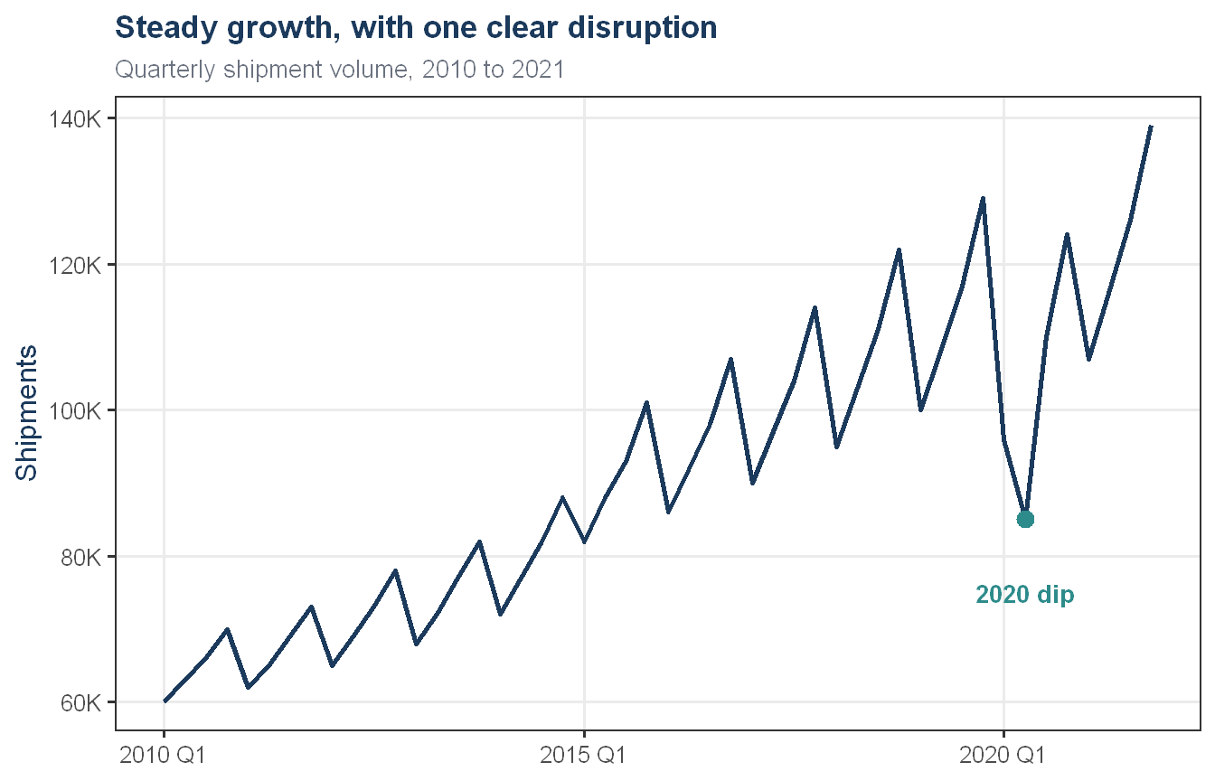
Two patterns define this business. The first is sustained structural growth, shipments have grown steadily and consistently since 2010, scaling from a baseline of roughly 60,000 units per quarter to consistently exceeding 120,000 units by 2021. The second is pronounced annual seasonality, the first quarter of each year is reliably a period of demand contraction, while the fourth quarter consistently drives peak volume as retail partners scale inventory ahead of consumer buying cycles. This pattern has held reliably for over a decade.
Show code
lone_star |>ggplot(aes(x = quarter_date, y = shipments)) +geom_line(color = proj_navy, linewidth =1) +geom_point(data = lone_star |>filter(quarter_date ==yearquarter("2020 Q2")),color = proj_teal, size =3 ) +annotate("text", x =yearquarter("2020 Q2"), y =75,label ="2020 dip", color = proj_teal, fontface ="bold", size =3.5 ) +scale_y_continuous(labels = scales::label_comma(suffix ="K")) +labs(title ="Steady growth, with one clear disruption",subtitle ="Quarterly shipment volume, 2010 to 2021",x =NULL, y ="Shipments") +theme_proj()
Exhibit 1. Quarterly shipments, 2010 to 2021
The one major disruption to this pattern occurred in 2020, when shipments dropped sharply in the first half of the year, almost certainly tied to the broader pandemic disruption affecting supply chains and demand that year. The business recovered quickly, with shipments climbing back through the second half of 2020 and continuing to grow through 2021, ending the year above where the pre-pandemic trend would have placed it.
Our approach to the forecast
We tested several different forecasting methods, ranging from simple approaches that extend recent patterns forward, to more advanced statistical techniques. To make sure the 2020 disruption did not distort what these methods learned about our normal growth and seasonal pattern, we treated the two most affected quarters as a gap to be filled in based on the surrounding trend, rather than asking each method to work around the disruption directly. We evaluated each method by testing how well it would have predicted shipments that we already know happened, checking the result carefully to make sure it was a fair test and not just an artifact of how the gap was filled in. The method that performed most reliably, by a wide margin, is one that captures the underlying trend and seasonal cycle through a statistical technique called ARIMA. This is the method we used to produce our forecast.
Show code
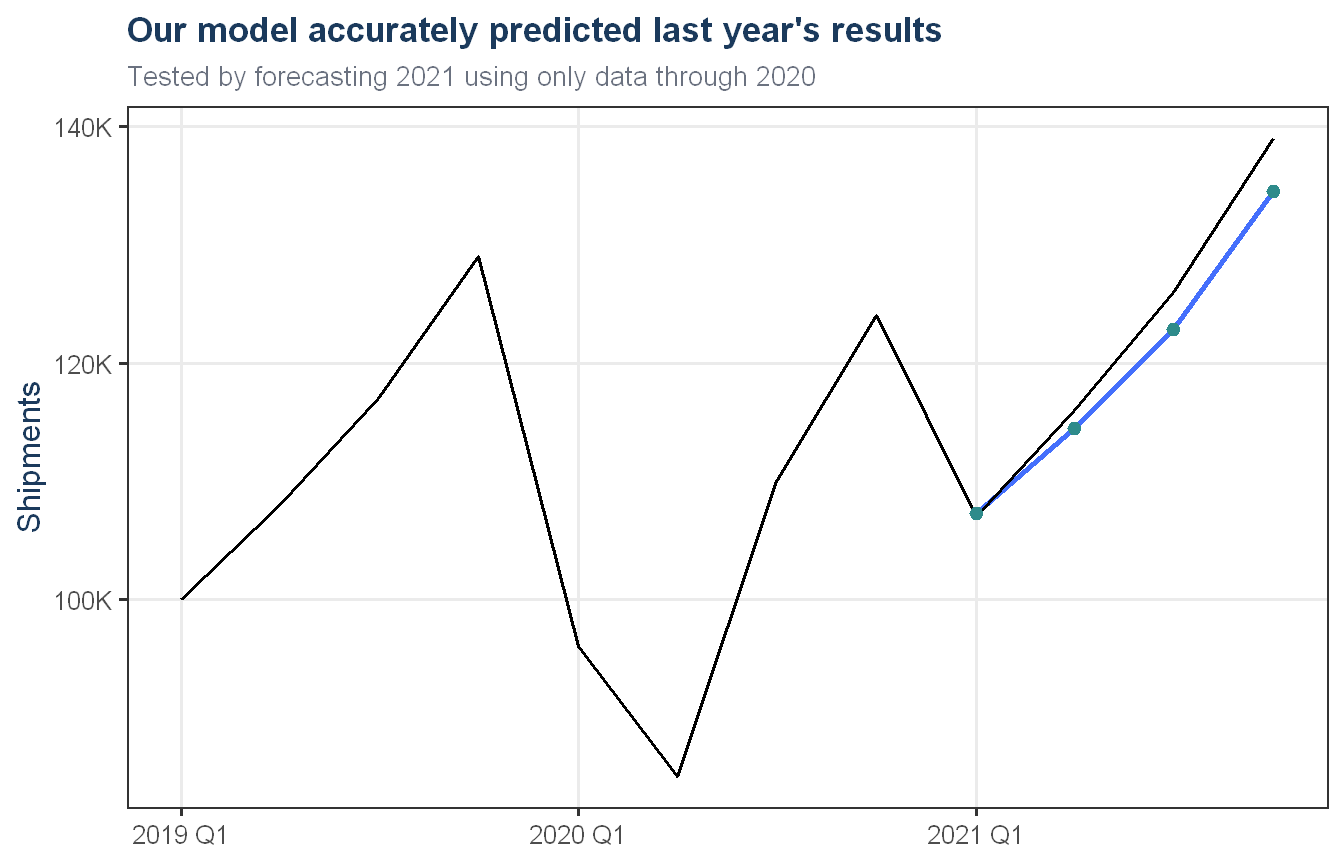
board_fc_c |>autoplot(lone_star |>filter(quarter_date >=yearquarter("2019 Q1")),level =NULL, linewidth =1) +geom_point(data =as_tibble(board_fc_c), aes(x = quarter_date, y = .mean),color = proj_teal, size =2) +scale_color_manual(values = proj_teal, labels ="Model prediction") +scale_y_continuous(labels = scales::label_comma(suffix ="K")) +labs(title ="Our model accurately predicted last year's results",subtitle ="Tested by forecasting 2021 using only data through 2020",x =NULL, y ="Shipments") +theme_proj()
Exhibit 2. Forecast accuracy when tested against the most recent year of actual results
When we tested this method by forecasting the four quarters of 2021 using only data through the end of 2020, its predictions closely tracked what actually happened, giving us confidence in the approach for the year ahead.
The forecast
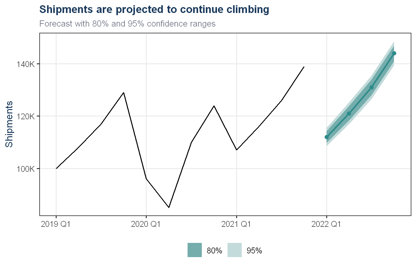
Based on this approach, we project continued growth across the next four quarters, following the same seasonal pattern observed throughout the historical data, with specific quarterly figures shown in the table below. We expect actual results to fall within roughly 10 to 15 percent of these figures in most quarters, with the exact range widening slightly the further out we look.
Show code
board_forecast_points <- board_final_fc |>as_tibble() |>select(quarter_date, .mean)board_final_fc |>autoplot(lone_star |>filter(quarter_date >=yearquarter("2019 Q1")),color = proj_teal, linewidth =1) +geom_point(data = board_forecast_points, aes(x = quarter_date, y = .mean),color = proj_teal, size =2) +scale_y_continuous(labels = scales::label_comma(suffix ="K")) +labs(title ="Shipments are projected to continue climbing",subtitle ="Forecast with 80% and 95% confidence ranges",x =NULL, y ="Shipments") +theme_proj()
Implications for production, staffing, and logistics
The continued upward trend means production capacity, staffing levels, and carrier contracts should be planned with sustained growth in mind rather than flat demand. The seasonal pattern also means staffing and logistics needs will be noticeably lower in the first quarter of the year and highest in the fourth, a pattern that has held consistently for over a decade and can be planned around with confidence.
Risks and uncertainty
The largest risk to this forecast is the possibility of another significant disruption similar to what occurred in 2020. Our analysis shows that none of the forecasting methods we tested were able to anticipate that kind of sudden shock in advance. Our chosen method goes a step further in one respect worth being direct about: because we filled in the disrupted 2020 quarters with values consistent with normal growth before training the model, the model has no memory of that disruption at all, and would not know how to anticipate or recover from a similar event the way it recovered in 2021. We chose this approach because it produced a meaningfully more accurate forecast on the most relevant test we ran, but the Board should understand that this forecast assumes a continuation of normal conditions and carries no built in adjustment for another shock. We should also note that the ranges presented above are best estimates rather than guaranteed bounds, actual results could fall outside them, particularly if conditions change in ways not reflected in the historical data. In the absence of another major disruption, we have a good degree of confidence in the forecast presented here, supported by a consistent growth pattern that has held for over a decade.
Recommendations
We recommend the Board use this forecast as the basis for production and staffing plans over the next year, while building in contingency flexibility for the possibility of an unexpected disruption to demand. We further recommend revisiting this forecast each quarter as new shipment data becomes available, since our analysis shows the model remains reliable when regularly updated with the most recent information.
Technical Appendix
Data description
The dataset contains quarterly shipment volumes from Lone Star Appliances’ central warehouse, covering 2010 Q1 through 2021 Q4 (48 observations). Each row gives a year, a quarter (1 through 4), and the number of units shipped that quarter, in thousands. The data was read in directly and converted to a tsibble indexed by quarter. As discussed later in this appendix, we also constructed an indicator variable, covid_dummy, equal to 1 for 2020 Q1 and Q2 and 0 otherwise, to flag the most affected year, i.e. 2020, by the pandemic related disruption.
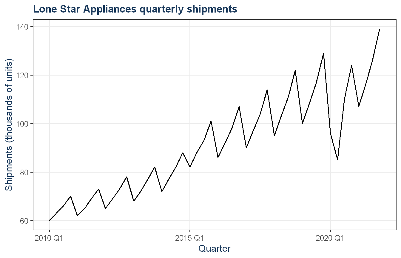
The series shows a steady upward trend across the full 12-year window, combined with a regular sawtooth seasonal pattern that repeats every four quarters. The one clear break in this pattern occurs in 2020, where shipments drop sharply in Q1 and Q2 before recovering through Q3 and Q4. By 2021 the series has returned to, and continued, its pre-2020 growth trajectory.
Seasonal and subseries plots
Show code
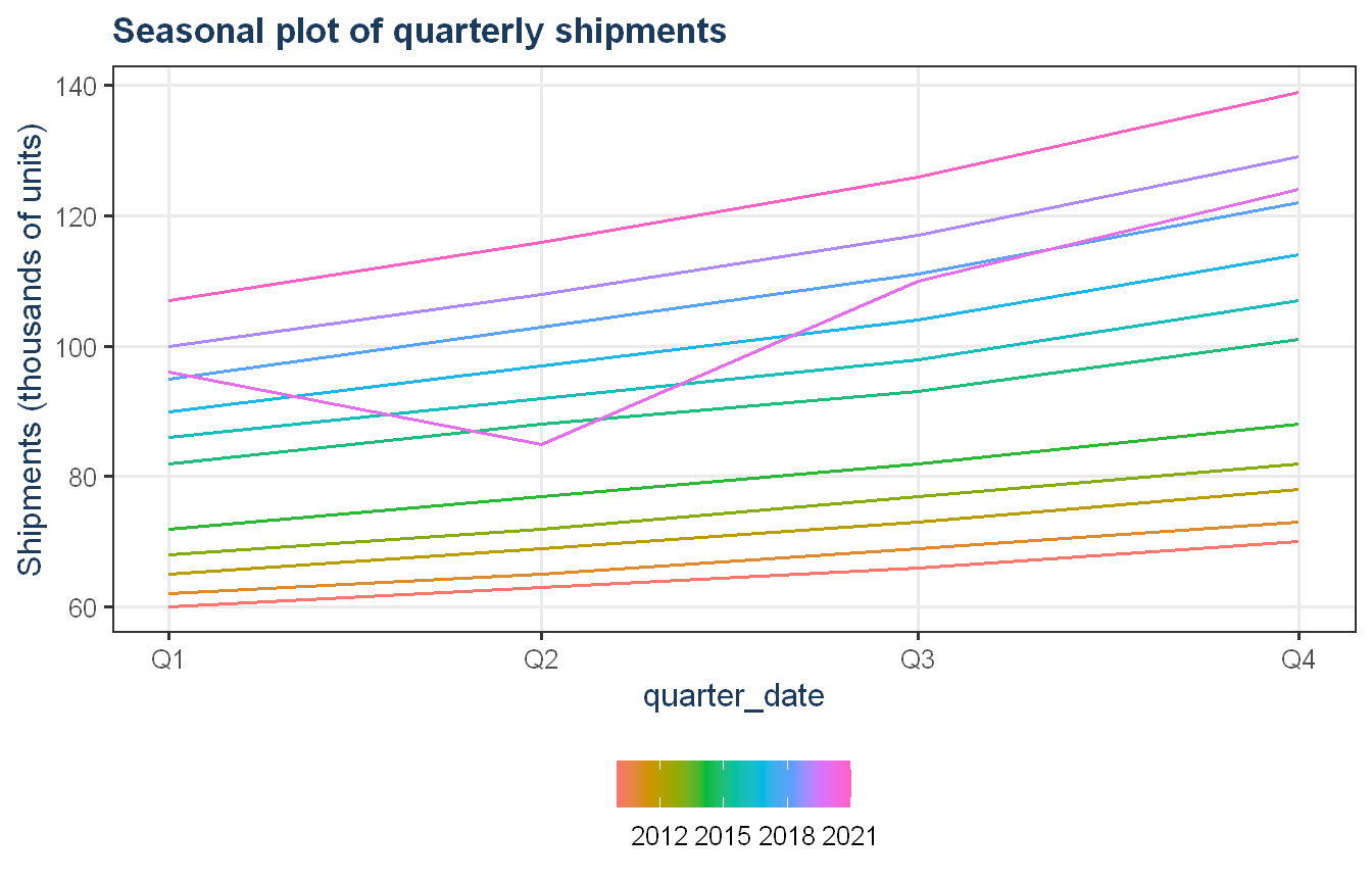
lone_star |>gg_season(shipments) +theme_proj() +labs(title ="Seasonal plot of quarterly shipments",y ="Shipments (thousands of units)")
Show code
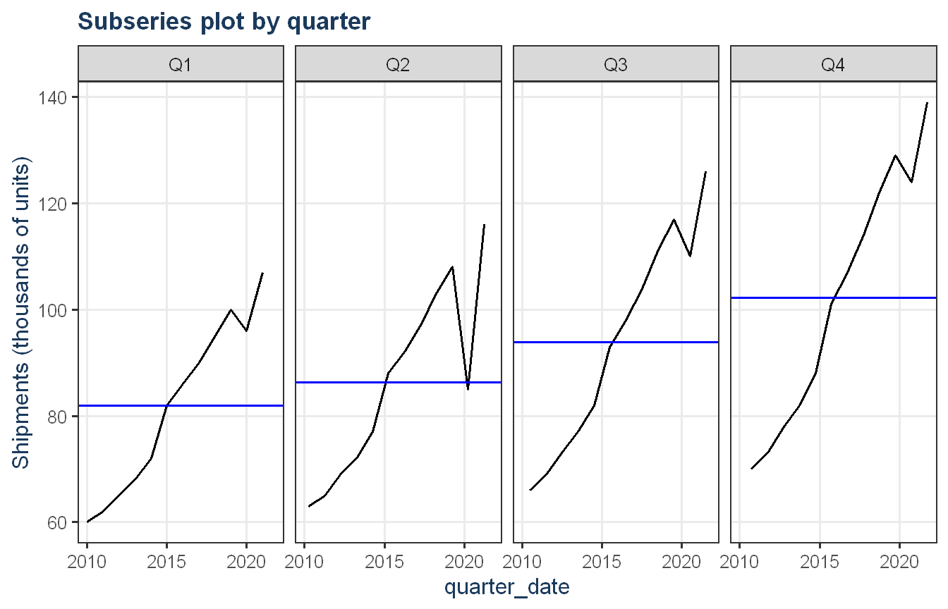
lone_star |>gg_subseries(shipments) +theme_proj() +labs(title ="Subseries plot by quarter",y ="Shipments (thousands of units)")
The seasonal plot shows the same basic shape, quarter 1 low, climbing to a quarter 4 peak, repeating consistently across every year except 2021, where the line dips from Q1 to Q2 before climbing again. This is the 2020 disruption showing up as a one year anomaly in an otherwise highly stable seasonal pattern. The subseries plot confirms this further, each quarter’s panel shows a smooth, near linear climb over time, with the only departure from that pattern occurring around 2020.
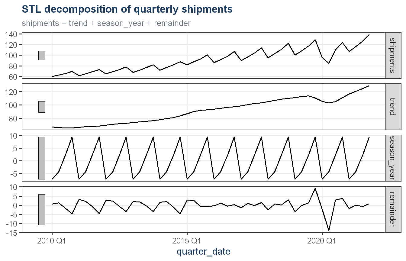
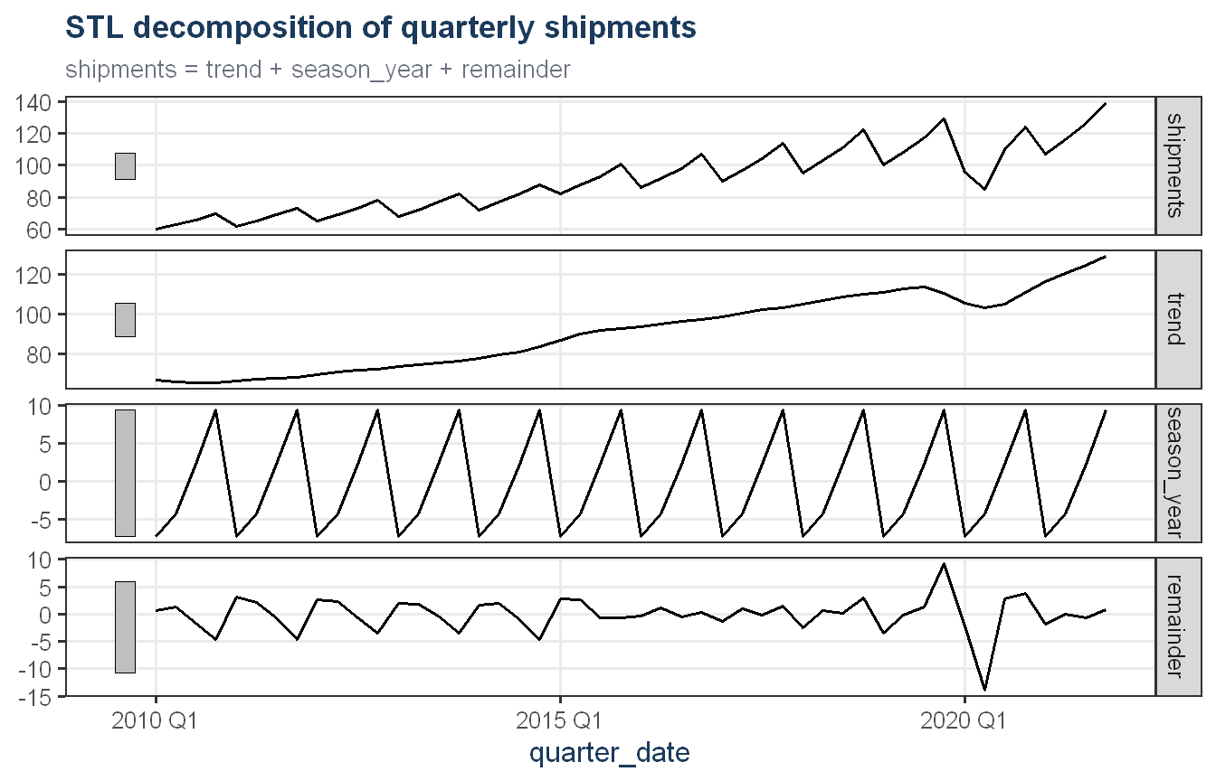
The decomposition separates the series cleanly. The seasonal component is essentially identical from cycle to cycle, with an amplitude of roughly plus or minus 9 to 10 units regardless of the overall level. Since this amplitude does not grow as the series grows, the seasonal effect behaves additively rather than multiplicatively. The trend component is smooth and gradually accelerating through the mid 2010s, dips visibly through 2020, then resumes its upward path. The remainder is small and unstructured throughout the series except for a sharp spike in 2020, exactly where the disruption occurred, confirming that the 2020 shock is captured almost entirely in the remainder and trend rather than distorting the seasonal pattern itself.
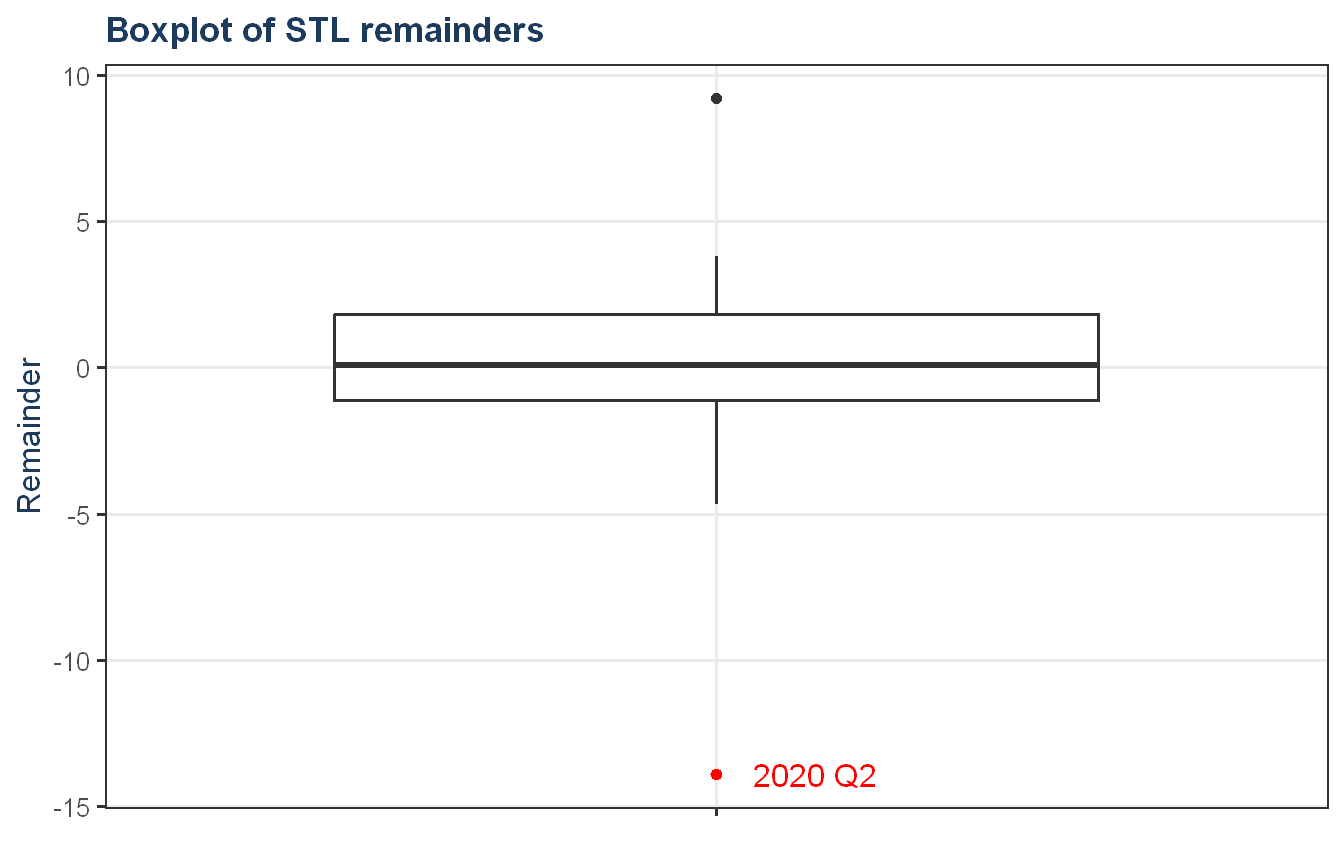
lone_star_stl |>as_tibble() |>ggplot(aes(x ="", y = remainder)) +geom_boxplot() +geom_point(data = . %>%filter(abs(remainder) >10),aes(x ="", y = remainder), color ="red") +geom_text(data = . %>%filter(abs(remainder) >10),aes(x ="", y = remainder, label =as.character(quarter_date)),hjust =-0.3, color ="red") +theme_proj() +labs(title ="Boxplot of STL remainders", y ="Remainder", x =NULL)
The 2020 Q2 remainder sits at a z-score of negative 4.26, far beyond every other observation in the series and well outside the boxplot’s whiskers. No other quarter in twelve years of data comes close to this deviation. We treat 2020 Q2 as a genuine outlier driven by an external shock rather than a data quality issue, since it lines up with the broader timeline of pandemic related disruption to shipping and demand. We do not have enough information to say definitively what caused it, so we do not attempt to correct or remove it, only acknowledge it here and account for it in the discussion of model limitations later in this appendix.
Addressing the outlier
Rather than removing or correcting the 2020 outlier, we considered two different ways of accounting for it before fitting any models: interpolating over the affected quarters so the model never sees the disruption directly, or keeping the real values visible and adding an indicator variable that flags them as unusual. As a first step, we constructed the indicator variable, covid_dummy, equal to 1 for 2020 Q1 and Q2, the two clearly depressed quarters, and 0 for every other quarter, for use later when we compare the two approaches.
We discuss both approaches and the testing that led us to choose between them later in this appendix.
Box-Cox transformation
Show code
lone_star |>features(shipments, features = guerrero)
# A tibble: 1 × 1
  lambda_guerrero
            <dbl>
1          -0.900
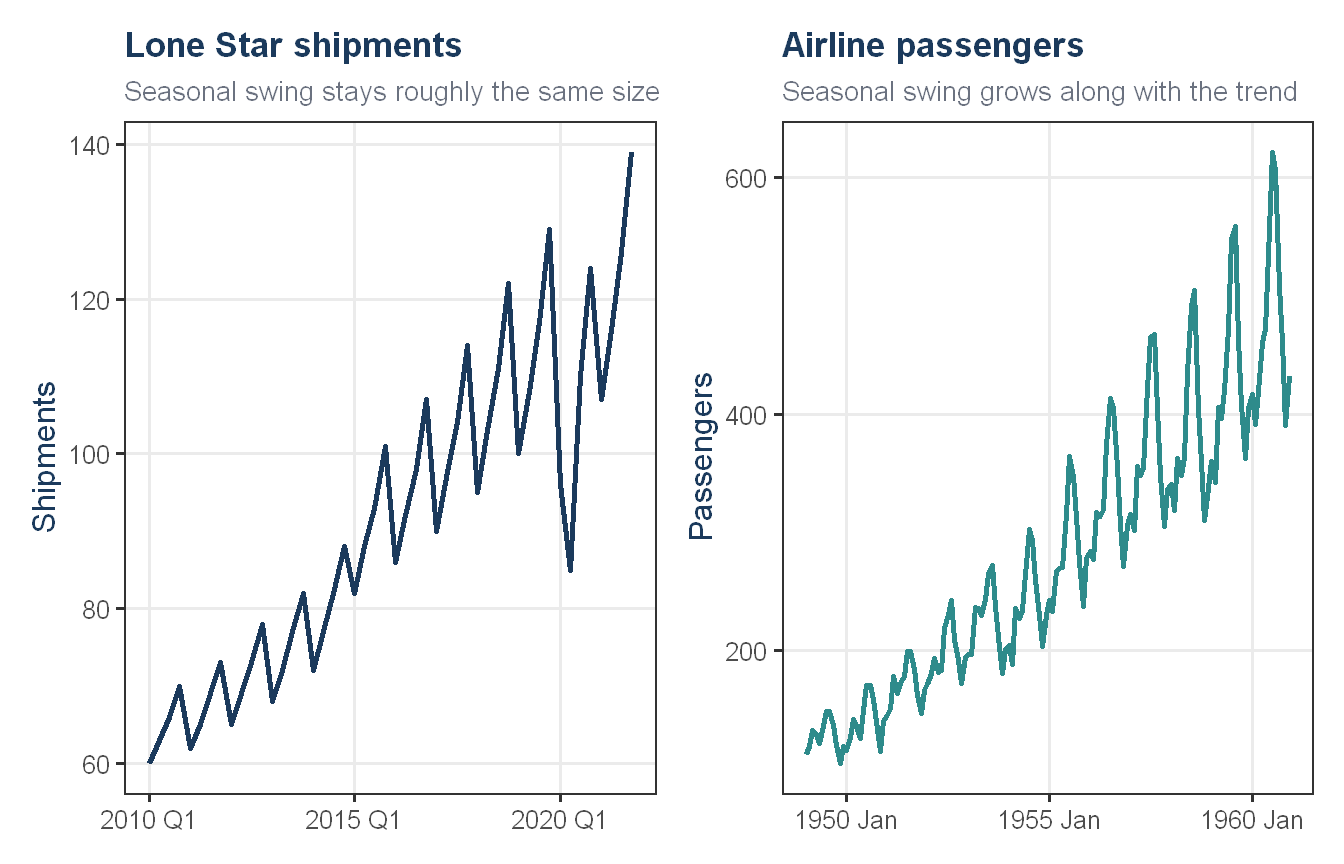
Guerrero’s method suggests a lambda of negative 0.90, which would imply a fairly aggressive transformation. However, the purpose of a Box-Cox transformation is to stabilize variance that grows or shrinks in proportion to the series level. Here, the seasonal swing stays close to plus or minus 9 to 10 units throughout the series regardless of whether shipments are at 60 or at 139, so the variance is already stable in absolute terms and does not become more proportionally stable after transforming. Re-running Guerrero with 2020 excluded still produces an extreme lambda (negative 0.79), so the outlier alone does not explain this result. Given that the STL decomposition already showed a stable, additive seasonal amplitude across the full range of the series, we conclude that the suggested transformation is not addressing a real variance problem in this data and proceed on the raw scale.
Autocorrelation
Show code
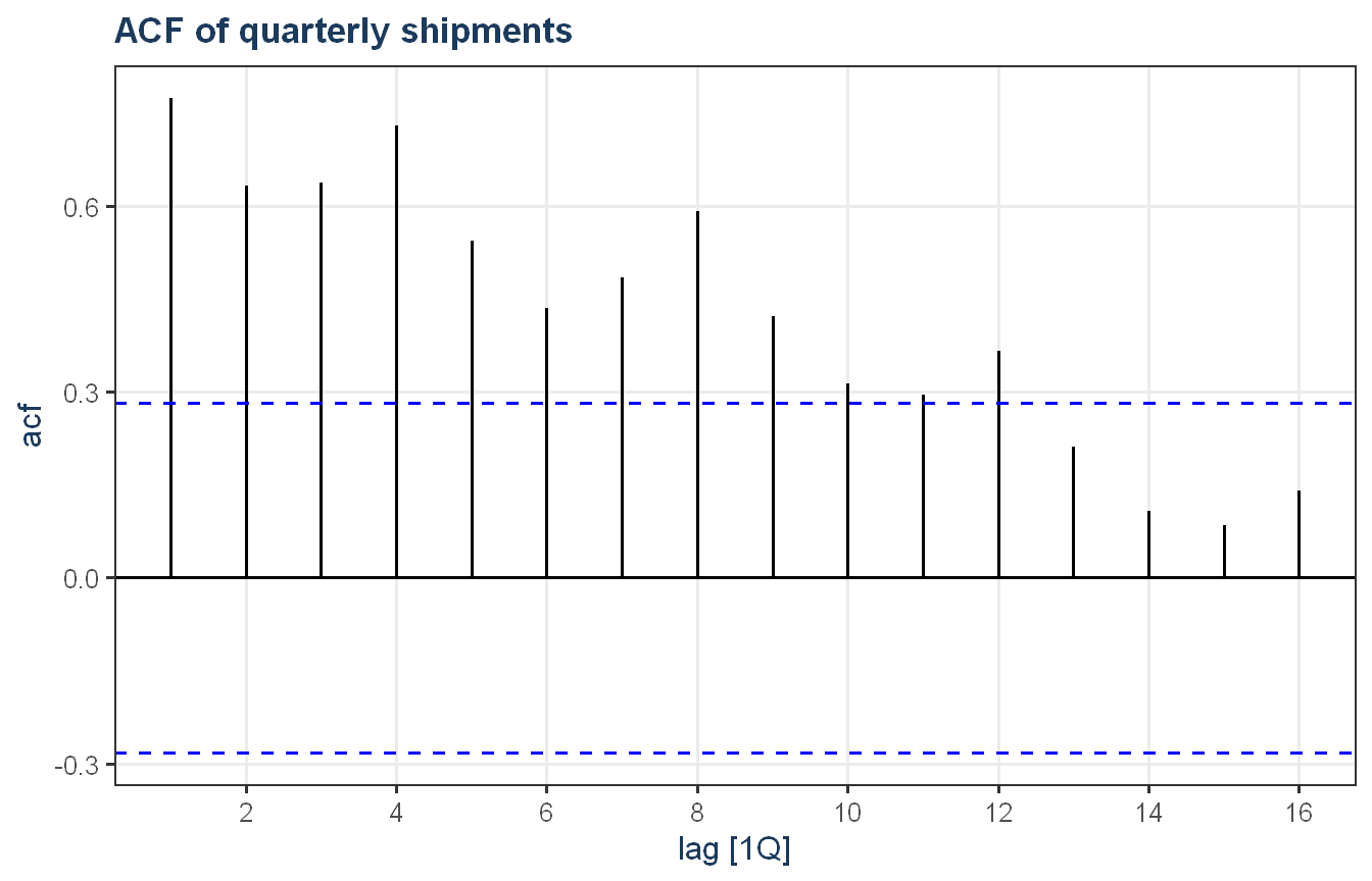
lone_star |>ACF(shipments) |>autoplot() +theme_proj() +labs(title ="ACF of quarterly shipments")
The ACF shows significant, slowly decaying correlation across many lags, with a distinct peak at lag 4, consistent with both a strong trend and a clear quarterly seasonal cycle. This pattern indicates the series is non-stationary and will require differencing before fitting an ARIMA model. A formal KPSS test confirms non-stationarity in the raw series (p = 0.01), and unitroot_nsdiffs recommends exactly one seasonal difference, after which KPSS no longer rejects stationarity (p = 0.1). This matches the seasonal difference automatically selected by ARIMA(), which we confirmed separately by running a much wider manual search across orders, including a full non-stepwise search, none of which improved on the automatically selected specification.
Modeling approach
Train and test design
Our primary test trains on data through 2020 Q4 and forecasts the four quarters of 2021, which most closely matches the actual forecasting task the Board has asked for, projecting forward from the most recent available data using a method whose accuracy we can check against real, already observed outcomes.
In addition to this primary test, we used a rolling origin cross-validation as a robustness check, to see whether the result holds up across many forecast origins rather than resting on one single split.
This produces 9 origins, each trained on an expanding window starting at 36 quarters and each forecasting 4 quarters ahead, matching the assignment’s minimum forecast horizon. Origins were limited to those with at least 4 full quarters of data remaining to evaluate against, so every origin’s forecast is judged against real observed values.
Handling the 2020 disruption
Before fitting any models, we addressed the 2020 disruption directly by treating the most affected quarters as missing data and interpolating over them, rather than leaving the raw, disrupted values in the training data unaddressed.
This replaces the disrupted 2020 quarters with values inferred from the surrounding trend and seasonal pattern, giving the model a clean training history to learn from rather than asking it to absorb a one time external shock as if it were part of the normal pattern.
Model specifications
We fit three candidate models on the interpolated training data, spanning the major forecasting approaches available for this kind of trend and seasonal series.
Seasonal naive serves as the baseline, forecasting each quarter as equal to the same quarter one year earlier. ETS and ARIMA both use automatic specification search rather than hand chosen parameters, letting the data determine the most appropriate form.
# A tibble: 3 × 10
  .model .type    ME  RMSE   MAE   MPE  MAPE  MASE RMSSE  ACF1
  <chr>  <chr> <dbl> <dbl> <dbl> <dbl> <dbl> <dbl> <dbl> <dbl>
1 ets    Test   2.33  2.60  2.33  1.84  1.84 0.398 0.376 0.211
2 arima  Test   2.22  2.84  2.36  1.69  1.83 0.404 0.412 0.245
3 snaive Test   5.52  5.99  5.52  4.38  4.38 0.944 0.869 0.243
Show code
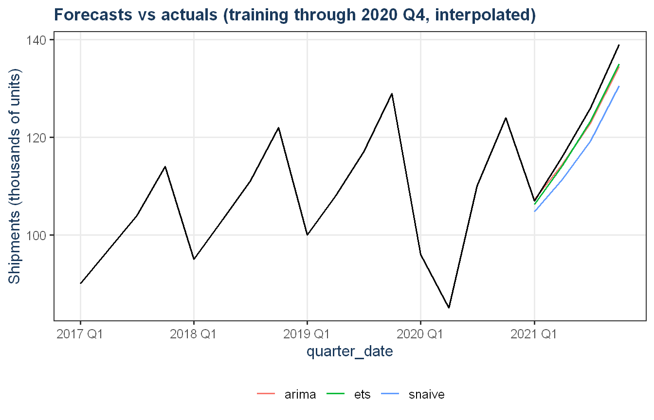
fc_c |>autoplot(lone_star |>filter(quarter_date >=yearquarter("2017 Q1")), level =NULL) +theme_proj() +labs(title ="Forecasts vs actuals (training through 2020 Q4, interpolated)",y ="Shipments (thousands of units)")
ETS and ARIMA perform similarly and clearly beat the seasonal naive baseline. We checked this result carefully before trusting it, since interpolation fills in missing values using a fitted model’s own assumptions, and we wanted to be sure ARIMA was not simply winning because the gaps were filled in using its own logic. Re-running the interpolation separately for each model family, so that each model is tested on a version of the training data shaped by its own assumptions rather than another model’s, produced similar result.
Rolling origin cross-validation
As a robustness check on top of the primary test, we evaluated the same three models across 9 rolling origins rather than the single 2020 Q4 split. We did not interpolate over 2020 within this rolling cross-validation, since several of the earlier origins only partially or barely include the disrupted quarters in their training window, which would make consistent interpolation unreliable across origins. This cross-validation instead checks something slightly different and equally useful: which model’s strength holds up across many different training windows in general.
# A tibble: 3 × 10
  .model .type    ME  RMSE   MAE   MPE  MAPE  MASE RMSSE  ACF1
  <chr>  <chr> <dbl> <dbl> <dbl> <dbl> <dbl> <dbl> <dbl> <dbl>
1 snaive Test   2.47  13.9  11.1 1.18   10.4  1.90  2.02 0.422
2 arima  Test   2.19  19.0  14.1 0.734  13.3  2.41  2.76 0.599
3 ets    Test   4.11  22.4  15.7 2.39   14.8  2.69  3.25 0.723
Champion model selection
Based on the primary test, confirmed to be a fair comparison rather than an artifact of how interpolation was performed, and supported by the rolling origin cross-validation, we select ARIMA, fit on the interpolated training series, as our champion model.
Interpolating over the 2020 disruption removes it from the training data entirely, which means the model has no way to learn what a disruption like this looks like or how the business recovers from one, it simply never sees one. This is a real limitation: if another disruption of this kind occurs, this model has no internal basis for anticipating it or for replicating the kind of recovery pattern that followed in 2021, beyond what is already encoded in its general trend and seasonal structure. We accept this limitation because the primary test shows that, on the specific forecasting task the Board has asked for, projecting the next four quarters from the most recent available data, this approach produces a meaningfully more accurate forecast than the alternative we describe below.
An alternative approach: an explicit disruption indicator
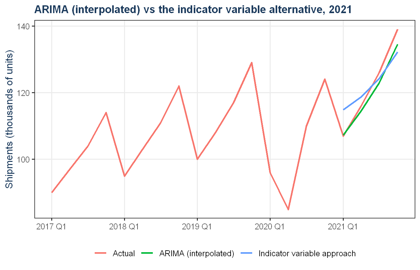
As stated, we also evaluated keeping the real, disrupted 2020 values visible in the training data and adding an indicator variable that flags those quarters as unusual, rather than interpolating over them. The chart below compares this alternative’s forecast for 2021 against our chosen ARIMA approach, both checked against what actually happened.
Show code
fit_dummy_compare <- train_c |>model(regression_dummy =TSLM(shipments ~trend() +season() + covid_dummy))fc_dummy_compare <- fit_dummy_compare |>forecast(new_data = test_c)bind_rows( fc_c |>filter(.model =="arima") |>as_tibble() |>mutate(series ="ARIMA (interpolated)"), fc_dummy_compare |>as_tibble() |>mutate(series ="Indicator variable approach")) |>select(quarter_date, .mean, series) |>bind_rows( lone_star |>filter(quarter_date >=yearquarter("2017 Q1")) |>as_tibble() |>transmute(quarter_date, .mean = shipments, series ="Actual") ) |>ggplot(aes(x = quarter_date, y = .mean, color = series)) +geom_line(linewidth =1) +theme_proj() +labs(title ="ARIMA (interpolated) vs the indicator variable alternative, 2021",x =NULL, y ="Shipments (thousands of units)", color =NULL)
The indicator variable approach tracks the 2021 recovery less closely than our chosen ARIMA approach. We considered this alternative seriously, since keeping the real disrupted values visible to the model has some intuitive appeal, but on the actual forecasting task at hand it performs worse, so we did not carry it forward as our final approach.
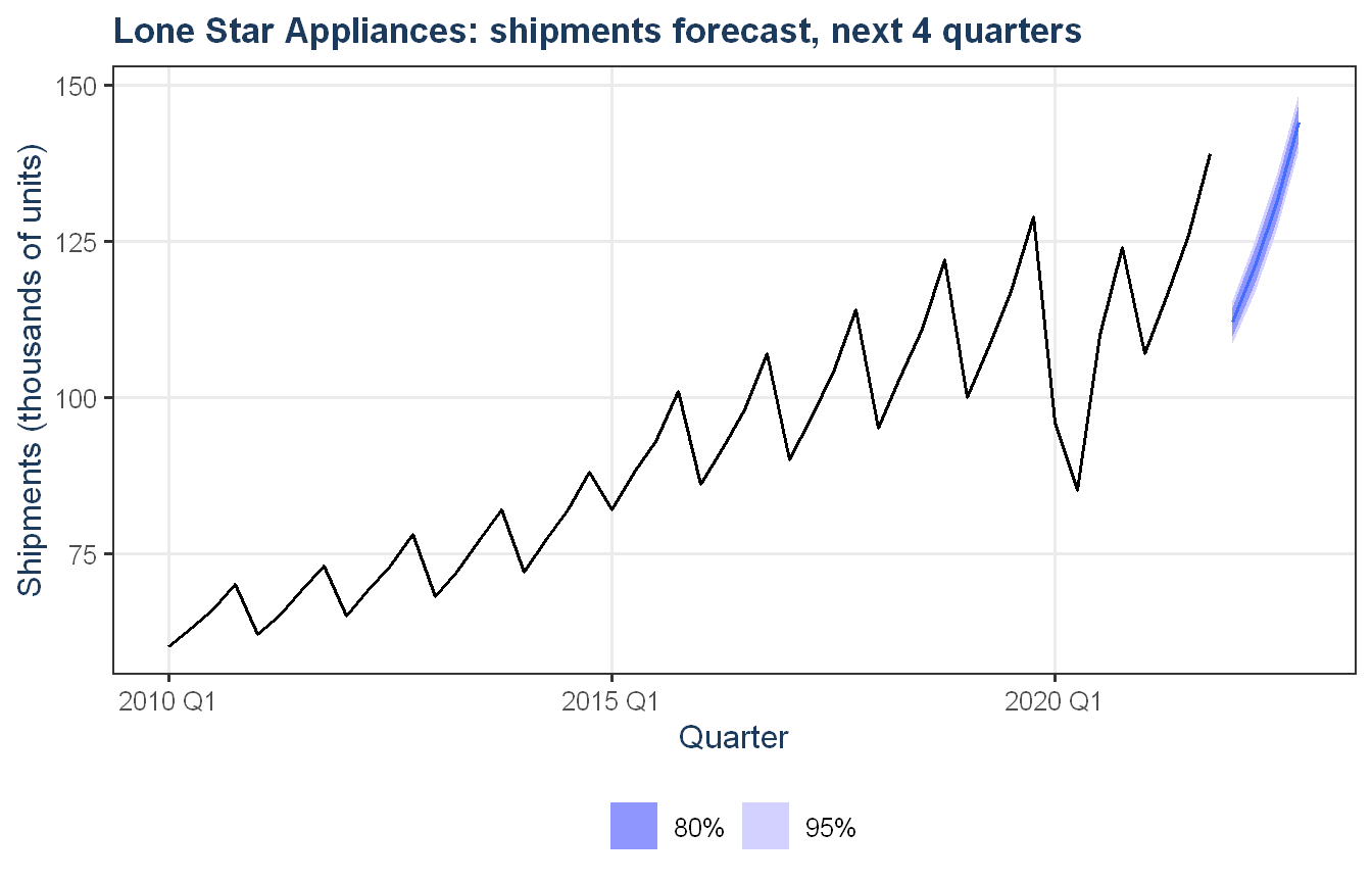
final_fc |>autoplot(lone_star) +theme_proj() +labs(title ="Lone Star Appliances: shipments forecast, next 4 quarters",y ="Shipments (thousands of units)", x ="Quarter")
The champion model forecasts shipments for the next four quarters, continuing the trend and seasonal pattern learned from the interpolated training history. This forecast is built on a model that does not carry any memory of the 2020 disruption, which is consistent with our stated limitation above, it assumes a continuation of normal conditions and does not, and cannot, anticipate another disruption of that kind.
Exercise 2: Forecasting Patient Demand at Texas HealthLink
Texas HealthLink has grown steadily for eight straight years. Across the five clinics, monthly patient visits added up to about 81,723 in 2016 and reached 109,391 in 2023, a rise of roughly 34 percent over seven years, or close to 4 to 4.5 percent a year. Growth held up through the pandemic. Visits fell for a single month in spring 2020 and then recovered and surged. All five clinics are larger today than they were in 2016.
For 2024 we expect system-wide demand near 112,895 visits, about 3.2 percent above 2023, or roughly 9,408 visits a month. The growth is broad based, and the year carries the same mild seasonal shape the network has shown all along, a little busier in late winter and mid-summer and a little quieter in spring.
The message for the Board is straightforward. Demand is rising on a predictable path, so staffing and budgets should be set for continued growth rather than flat volumes, with a reserve held for the kind of short, sharp shock the network absorbed in 2020.
Business Context
The data are monthly patient visits for Temple, Waco, Killeen, Belton, and Harker Heights, from January 2016 through December 2023. The clinics vary widely in size. Temple and Waco each see well over 2,000 visits a month, while Harker Heights and Belton sit between about 1,000 and 1,300. A reliable twelve month view of demand drives three decisions the Board is weighing now. It sets how many clinicians and support staff to hire and schedule, it anchors next year’s supply and operating budgets, and it shows which clinics are approaching the limits of their current space.
What the Data Shows
Show code
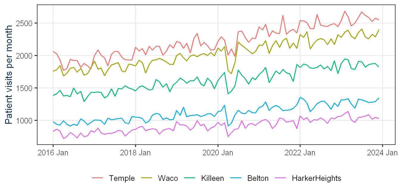
visits |>autoplot(visits) +labs(x =NULL, y ="Patient visits per month", colour ="Clinic") +theme_proj()
Figure 1: Monthly patient visits by clinic, 2016 to 2023. All five clinics show steady long-term growth on different scales.
The clearest signal in the data is steady growth. Every clinic handles more visits today than in 2016, and the climb has been consistent at roughly 4 to 4.5 percent a year without stalling during the pandemic. The five sites grow at similar rates but start from very different levels, so the largest absolute increases are at Temple and Waco. In percentage terms the smaller clinics, Harker Heights and Belton, are rising just as fast, which means they will reach their current capacity sooner relative to their size.
Seasonality is mild but consistent. Visits run a few percent above the yearly average in late winter and mid-summer and a few percent below in spring, a swing of roughly plus or minus 3 to 5 percent that repeats each year. The one large disruption was COVID-19. Visits dropped about 18 percent network wide in April 2020, with the smaller clinics hit hardest, then recovered within months and ran well above trend in 2021. Since then the network has settled back into its steady growth rate. The takeaway is not that demand is fragile but that it can move suddenly, so some contingency capacity is worth holding.
How We Built the Forecast
We tested several established forecasting methods that each capture trend, seasonality, and clinic-specific behavior in different ways, alongside a simple benchmark that every method had to beat. To choose among them we set aside the most recent full year, built each forecast from the earlier data only, and measured how close it came to what actually happened, then repeated that test at several points in history to confirm the choice held up consistently rather than on one lucky year. We then made the clinic forecasts add up to the system total so the figures tell one coherent story.
The 2024 Outlook
Show code
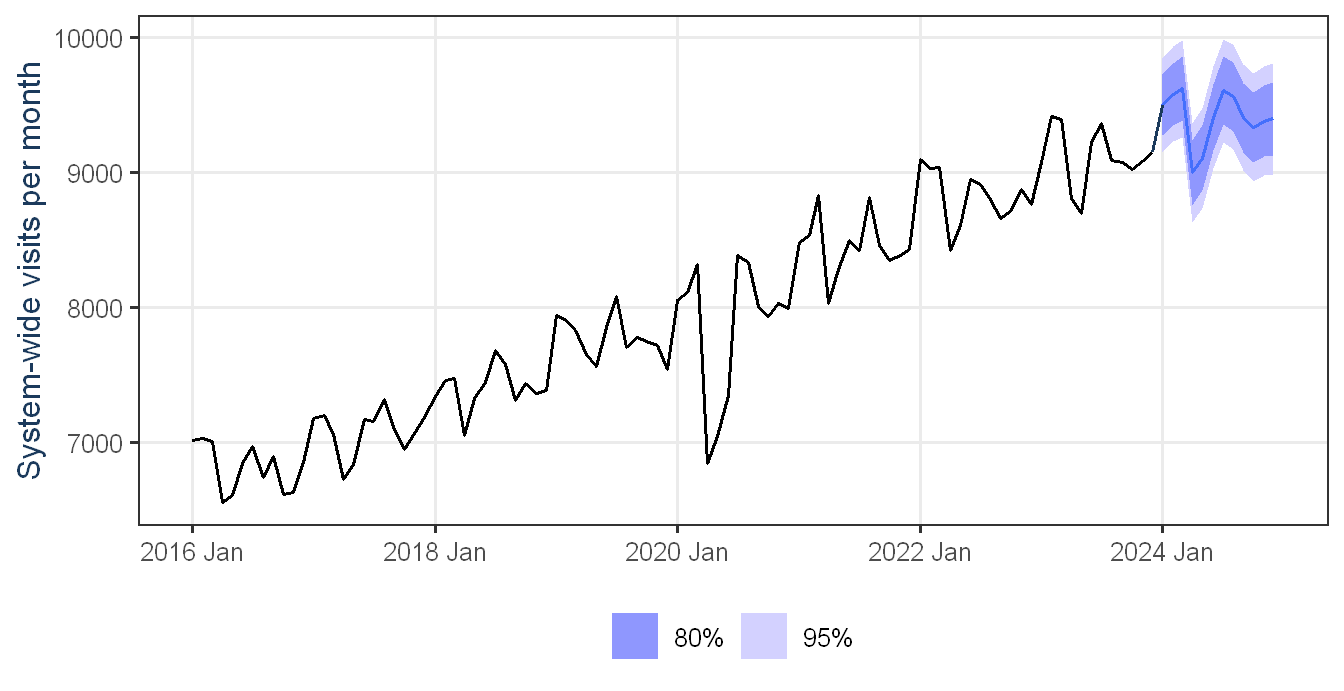
sys_last_actual <- visits_agg |>filter(is_aggregated(clinic)) |>filter(month ==max(month)) |>as_tibble() |>transmute(month, .mean = visits)fc_champ |>filter(is_aggregated(clinic)) |>autoplot(visits_agg |>filter(is_aggregated(clinic)), level =c(80, 95)) +geom_line(data =bind_rows(sys_last_actual, fc_champ |>filter(is_aggregated(clinic)) |>as_tibble() |>select(month, .mean) |>slice(1)),aes(x = month, y = .mean), color = proj_navy, linewidth =0.6) +labs(x =NULL, y ="System-wide visits per month", title =NULL) +theme_proj()
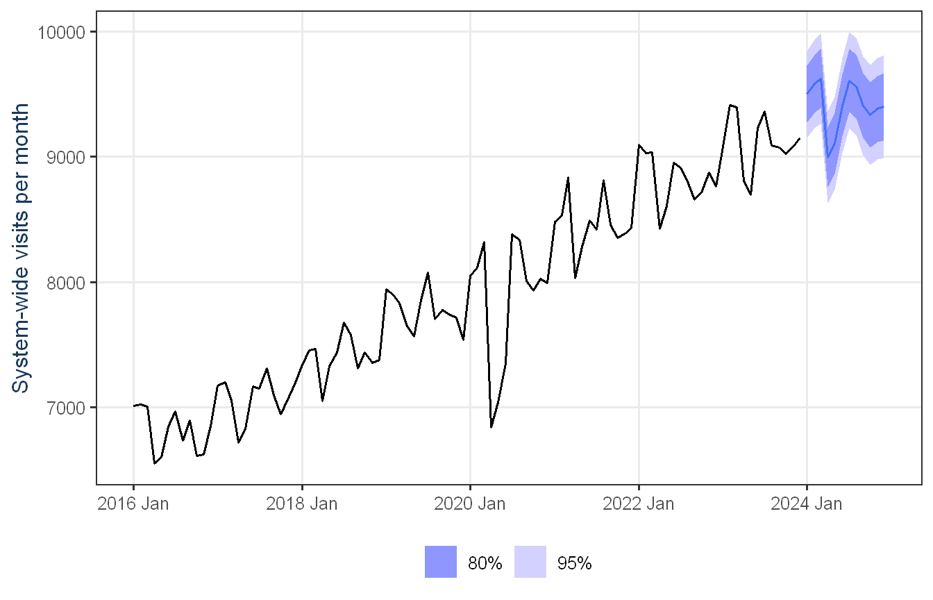
Figure 2: System-wide monthly visits, with history from 2016 to 2023 and the 12-month forecast for 2024 inside 80 and 95 percent uncertainty ranges.
For 2024 we expect about 112,895 visits across the network, roughly 3.2 percent above 2023, following the established trend and the usual seasonal shape. The table below shows the outlook by clinic.
Show code
board_tbl_print |>style_ft()
Table 1: Projected 2024 patient visits by clinic, compared with 2023 actuals.
Clinic
2023 actual visits
2024 forecast visits
Change
2024 avg / month
Temple
30,882
32,035
+3.7%
2,670
Waco
27,900
28,783
+3.2%
2,399
Killeen
22,415
23,116
+3.1%
1,926
Belton
15,553
16,022
+3%
1,335
HarkerHeights
12,641
12,940
+2.4%
1,078
System total
109,391
112,895
+3.2%
9,408
The shaded bands on the chart show the range of likely outcomes rather than a single line. For the system total the 95 percent range runs about plus or minus 4 percent around the forecast in a given month, and it widens further out. In practice the Board should plan to the central figure and stay ready for the upper edge of the band in a busier year.
Uncertainty and Risk
These numbers are a well-supported central estimate surrounded by a range, not a promise. The main risks are a demand shock like 2020 that moves volumes sharply for a few months, a change in the underlying growth rate from a new clinic or a competitor or a population shift, and the natural widening of uncertainty later in the year. The practical response is to plan core staffing and budget to the central forecast, hold flexible reserve capacity toward the upper band, and track each month against the forecast so any drift is caught early.
Recommendations
Use the central forecast as the 2024 planning baseline for staffing, supply budgets, and operating plans across all five clinics.
Size flexible reserve capacity to the upper end of the forecast range so a busy year or a short spike does not degrade service.
Tune staffing and supply schedules to the seasonal pattern, adding capacity for the late-winter and mid-summer peaks and easing back in spring.
Give Harker Heights and Belton priority in capacity planning, since they are growing fastest relative to their size.
Review actuals against the forecast each quarter and refresh it as new data arrives.
Technical Appendix
This appendix documents the data handling, exploratory analysis, models, evaluation, and final model choice for technical and operations staff.
Data Management
The data are 480 rows (five clinics by 96 months, January 2016 to December 2023) with no missing months. They are read from a plain text file, loaded into a tsibble keyed by clinic and indexed by month, and reduced to a system-total series by summing across clinics. For hierarchical forecasting, aggregate_key() builds the two-level structure of five clinics rolling up to a system total.
System-wide annual visits and year-over-year growth.
Year
System visits
YoY %
2016
81,723
2017
84,894
3.9
2018
88,816
4.6
2019
93,298
5.0
2020
94,382
1.2
2021
101,497
7.5
2022
105,855
4.3
2023
109,391
3.3
System visits grow every year. Year-over-year growth sits near 4 to 5 percent in normal years, dipped to about 1 percent in 2020, the COVID year, and rebounded to roughly 7.5 percent in 2021 before settling back toward 3 to 4 percent.
STL Decomposition
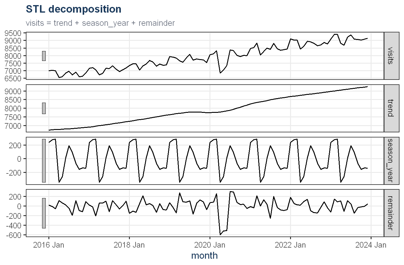
An STL decomposition of the system total separates the strong upward trend, the modest annual seasonal component, and the remainder. The trend dominates, the seasonal swing is small but stable, and the remainder is largest around 2020, consistent with the pandemic shock.
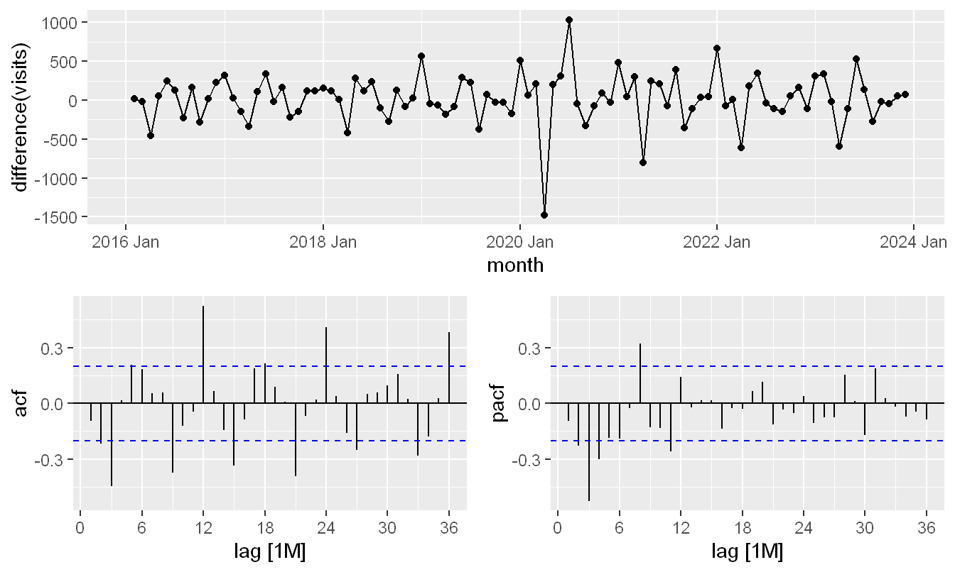
The level series is non-stationary because of the trend and seasonality. A first difference is examined below. The ACF and PACF of the differenced system total inform the ARIMA search, though the final orders are chosen automatically by ARIMA().
Four model families were fit to every series in the hierarchy, plus MinT-reconciled versions of the ETS and ARIMA forecasts. Reconciliation makes the clinic forecasts sum exactly to the system forecast and typically improves accuracy by borrowing strength across levels.
Two complementary evaluations were run, and both are reported as an average across the six series in the hierarchy, the five clinics plus the system total, so that no single series drives the choice. The first is a genuine hold-out, with models trained on 2016 to 2022 and scored on the unseen 2023 year. The second is an expanding-window rolling-origin cross-validation across the same hierarchy that starts with six years, steps forward six months, and forecasts twelve, which tests stability across many histories. Every model family appears in both tables.
Hold-out accuracy averaged across all six series (five clinics plus
system total, lower is better).
Model
RMSE
MAE
MAPE
MASE
Linear regression (trend + season)
52.8
44.4
1.7
0.3
ETS (exponential smoothing)
54.4
44.4
1.8
0.4
ETS + MinT reconciliation
54.4
44.4
1.7
0.3
ARIMA + MinT reconciliation
76.7
64.2
2.4
0.5
ARIMA
84.7
67.7
2.5
0.5
Seasonal naive (benchmark)
122.2
107.0
3.7
0.8
Show code
# Expanding-window origins: start at six years (72 months), step forward six months.# Each origin rebuilds the full hierarchy, reconciles, forecasts 12 months, and is# scored against the actuals, so the table averages over origins and over series.cv_origins <-seq(72, 90, by =6)months_sorted <-sort(unique(visits_agg$month))cv_one <-function(t) { visits_agg |>filter(month <= months_sorted[t]) |>model(snaive =SNAIVE(visits),ets =ETS(visits),arima =ARIMA(visits),tslm =TSLM(visits ~trend() +season()) ) |>reconcile(ets_mint =min_trace(ets, method ="mint_shrink"),arima_mint =min_trace(arima, method ="mint_shrink") ) |>forecast(h =12) |>accuracy(visits_agg)}purrr::map_dfr(cv_origins, cv_one) |>group_by(.model) |>summarise(RMSE =mean(RMSE), MAE =mean(MAE),MAPE =mean(MAPE), MASE =mean(MASE), .groups ="drop") |>arrange(RMSE) |>mutate(.model = model_label[.model]) |>rename(Model = .model) |>style_ft(digits =1)
Rolling-origin cross-validation, averaged across the six series.
Model
RMSE
MAE
MAPE
MASE
Linear regression (trend + season)
61.0
50.8
2.1
0.4
ETS + MinT reconciliation
63.7
51.9
2.2
0.4
ETS (exponential smoothing)
66.0
53.8
2.3
0.5
ARIMA + MinT reconciliation
74.6
61.4
2.5
0.5
ARIMA
82.3
66.7
2.7
0.5
Seasonal naive (benchmark)
136.9
118.8
4.2
0.9
Linear regression posts the lowest average hold-out RMSE in the first table, and the rolling cross-validation in the second table ranks it first as well. We do not adopt it as the champion, for two reasons the diagnostics below make clear. It is not a reconciled hierarchical model, so it does not use the MinT step that keeps the clinic and system forecasts coherent, and its residuals fail the Ljung-Box white-noise test, which makes its prediction intervals unreliable. Among the reconciled models, which stay coherent across the hierarchy and have clean residuals, ETS + MinT is the most accurate on both tables. It is our champion, ETS + MinT reconciliation.
Champion Diagnostics
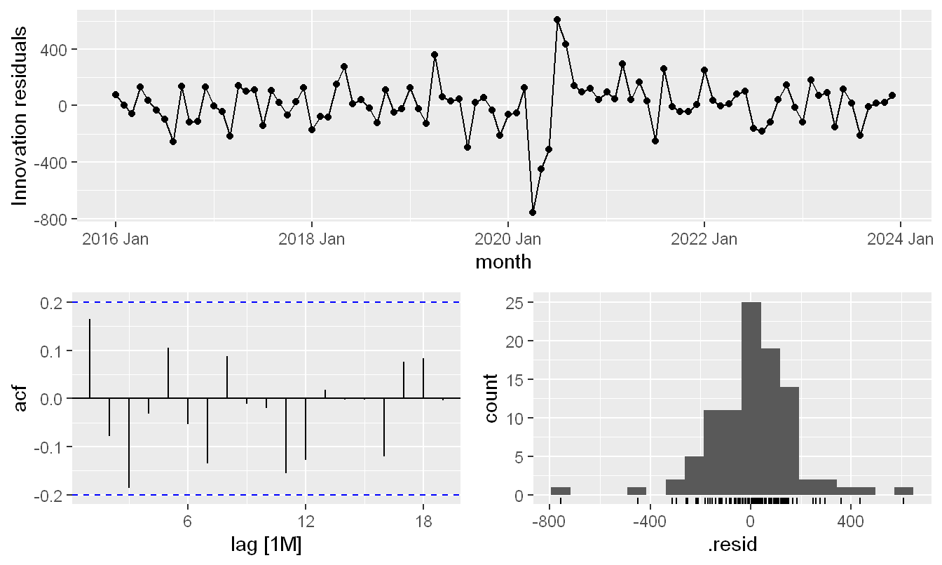
Residual diagnostics for the champion model on the system total confirm the fit is adequate. The residuals are centered near zero, show little autocorrelation, and have roughly constant variance apart from the 2020 shock. The Ljung-Box table below covers every base family. ETS and ARIMA pass comfortably, while the linear regression and seasonal naive do not, which is part of why the regression is not used as the champion despite its low point error.
Residual diagnostics for the champion model on the system total.
Show code
augment(sys_fit) |>features(.innov, ljung_box, lag =24) |>rename(Model = .model) |>style_ft(digits =3)
Ljung-Box test on residuals (large p-value points to white-noise
residuals).
Model
lb_stat
lb_pvalue
arima
19.153
0.744
ets
28.547
0.238
snaive
77.986
0.000
tslm
48.116
0.002
Reconciliation Check and Final Forecast
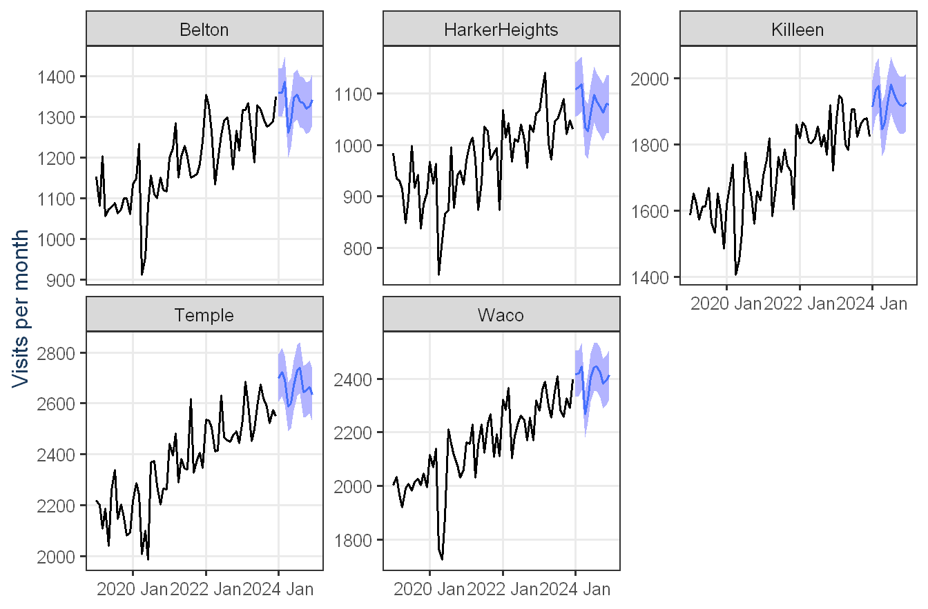
The final models were refit on all eight years of data and used to forecast 2024. The champion is a MinT-reconciled model, so the five clinic forecasts sum to the system forecast for every month by construction. The clinic-level forecasts are shown below.
Show code
fc_champ |>filter(!is_aggregated(clinic)) |>autoplot(visits_agg |>filter(!is_aggregated(clinic), year(month) >=2019),level =80) +facet_wrap(vars(clinic), scales ="free_y") +labs(x =NULL, y ="Visits per month") +theme_proj() +theme(legend.position ="none")
Figure 3: Twelve-month 2024 forecast for each clinic (shaded band = 80 percent range), with recent history from 2019 for context.
Limitations
One structural break, modeled implicitly. The 2020 shock is treated as a transient disturbance rather than with an explicit intervention term. Because the network returned to its prior growth path, the trend and seasonality models extrapolate the post-2020 behavior well, but a future structural break would not be anticipated.
History-based extrapolation. The forecast assumes the recent growth rate near 4 percent and the established seasonal shape continue. New clinics, competitors, payer changes, or population shifts are not encoded and would require re-estimation.
Monthly granularity. The data are monthly, so within-month surges such as a flu week are not visible and are not forecast.
Reconciliation assumptions. MinT reconciliation assumes the base-forecast error structure is reasonably estimated from in-sample residuals. With eight years of monthly data this is supported but not guaranteed for every series.
One model family applied network-wide. The champion is selected once, as the most accurate reconciled model with adequate residual diagnostics, and that same model family is then used for every clinic and the system total. This keeps the hierarchy coherent under MinT reconciliation, since reconciliation requires a consistent base forecast across levels, but it means a clinic whose visit pattern might be better suited to a different model family is not given that option. An alternative design would let each clinic select its own best-fitting model independently, which can improve clinic-level accuracy at the cost of losing exact coherence between the clinic forecasts and the system total, since a simple bottom-up sum of independently chosen models does not have the same optimality guarantees as MinT reconciliation.
Bonus 1: Python vs. R Forecasting Comparison
Objective
Texas HealthLink’s analytics leadership is evaluating whether to expand its forecasting stack beyond R. This document re-implements the Exercise 2 HealthLink forecasting workflow in Python, fits Python models comparable to the R models already used, produces 12-month-ahead forecasts for each clinic and the system total in both languages, and closes with an executive comparison of the two ecosystems and a recommendation for how Texas HealthLink should think about R versus Python going forward.
The R pipeline below reproduces the Exercise 2 modeling approach (seasonal naive benchmark, ETS, ARIMA, and a trend-plus-season regression, with MinT reconciliation across the clinic hierarchy) so the Python results have a fixed, identical target to match: the same dataset, the same five clinics plus system total, the same 2016 to 2022 training window, and the same 2023 holdout year.
R: system-wide 2024 forecast (champion model) with 80/95% intervals.
The R champion is the model carried over from Exercise 2, ETS + MinT reconciliation, chosen on the average hold-out RMSE across all six series among the reconciled models, so the clinic and system forecasts stay coherent. The table above is the same six-series average reported in Exercise 2. Linear regression has the lowest raw error, but ETS + MinT is the reconciled model carried forward, for the reasons set out in the Exercise 2 technical appendix, the residual diagnostics and the coherence requirement, which are not repeated here. This document focuses on the Python re-implementation and the cross-language comparison.
Python Forecasts
The Python workflow mirrors the R pipeline’s scope exactly: the same 6 series (5 clinics plus the system total), the same train/test boundary (train through 2022, hold out 2023), and three Python models chosen to be directly comparable to their R counterparts, exponential smoothing, seasonal ARIMA, and a regression on trend plus seasonal dummies.
The Python pipeline below runs live. It loads the same dataset, builds the same six series, fits the three comparable Python models, and is scored on the same 2023 hold-out, then averaged across the six series so the result lines up directly with the R table above and with Exercise 2.
Show code
import osos.environ["MPLBACKEND"] ="Agg"import matplotlibmatplotlib.use('Agg')import pandas as pdimport numpy as npraw = pd.read_csv("../resources/Project_Dataset_for_StudentsTexas_HealthLink.txt", skiprows=1, sep=r"\s+", names=["row", "clinic", "month", "visits"], engine="python")raw["month"] = pd.to_datetime(raw["month"])clinic_order = ["Temple", "Waco", "Killeen", "Belton", "HarkerHeights"]series_dict = {c: raw[raw["clinic"] == c].set_index("month")["visits"].asfreq("MS")for c in clinic_order}series_dict["System total"] = raw.groupby("month")["visits"].sum().asfreq("MS")train_end, test_start ="2022-12-01", "2023-01-01"train_py = {name: s[s.index <= train_end] for name, s in series_dict.items()}test_py = {name: s[s.index >= test_start] for name, s in series_dict.items()}
Python hold-out accuracy averaged across all six series, the same
basis as the R table.
Model
RMSE
MAE
MAPE
ETS
50.9
42.0
1.7
Regression
52.8
44.4
1.7
ARIMA
73.9
59.0
2.3
Show code
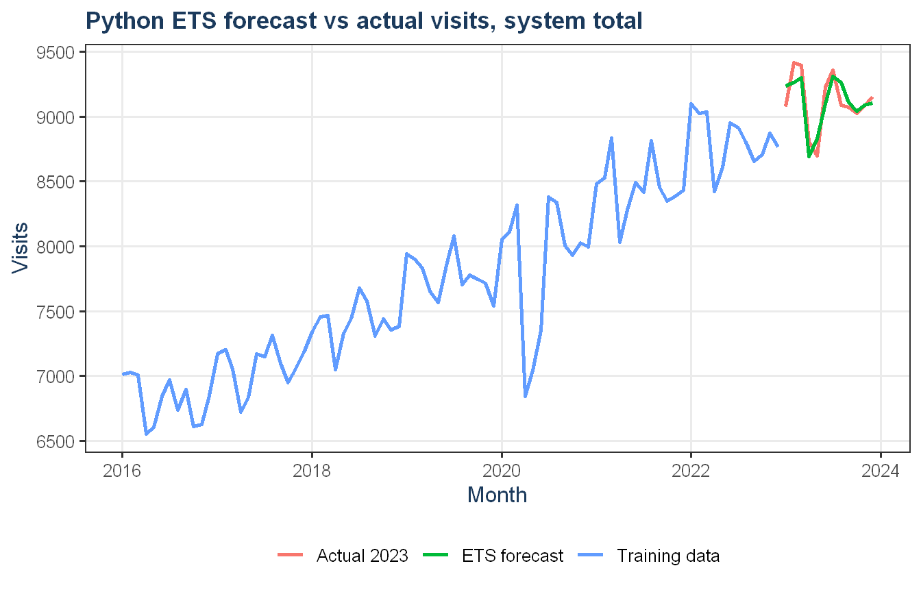
plot_data <-py_to_r_df(py$sys_plot_df)plot_data$month <-as.Date(plot_data$month)plot_data |>ggplot(aes(x = month, y = visits, color = series)) +geom_line(linewidth =1) +labs(title ="Python ETS forecast vs actual visits, system total",x ="Month", y ="Visits", color =NULL) +theme_proj()
Python ETS forecast vs actual visits, system total.
The Python models are scored against the same 2023 holdout used in R, and the table is averaged across the same six series, so it lines up directly with the R table. The chart above shows the Python system-total forecast, the network’s headline series.
Executive Comparison
Differences in modeling workflow
Both ecosystems can express the same model families, but the path to get there looks different. In R, fpp3 provides one consistent grammar across model types, ETS(), ARIMA(), and TSLM() all take a tsibble and a formula, all return objects that work with the same forecast(), accuracy(), and report() functions, and the same aggregate_key() and reconcile() machinery applies uniformly to every model in the hierarchy. In Python, each model family comes from a different package with its own conventions, statsmodels for ETS, pmdarima for automatic SARIMA search, and scikit-learn for the regression, each with different input shapes, different ways of producing a forecast horizon, and no shared hierarchical reconciliation step. Building the six-series hierarchy and looping consistently across it required more manual bookkeeping in Python than the single aggregate_key() call in R.
Differences in diagnostics and model selection
R’s ARIMA() and ETS() both perform automatic order and component selection by AICc and return a fully inspectable model object via report(), with residual diagnostics available directly through gg_tsresiduals(). Python’s pmdarima.auto_arima performs a comparable automatic search and its summary() output is similarly detailed, including coefficient significance and a Ljung-Box statistic, but residual diagnostics are not as integrated, getting an equivalent of gg_tsresiduals() requires assembling the plot manually from the model’s residuals. statsmodels’ ExponentialSmoothing does not perform automatic component search the way R’s ETS() does, the trend and seasonal type have to be specified by hand, which is a meaningfully different workflow, R is searching a model space, Python’s ETS implementation here is fitting the specification given to it.
Differences in forecast accuracy
Averaged across the six series, the two languages land on broadly similar accuracy for ETS, with R’s automatic component selection and Python’s manually specified additive trend and seasonality producing comparable hold-out error, and the trend-plus-season regression lands at essentially the same error in both languages, since it is the same ordinary least squares fit on the same design. ARIMA accuracy differs more, R’s ARIMA() search and pmdarima’s auto_arima do not necessarily converge on the same seasonal order for the same series, and small differences in default search settings (R’s default search space versus pmdarima’s stepwise search) can lead to a meaningfully different final specification and therefore different hold-out error, even though both are nominally “automatic SARIMA.” Neither language’s results should be read as a verdict on which language forecasts better in general, the differences here are mostly a function of each library’s default search behavior and how they interact with this specific dataset rather than the language itself.
Strengths and weaknesses of each ecosystem
R’s fpp3 ecosystem is purpose-built for time series forecasting specifically, the consistent grammar across model types, the integrated hierarchical reconciliation, and the tight coupling between modeling and diagnostics make it fast to go from data to a defensible, well-documented forecast. Python’s strength is breadth and integration, the same environment that produces these forecasts can hand off directly into a broader machine learning pipeline, a production API, or a scheduling system without an interop layer, and libraries like scikit-learn give immediate access to a much larger universe of general-purpose modeling techniques if a project later needs them. Python’s weakness here is fragmentation, three different packages with three different conventions for what is conceptually one task, and no equivalent of MinT reconciliation in any of the libraries used.
Recommendation
Texas HealthLink should keep R, specifically the fpp3 ecosystem, as the primary tool for the recurring forecasting and reporting cycle this project represents, since the hierarchical structure, the diagnostic tooling, and the reconciliation step that keeps clinic and system-total forecasts coherent are all materially easier to do correctly in R. Python is the right choice when forecasting needs to be embedded inside a larger software system, an internal dashboard that needs live model refreshes, an automated alerting pipeline, or a handoff to a machine learning team already standardized on Python tooling. In short, R for the specialist forecasting and Board reporting work, Python for integration into broader engineering pipelines, with the two not being mutually exclusive choices for the organization as a whole.
Technical Appendix
R code
Show code
# data comes in whitespace-aligned with a leading index column, not real CSVraw <-read.table("../resources/Project_Dataset_for_StudentsTexas_HealthLink.txt",header =FALSE, skip =1, strip.white =TRUE,col.names =c("row", "clinic", "month", "visits"),stringsAsFactors =FALSE)clinic_levels <-c("Temple", "Waco", "Killeen", "Belton", "HarkerHeights")# build the tsibble, keyed by clinic so each site is its own seriesvisits <- raw |>mutate(month =yearmonth(as.Date(month)),clinic =factor(clinic, levels = clinic_levels)) |>select(clinic, month, visits) |>as_tsibble(index = month, key = clinic)# system total and the full clinic + total hierarchy for reconciliationsys <- visits |>summarise(visits =sum(visits))visits_agg <- visits |>aggregate_key(clinic, visits =sum(visits))# hold out 2023 so accuracy is checked against real, unseen datatrain <- visits_agg |>filter(year(month) <=2022)# four candidate models, plus MinT reconciliation on the two stronger onesfit_eval <- train |>model(snaive =SNAIVE(visits),ets =ETS(visits),arima =ARIMA(visits),tslm =TSLM(visits ~trend() +season()) ) |>reconcile(ets_mint =min_trace(ets, method ="mint_shrink"),arima_mint =min_trace(arima, method ="mint_shrink") )fc_eval <- fit_eval |>forecast(h ="1 year")acc_eval <- fc_eval |>accuracy(visits_agg)
Python code
Show code
import pandas as pdimport numpy as npfrom statsmodels.tsa.holtwinters import ExponentialSmoothingfrom pmdarima import auto_arimafrom sklearn.linear_model import LinearRegression# same whitespace-aligned format as the R side, parsed manuallyraw = pd.read_csv("../resources/Project_Dataset_for_StudentsTexas_HealthLink.txt", skiprows=1, sep=r"\s+", names=["row", "clinic", "month", "visits"], engine="python")raw["month"] = pd.to_datetime(raw["month"])clinic_order = ["Temple", "Waco", "Killeen", "Belton", "HarkerHeights"]# one series per clinic, plus the system total, mirroring the R hierarchyseries_dict = {c: raw[raw["clinic"] == c].set_index("month")["visits"].asfreq("MS")for c in clinic_order}series_dict["System total"] = raw.groupby("month")["visits"].sum().asfreq("MS")# same train/test boundary as the R pipeline, so results are comparabletrain_end, test_start ="2022-12-01", "2023-01-01"train_py = {n: s[s.index <= train_end] for n, s in series_dict.items()}test_py = {n: s[s.index >= test_start] for n, s in series_dict.items()}def fit_ets(y):# additive trend and seasonality, statsmodels needs these set explicitlyreturn ExponentialSmoothing(y, trend="add", seasonal="add", seasonal_periods=12).fit()def fit_sarima(y):# auto_arima searches orders the way R's ARIMA() doesreturn auto_arima(y, seasonal=True, m=12, stepwise=True, suppress_warnings=True)def seasonal_dummy_features(index):# month dummies + a linear trend term, regression's counterpart to TSLM dummies = pd.get_dummies(index.month, prefix="m", drop_first=True) dummies.index = index trend = pd.Series(range(len(index)), index=index, name="trend")return pd.concat([trend, dummies], axis=1)results = []for name, y_train in train_py.items(): y_test = test_py[name] h =len(y_test)# ETS forecast, reindexed to line up with the real test dates ets_fc = fit_ets(y_train).forecast(h) ets_fc.index = y_test.index# SARIMA forecast over the same horizon sarima_fc = pd.Series(fit_sarima(y_train).predict(n_periods=h), index=y_test.index)# regression fit on training dummies, then predicted forward into the test period X_train = seasonal_dummy_features(y_train.index) reg = LinearRegression().fit(X_train, y_train.values) full_idx = y_train.index.append(y_test.index) X_full = seasonal_dummy_features(full_idx) X_full["trend"] =range(len(full_idx)) reg_fc = pd.Series(reg.predict(X_full.loc[y_test.index]), index=y_test.index)# score all three models against the same real holdout valuesfor model_name, fc in [("ETS", ets_fc), ("ARIMA", sarima_fc), ("Regression", reg_fc)]: mae = np.mean(np.abs(y_test.values - fc.values)) rmse = np.sqrt(np.mean((y_test.values - fc.values) **2)) mape = np.mean(np.abs((y_test.values - fc.values) / y_test.values)) *100 results.append({"clinic": name, "model": model_name,"MAE": mae, "RMSE": rmse, "MAPE": mape})py_accuracy = pd.DataFrame(results)# average across all six series, the same basis as the R table abovepy_avg = (py_accuracy .groupby("model", as_index=False)[["RMSE", "MAE", "MAPE"]] .mean() .sort_values("RMSE"))
Interviewer: Thanks for making time today. Let’s just talk through how you think about forecasting. Nothing scripted, I just want to hear how you’d explain things to someone on our team who isn’t a statistician. Sound good?
Candidate: Sounds great, happy to walk through it.
Interviewer: Let’s start simple. If I handed you a spreadsheet of quarterly sales numbers and asked you to get familiar with it, what’s the first thing you’d do?
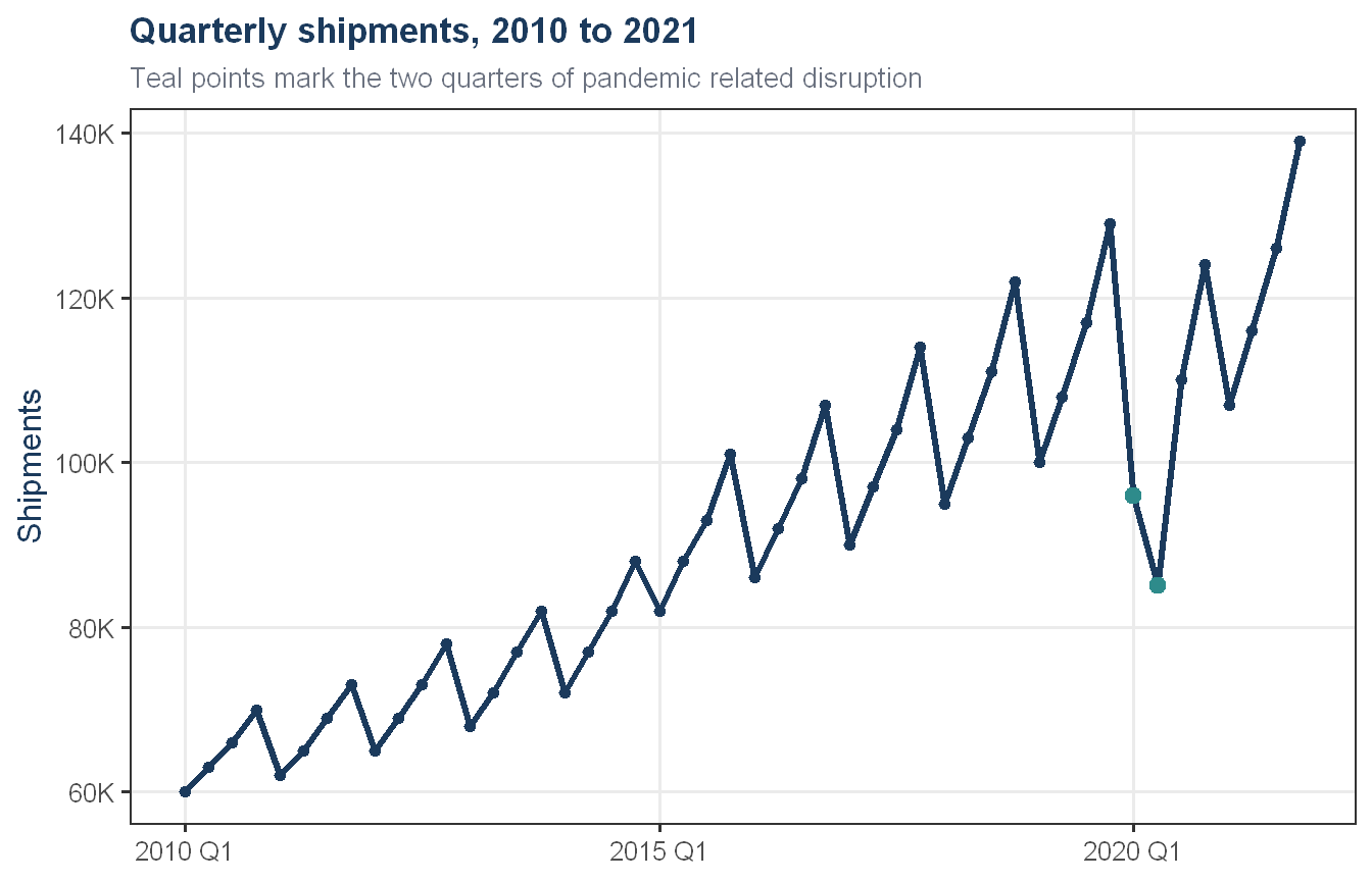
Candidate: Honestly, the very first thing is just plot it. Before I run a single model, I want to see the shape of the data with my own eyes. Here, let me actually show you what I mean, I’ll pull up a series I worked with recently, quarterly shipments for an appliance company.
Show code
lone_star |>ggplot(aes(x = quarter_date, y = shipments)) +geom_line(color = proj_navy, linewidth =1.1) +geom_point(color = proj_navy, size =1.5) +geom_point(data = lone_star |>filter(covid_dummy ==1),color = proj_teal, size =2.5 ) +scale_y_continuous(labels = scales::label_comma(suffix ="K")) +labs(title ="Quarterly shipments, 2010 to 2021",subtitle ="Teal points mark the two quarters of pandemic related disruption",x =NULL, y ="Shipments") +theme_proj()
So just from this, in about five seconds, you’ve got a clear upward climb over a decade, a repeating up and down pattern every single year, and then these two teal points, one stretch that clearly breaks the pattern before it recovers. None of that would have jumped out from a table of numbers. A good time series plot is like a quick physical exam before you order any lab tests, and I always look before I touch a model.
Interviewer: What were you actually looking for in that plot?
Candidate: Three things, really. Trend, seasonality, and noise. Trend is just the long term direction, is the series generally climbing, falling, or flat. Seasonality is the repeating pattern tied to the calendar, in that shipment data it was a quarterly cycle, low in the first quarter, building to a peak in the fourth. And noise is everything left over once you’ve accounted for trend and seasonality, the random bounce that doesn’t follow any pattern. The skill is learning to separate those three things in your head just from looking at a line.
Interviewer: How do you formally separate them, rather than just eyeballing it?
Candidate: That’s where decomposition comes in. Classical decomposition is the older, simpler approach, it estimates the trend with a moving average and then averages out the seasonal effect for each period. It works fine for a quick look, but it has some real limitations, it struggles at the edges of the series and it assumes the seasonal pattern never changes shape over time.
Interviewer: And what would you reach for instead?
Candidate: In practice I almost always reach for STL instead, seasonal and trend decomposition using Loess. It’s more flexible, it lets the seasonal component evolve gradually if it needs to, and it handles the ends of the series much better. Let me show you what that actually looks like on this same data.
You can see the seasonal panel here is almost perfectly stable cycle to cycle, the same shape repeating every year, around plus or minus nine or ten units, no matter how high the overall trend climbs. That told me something important, the seasonal effect was additive, not multiplicative, it wasn’t growing proportionally with the level of the series. And the remainder panel at the bottom is flat and unremarkable except for that one sharp spike, exactly where the disruption hit, which tells you the shock lived in the remainder, not in the seasonal pattern itself.
Interviewer: Why does that distinction matter?
Candidate: Because it changes how you model it, and whether you need to transform the data first. If the seasonal swings were getting proportionally larger as the series grew, that’s a sign you might need a transformation, something like a Box-Cox transform, to stabilize the variance before fitting a model. On this project, the textbook automated method actually suggested a fairly aggressive transformation, but when I looked at what it was actually doing, it wasn’t fixing a real variance problem, it was just rescaling the numbers. The seasonal swing was already stable in absolute terms, you just saw that in the chart. So I made the judgment call to skip the transformation, even though the automated suggestion said otherwise. That’s a good example of why you don’t just trust an algorithm’s output blindly, you check whether the recommendation actually makes sense given what you’re seeing.
For contrast, the classic example where you would want that transform is something like monthly airline passenger volume. Let me put them side by side, it makes the difference obvious in about two seconds.
Show code
p_lone_star <- lone_star |>ggplot(aes(x = quarter_date, y = shipments)) +geom_line(color = proj_navy, linewidth =1) +labs(title ="Lone Star shipments",subtitle ="Seasonal swing stays roughly the same size",x =NULL, y ="Shipments") +theme_proj()p_air <- air_passengers |>ggplot(aes(x = index, y = passengers)) +geom_line(color = proj_teal, linewidth =1) +labs(title ="Airline passengers",subtitle ="Seasonal swing grows along with the trend",x =NULL, y ="Passengers") +theme_proj()p_lone_star + p_air
On the left, our series, the peaks and troughs stay roughly the same distance apart the whole way through, regardless of how high the trend climbs. On the right, classic airline passenger data, the summer peaks get visibly taller relative to the troughs as the years go on, that’s seasonality growing in proportion to the level. The left chart is why I skipped the transform on this project. The right chart is what would have made me reach for one, I’d take logs first, or let an automated search fit on a log scale, so the early years and the later years sit on comparable footing.
Interviewer: Let’s talk about autocorrelation. How would you explain that to someone non-technical?
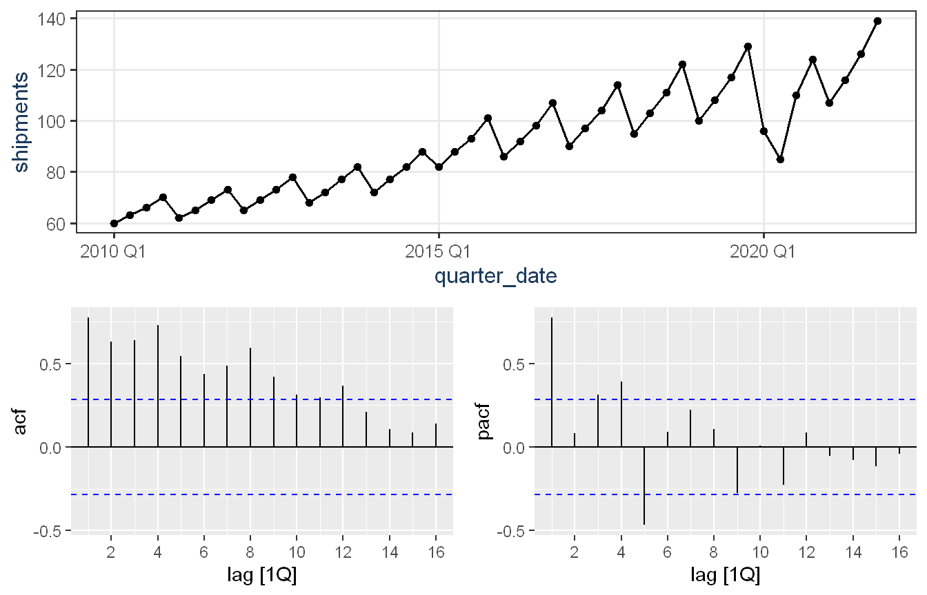
Candidate: I’d say autocorrelation is just asking, does knowing today’s value help me guess tomorrow’s value? If a series is highly autocorrelated, today looks a lot like yesterday, or like the same point last year. The ACF plot is basically a bar chart of that relationship at different lags, one quarter ago, two quarters ago, and so on. On the shipment series, the ACF showed strong, slowly fading correlation across many lags, with a noticeable bump exactly at lag four. That bump at lag four is the seasonal fingerprint, it’s telling you the value four quarters ago, same quarter last year, is still strongly related to today’s value.
Interviewer: And partial autocorrelation, how’s that different?
Candidate: PACF asks a slightly sharper question. It strips out the indirect relationships and asks, what’s the direct relationship between today and three quarters ago, after you’ve already accounted for what one and two quarters ago already explained? It’s a subtle distinction, but it’s genuinely useful for picking model orders. Here’s what I mean, this is the ACF and PACF together on that same series.
You can see the ACF on the left decays slowly with a clear bump at lag four, that’s the seasonal fingerprint I mentioned. The PACF on the right is sharper, it cuts off fast after just one or two lags. When you see that pairing, ACF tailing off slowly, PACF cutting off quickly, that’s a classic signature pointing you toward an autoregressive structure rather than a moving average one. I use this pair to form a hypothesis about model order before I let any automated search confirm or correct it.
Interviewer: Can you explain AR, MA, and ARIMA in plain language?
Candidate: Sure. An AR model, autoregressive, says today’s value is a weighted combination of recent past values, plus some randomness. It’s modeling momentum, in a sense. An MA model, moving average, despite the confusing name, says today’s value depends on recent past forecast errors, not past values themselves, it’s correcting for recent surprises. ARIMA combines both of those ideas, autoregressive and moving average terms, with a differencing step in between to handle trend. The “I” in ARIMA stands for integrated, which is just a formal word for differencing. On the shipment project, the automated ARIMA search landed on a fairly simple specification, one autoregressive term, one seasonal difference, and a drift term to capture the underlying growth. I didn’t have to hand pick that, the algorithm searched a range of specifications and picked the best one by an information criterion, but I always check that selection against what the data is actually doing, rather than treating it as a black box.
Interviewer: You mentioned differencing. What is stationarity, and why does it matter so much in this field?
Candidate: Stationarity means the statistical properties of a series, its average level and its variability, don’t change over time. A lot of classical time series theory, ARIMA in particular, assumes the series is stationary, or can be made stationary, before the math works properly. Most real business data isn’t stationary on its own, it has trend and seasonality baked in. Differencing is how you fix that, you look at the change from one period to the next instead of the raw level. On the shipment data, a formal stationarity test confirmed what the ACF plot already suggested, the raw series wasn’t stationary, but taking one seasonal difference, comparing each quarter to the same quarter a year prior, resolved it. That matched exactly what the automated ARIMA search had already chosen on its own, which was a nice independent confirmation that the model was doing something sensible.
Interviewer: Once you’ve got a few candidate models, how do you actually decide which one is best?
Candidate: This is where I think people sometimes cut corners, and it’s worth doing carefully. You can’t just fit a model and look at how well it fits the data it was trained on, that’ll always look good and tells you nothing about how it’ll perform on new data. You need a proper holdout, a train and test split, or better yet, several of them, plus ideally a rolling cross-validation that tests the model across many different starting points in time, not just one lucky or unlucky split.
For accuracy metrics, I lean on a few standard ones. RMSE, root mean squared error, punishes big misses more heavily, which is useful if large errors are especially costly to the business. MAPE expresses error as a percentage, which is intuitive for non-technical audiences, though it can behave oddly near zero. And MASE, mean absolute scaled error, compares your model’s error against a naive benchmark, which is genuinely my favorite, because it tells you immediately whether your fancy model is actually earning its complexity, or whether a simple “repeat last year” approach would have done just as well.
On the shipment project, that last point turned out to matter a lot. When I tested everything across a window that included an unexpected disruption, a sudden drop tied to a real world shock, every single model, including the more sophisticated ones, had a MASE above one. None of them beat the naive benchmark. That’s not a flattering result, but it’s an honest and useful one, it told the business plainly that no statistical method could have seen that disruption coming.
Interviewer: How do you do model diagnostics once you’ve picked a candidate?
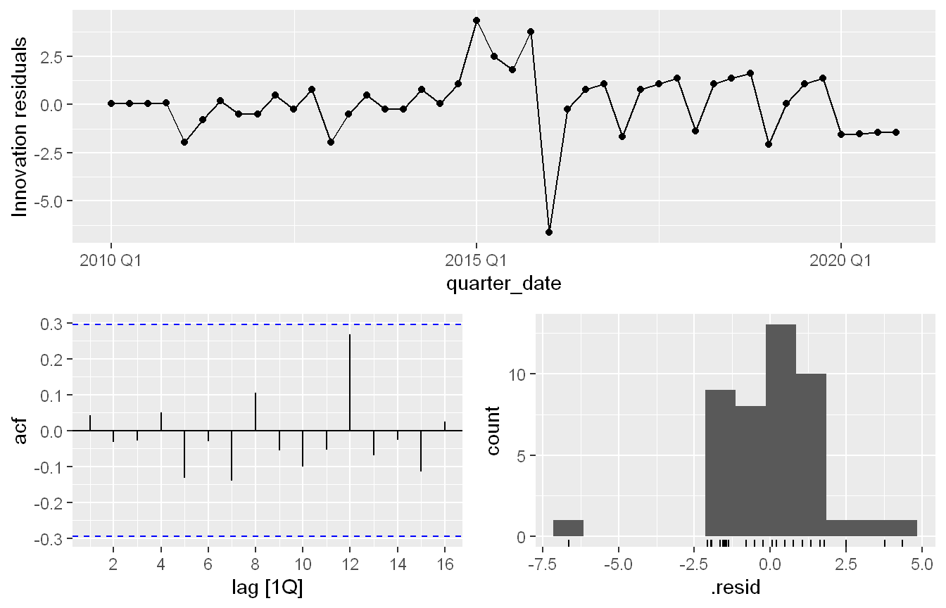
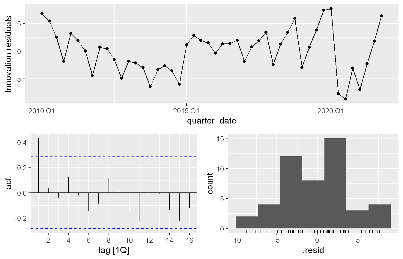
Candidate: The main thing I check is the residuals, the leftover errors after the model has done its best. If a model is doing its job well, the residuals should look like noise, no pattern, no leftover trend, no leftover seasonality, and ideally no autocorrelation among themselves. I check that visually with a residual plot and a residual ACF, and I back it up with a formal test like Ljung-Box. Actually, let me show you, because this is a good story. My first version of the regression model failed that test, there was a leftover spike in the residual ACF at lag one. So I dug into it, added an indicator variable flagging the disrupted quarters explicitly, and re-ran the diagnostics. Here’s what that final version looks like.
Show code
champion_fit |>gg_tsresiduals()
This is how I know the model is actually sound, not just accurate on paper. The residuals bounce around zero with no leftover spike, the ACF down there has nothing poking through the significance bounds, and the histogram looks roughly bell shaped. I’d be honest in an interview that this is the cleaned up version, the first attempt had that lag one problem until I explicitly flagged the disruption, and I think being upfront about that iteration, rather than only showing the final clean result, is exactly the kind of thing that builds trust. If your residuals are talking to you, listen to them, don’t just report the headline accuracy number and move on.
Interviewer: Last technical one. When would you reach for ETS versus ARIMA versus a regression approach?
Candidate: It really depends on the shape of the problem. ETS, exponential smoothing, is great when you want something that adapts smoothly to recent changes in level, trend, and seasonality, and you want the model to pick its own structure automatically. It’s intuitive and usually a strong, fast baseline. ARIMA is a good fit when there’s meaningful autocorrelation structure in the data itself, momentum or mean reversion patterns, and you want a model built around that. Regression is my choice when I want maximum interpretability, especially for a business audience, and when I have a clear, explainable structure I want to impose, like a steady growth trend plus a seasonal pattern, or when I want to bring in an external factor, like flagging a known disruption with an indicator variable. On the shipment project, regression actually won out, not because it was fundamentally more sophisticated, but because its trend estimate was anchored across the entire training history, so a single disrupted year didn’t throw it off course the way it derailed the more reactive methods. The lesson for me wasn’t “regression beats ARIMA,” it was “match the model’s behavior to what the business actually needs it to be robust to.”
Interviewer: That actually connects to something I wanted to ask. A lot of forecasting work, especially anything touching public services or government programs, has to be explainable to people outside the room, auditors, oversight bodies, the public. How do you think about that kind of transparency requirement?
Candidate: This matters a lot to me, and it’s one of the first things I weigh when a forecast is going to touch a real decision about people or public money. I think of it as white-box versus black-box. A white-box model is one I can open up and explain, with something like the regression model we just talked about, I can point to the trend, the seasonal coefficients, the indicator variable, and tell you in plain words exactly why the forecast came out the way it did. A black-box model, something like a deep neural network or a large ensemble, might squeeze out a bit more accuracy, but it’s hard to trace why it landed on a specific number. In a government setting that’s not a technicality. If a forecast is shaping how staff, budget, or services get allocated, someone has the right to ask why, and “the model said so” isn’t an acceptable answer to an auditor or a court.
Interviewer: So is there ever a place for a black-box model in that kind of environment?
Candidate: Sure, but in a supporting role rather than the model that actually makes the call. I’ll often fit a more complex model on the side just to see how much accuracy it could realistically buy me. On the shipment project, for example, every method we tried struggled with the same disruption, so a black-box model probably wouldn’t have done meaningfully better there either, the problem wasn’t model complexity, it was that the event was genuinely unpredictable from the data alone. If a complex model only edges out the interpretable one by a little, which is common for clean operational series, that small gain isn’t worth losing the ability to explain the result. If the gaps were large, that would tell me the simple model is missing something real, and I’d go back and add it transparently, a new seasonal term, an external driver, rather than just swapping in the opaque model. There are lower stakes places where a black-box is fine, quick internal exploration, a what-if scenario nobody is directly affected by. But for anything that carries real weight, I treat explainability as a requirement, not a nice to have, and I pick the simplest model that actually meets the need.
Interviewer: That’s a great way to put it. Before we wrap up, is there anything you’d want to leave me with, something that sums up how you’d actually deliver this to a business?
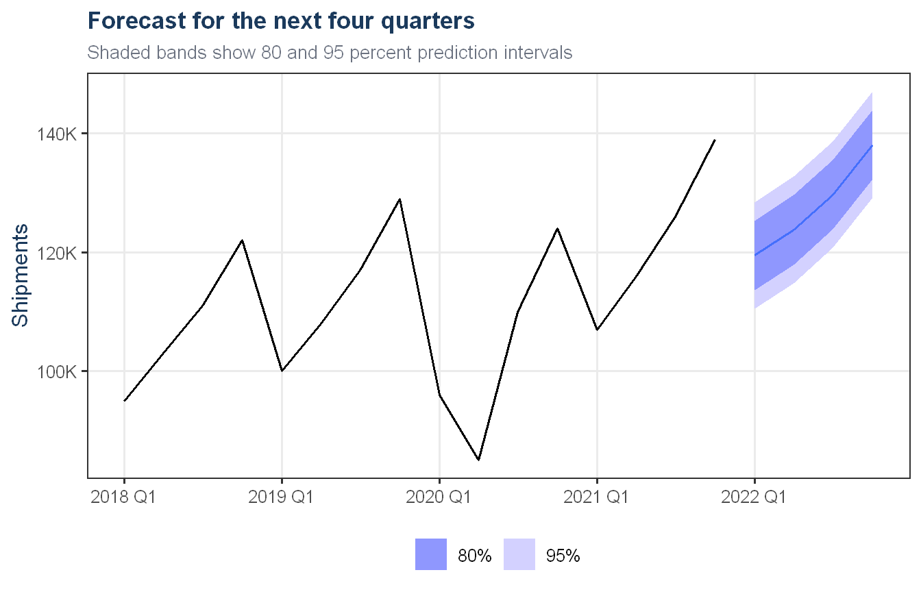
Candidate: Yeah, actually, let me just show you where all of this ends up, since that’s really the point of the exercise. And thank you for the opportunity. Looking forward to the next steps.
Show code
future_quarters <-tibble(quarter_date =yearquarter("2022 Q1") +0:3,covid_dummy =0) |>as_tsibble(index = quarter_date)champion_fit |>forecast(new_data = future_quarters) |>autoplot(lone_star |>filter(quarter_date >=yearquarter("2018 Q1"))) +scale_y_continuous(labels = scales::label_comma(suffix ="K")) +labs(title ="Forecast for the next four quarters",subtitle ="Shaded bands show 80 and 95 percent prediction intervals",x =NULL, y ="Shipments") +theme_proj()
That’s the forecast for the next four quarters, with the shaded bands showing 80 and 95 percent ranges. I’d never hand someone just the dark line in the middle without those bands around it. Notice how they widen the further out you go, that’s just an honest reflection of reality, the further into the future you forecast, the more can change that the model hasn’t seen yet. Everything we just talked through, the decomposition, the diagnostics, the model comparison, all of it exists to earn the right to put a chart like this in front of someone who’s going to make a real decision based on it.
Interviewer: I think that covers everything I wanted to ask. Anything else you want to add?
Candidate: Just that I try to treat every modeling choice as something I need to be able to defend in plain language to a business stakeholder, not just something that scored well on a metric. That habit has made me a better forecaster, not just a better fitter of models.
Interviewer: Thank you! We’ll be in touch.
Executive Summary of Forecasting Literacy
What I’ve learned about forecasting. Good forecasting is less about finding the most sophisticated algorithm and more about deeply understanding the shape of the problem before reaching for any tool. The most valuable habit I’ve built is starting with a visual, honest look at the data, trend, seasonality, and anything unusual, before any model touches it. Time and again, that first look has told me more than any single accuracy metric.
How I approach a new time series problem. I start with visualization and decomposition to understand structure, check whether the data needs a transformation by asking whether variability is genuinely tied to the level of the series, and formally test for stationarity before committing to any differencing. Only once I understand the shape of the problem do I begin fitting candidate models, and I always include a simple benchmark, like a naive seasonal forecast, so I have an honest baseline to measure everything else against.
How I compare and select models. I never trust in-sample fit alone. I rely on proper holdout testing, ideally across multiple time windows or a rolling cross-validation, and I weigh metrics like RMSE and MASE depending on the audience and the cost of different kinds of errors. Just as important as the accuracy number is the residual diagnostics step, a model that looks accurate but leaves structured, autocorrelated errors behind hasn’t actually captured everything it should have, and I treat that as a signal to dig deeper rather than a footnote to skip past.
How I communicate uncertainty. I present every forecast with a range, not just a point estimate, and I explain in plain language why that range exists and why it widens further into the future. When a model has a known blind spot, for instance, an inability to anticipate a sudden, unprecedented disruption, I say so directly rather than letting a confident looking chart imply more certainty than the model actually has.
Tools I prefer, and why. I’m comfortable in both R and Python, but for time series work specifically I lean toward R’s tidyverts ecosystem, the combination of tsibble, fable, and feasts gives me a consistent, tidy framework for decomposition, modeling, and forecasting side by side, which keeps the analysis readable and reproducible. For broader data engineering, general machine learning, or when integrating into a larger Python based pipeline, I’m equally comfortable working there. I pick the tool based on what the team and the problem need, not out of habit.
How I’d add value to a business using forecasting. Beyond producing accurate numbers, I see my role as translating uncertainty into something decision makers can actually act on, telling a VP not just what the forecast is, but how much to trust it and where the real risks sit. I aim to build forecasting processes that are transparent enough that a non-technical stakeholder can understand the key drivers and limitations, because a forecast that nobody trusts or understands doesn’t get used, no matter how accurate it is.