fpp3: core forecasting toolkit (tsibble, feasts, fable, etc.) used throughout for time series manipulation, decomposition, ETS, ARIMA, and forecast accuracy. Also loads dplyr, tidyr, ggplot2, etc. for general data wrangling and plotting.
flextable: formats summary and accuracy tables for clean rendering in the Word output.
patchwork: combines multiple ggplot objects into a single figure, used for inset zoom plots.
mlbench: provides the Glass and Soybean datasets used in the KJ exercises.
seasonal: backend for X_13ARIMA_SEATS(), used to compare STL against X-11 and SEATS decompositions.
GGally: provides ggpairs() for pairwise predictor visualization.
caret: used for preprocessing (Box-Cox/Yeo-Johnson transformations) and near-zero variance detection.
e1071: provides skewness() for quantifying predictor skew.
mice: multiple imputation by chained equations, used to impute missing categorical data and compare against simple mode imputation.
Exercise HA 2.10.1
Explore the following four time series: Bricks from aus_production, Lynx from pelt, Close from gafa_stock, Demand from vic_elec.
Use ? (or help()) to find out about the data in each series.
What is the time interval of each series?
Use autoplot() to produce a time plot of each series.
For the last plot, modify the axis labels and title.
Code and Discussion
Approach: We used ? to read the documentation for each dataset (shown but not run, since ? opens an interactive help pane), then printed each tsibble to confirm the time interval from the bracketed tag in its header.
Show code
?aus_production # quarterly clay brick production in Australia?pelt # annual lynx/hare pelt trades, Hudson Bay Company?gafa_stock # daily GAFA closing prices, trading days only?vic_elec # half-hourly electricity demand, Victoria Australia
From the header tags, the time interval of each series is: aus_production is quarterly [1Q], pelt is annual [1Y], gafa_stock is irregular daily [!] (observations on trading days only), and vic_elec is half-hourly [30m].
Approach: We produced a time plot of the Bricks series with autoplot().
Show code
aus_production |>autoplot(Bricks) +theme_bw()
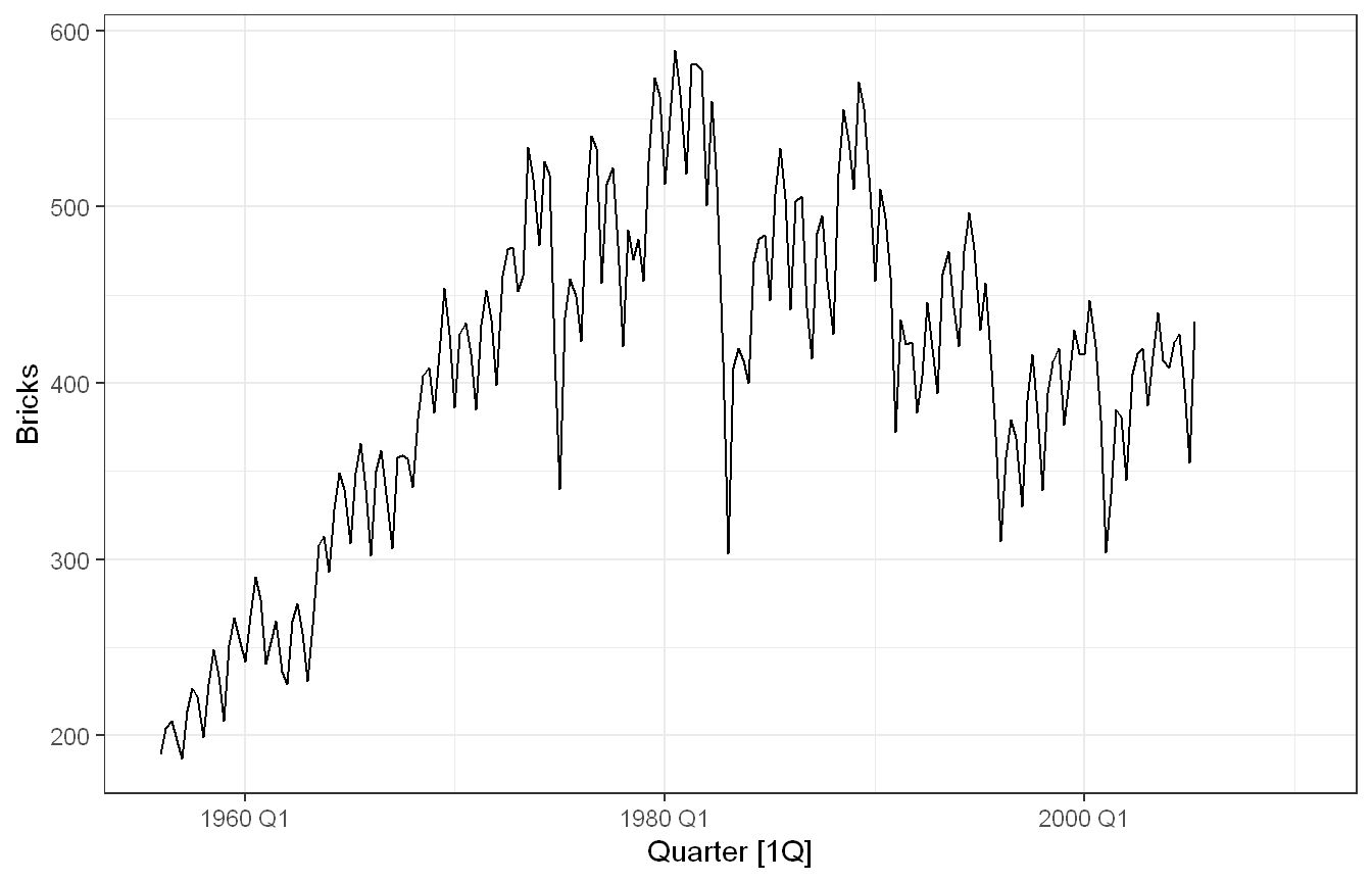
Clay brick production in millions of bricks, 1956 Q1 to 2010 Q2. The plot shows a strong upward trend from the late 1950s to a peak around 1980. After that production falls sharply in the early 1980s and stays volatile through the end of the series, ending near 430. A clear within-year seasonal pattern runs throughout, and there are missing values at the very end. This series displays trend, seasonality, and cyclic swings tied to the construction sector.
Approach: We produced a time plot of the Lynx series.
Show code
pelt |>autoplot(Lynx) +theme_bw()
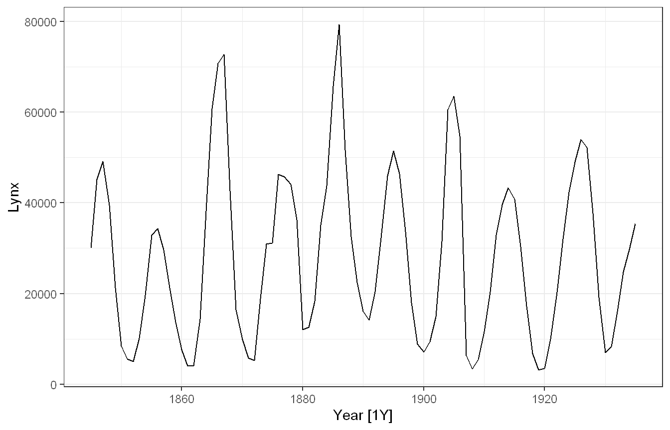
Lynx pelts traded by the Hudson Bay Company span 1845 to 1935. The plot reveals a strong cyclic pattern repeating every 8 to 10 years. This reflects the classic predator-prey oscillation between lynx and snowshoe hares. Peak heights vary across cycles, with the tallest around 1885 reaching roughly 80,000 pelts. The cycle length is not fixed, making this cyclic behaviour rather than seasonality. No long-term trend is present.
Approach: We produced a time plot of the Close series, which holds all four GAFA stocks.
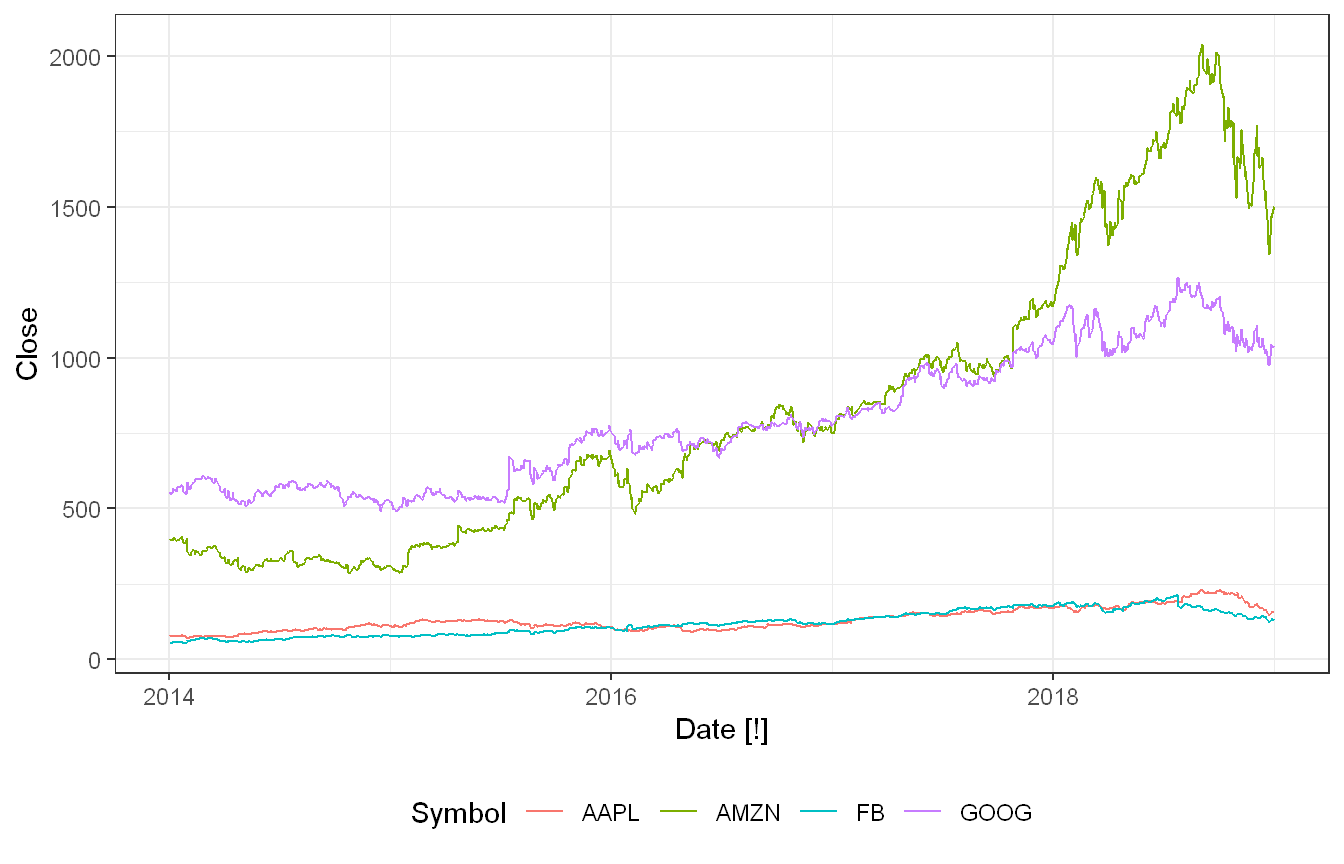
Daily closing prices cover AAPL, AMZN, GOOG and FB from 2014 to 2018. The [!] interval tag flags an irregular series since observations exist only on trading days. All four stocks trend upward but at very different price levels. By mid 2018, AMZN and GOOG reach roughly US$2,000 and US$1,250 respectively. AAPL and FB stay well below US$250 throughout. autoplot() plots all four as separate coloured lines using the Symbol key.
Approach: We produced a time plot of the Demand series, modifying the axis labels and title as required.
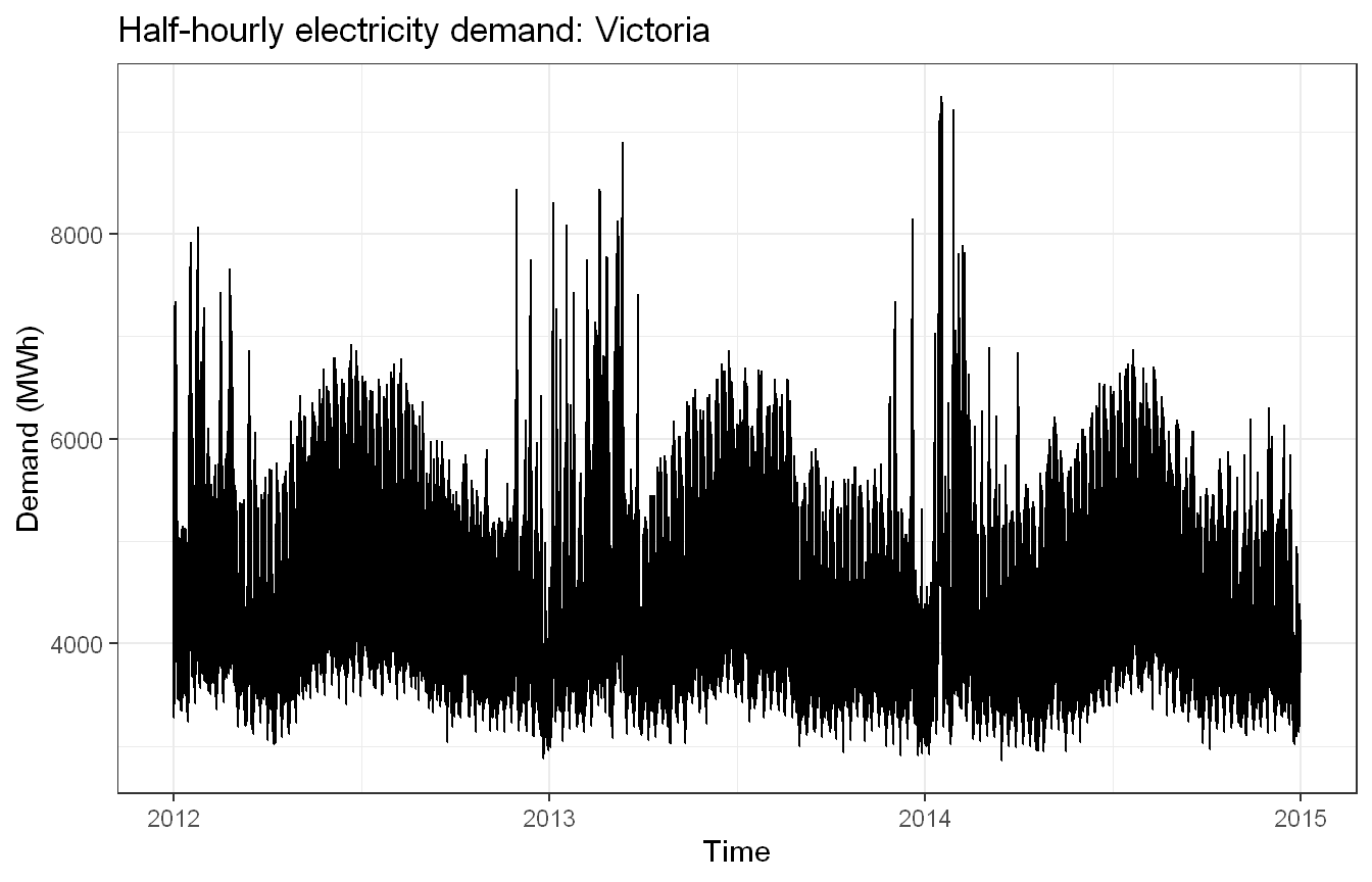
Victorian electricity demand covers 2012 through end of 2014. Summer peaks are the sharpest, with the largest in early 2014 exceeding 9,000 MWh due to air-conditioning load. Winter heating produces milder secondary peaks. Daily and weekly cycles exist but are invisible at this zoom level, which motivates the seasonal plots introduced later in the course. The custom axis labels and title make the figure presentation-ready.
Exercise HA 2.10.3
Download the file tute1.csv from the book website, open it in Excel (or some other spreadsheet application), and review its contents. You should find four columns of information. Columns B through D each contain a quarterly series, labelled Sales, AdBudget and GDP. Sales contains the quarterly sales for a small company over the period 1981-2005. AdBudget is the advertising budget and GDP is the gross domestic product. All series have been adjusted for inflation.
You can read the data into R with the following script.
Convert the data to time series.
Construct time series plots of each of the three series. Check what happens when you don’t include facet_grid().
Code and Discussion
Approach: We read tute1.csv directly from the book’s hosted link so the document renders without a manual download.
The file holds 100 quarterly observations from 1981 Q1 to 2005 Q4 (25 years). The key step is calling yearquarter() before as_tsibble(). Without it, the Quarter column stays a plain string and R has no way to know the data is quarterly. The [1Q] tag in the printed header confirms the interval was set correctly.
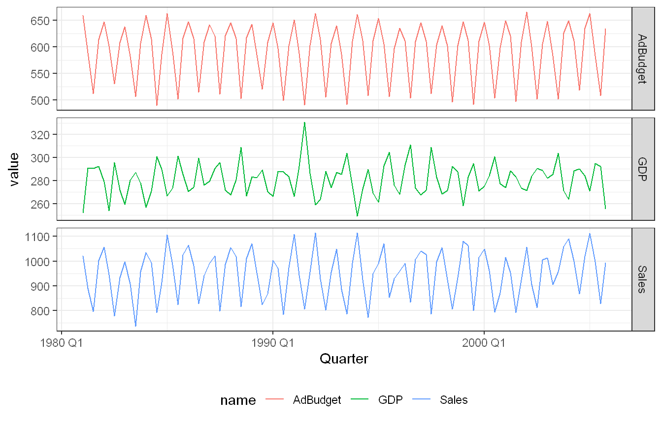
Approach: We reshaped to long format with pivot_longer() and plotted all three series with facet_grid().
Each series gets its own panel with an independently scaled y-axis. The scales = "free_y" argument lets each panel’s range fit its own data, so the dominant feature of all three series stands out clearly. Strong, regular quarterly seasonality drives all three rather than any long-run trend. The levels stay broadly stable across 1981-2005 (Sales around 800-1,100, AdBudget around 500-660, GDP around 250-330). Sales and AdBudget trace very clean repeating cycles; GDP is noisier and less regular but still seasonal.
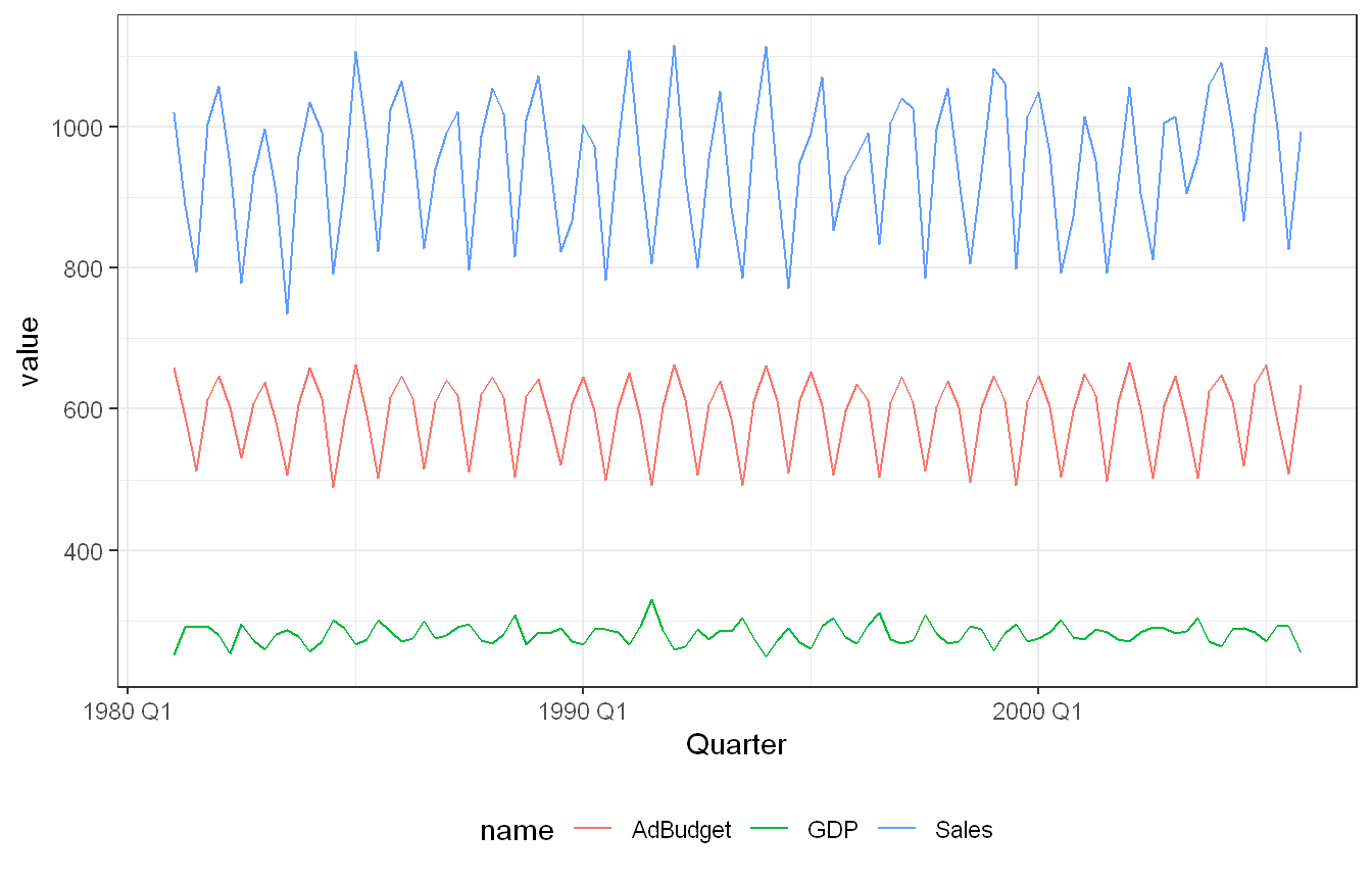
Approach: We then plotted the same three series without facet_grid() to see what changes.
Overlaid on one shared y-axis, the series form three separate horizontal bands: Sales on top, AdBudget in the middle, GDP compressed into a thin band near the bottom. The seasonal patterns are still visible since the bands don’t overlap, but GDP’s fluctuations are squashed and hard to read at this shared scale. The faceted version with free y-scales is far better for examining each series on its own, which is why the book gives it as the suggested answer.
Exercise HA 3.7.2
For each of the following series, make a graph of the data. If transforming seems appropriate, do so and describe the effect.
United States GDP from global_economy.
Slaughter of Victorian “Bulls, bullocks and steers” in aus_livestock.
Victorian Electricity Demand from vic_elec.
Gas production from aus_production.
Code and Discussion
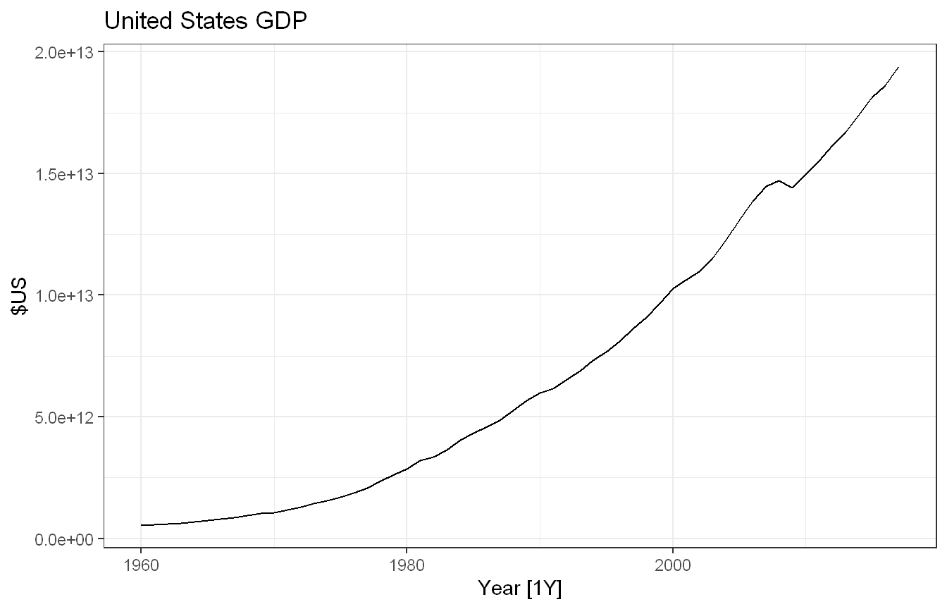
Approach: We plotted United States GDP with autoplot() and assessed whether the variation grows with the level of the series, since widening variance is the signal that a transformation would help.
Show code
global_economy |>filter(Country =="United States") |>autoplot(GDP) +labs(y ="$US", title ="United States GDP") +theme_bw()
US GDP rises smoothly and roughly exponentially from 1960 to 2017. The variation around the trend does not obviously balloon with the level. The curve is very smooth with no seasonality and little noise, so a variance-stabilising transformation is not really necessary here. A log (or per-capita) transformation would straighten the exponential growth into a near-linear trend if a simpler shape were wanted, but it is optional for a single smooth series like this.
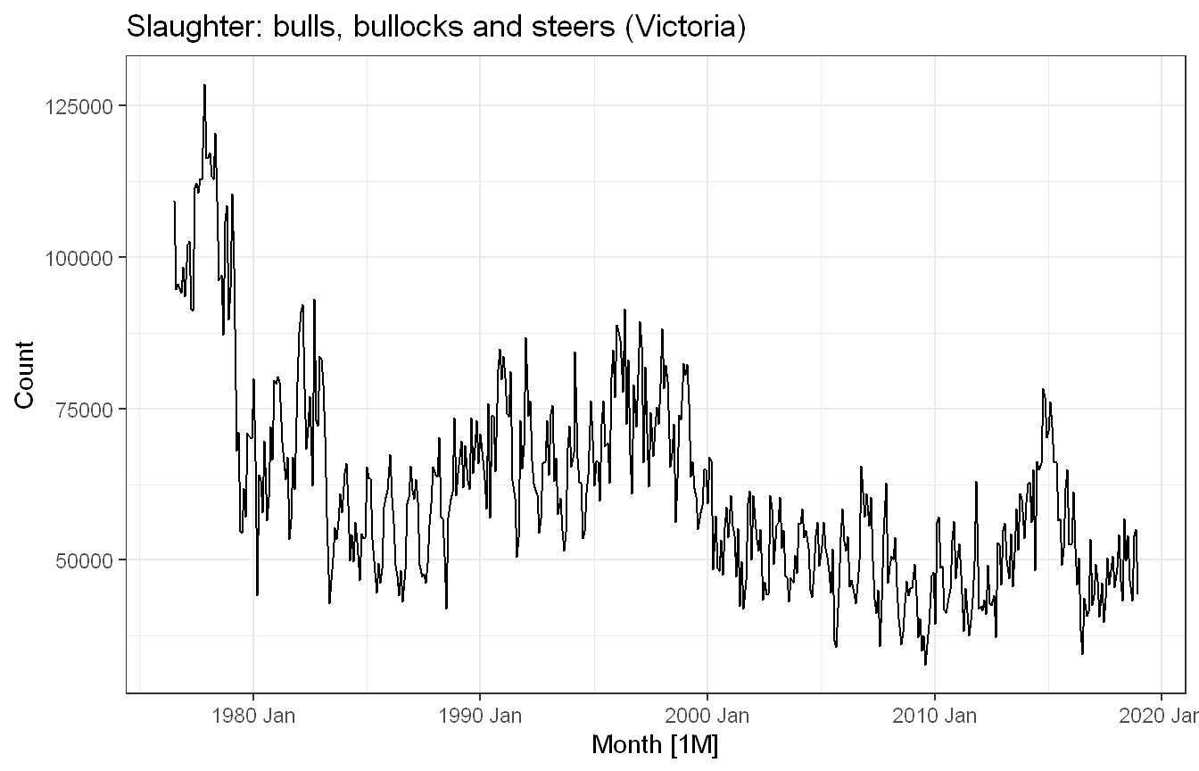
Approach: We plotted Victorian cattle slaughter counts and checked whether the fluctuations scale with the level.
Show code
aus_livestock |>filter(Animal =="Bulls, bullocks and steers", State =="Victoria") |>autoplot(Count) +labs(title ="Slaughter: bulls, bullocks and steers (Victoria)") +theme_bw()
Monthly slaughter counts in Victoria. The series drifts downward over the long run with moderate fluctuations, but the size of those fluctuations stays roughly constant rather than scaling with the level. Because the variance is already fairly stable, a Box-Cox transformation offers little benefit, so we leave the series untransformed.
Approach: We plotted Victorian electricity demand and checked whether a transformation was needed.
Show code
vic_elec |>autoplot(Demand) +labs(y ="Demand (MWh)", title ="Victorian electricity demand") +theme_bw()
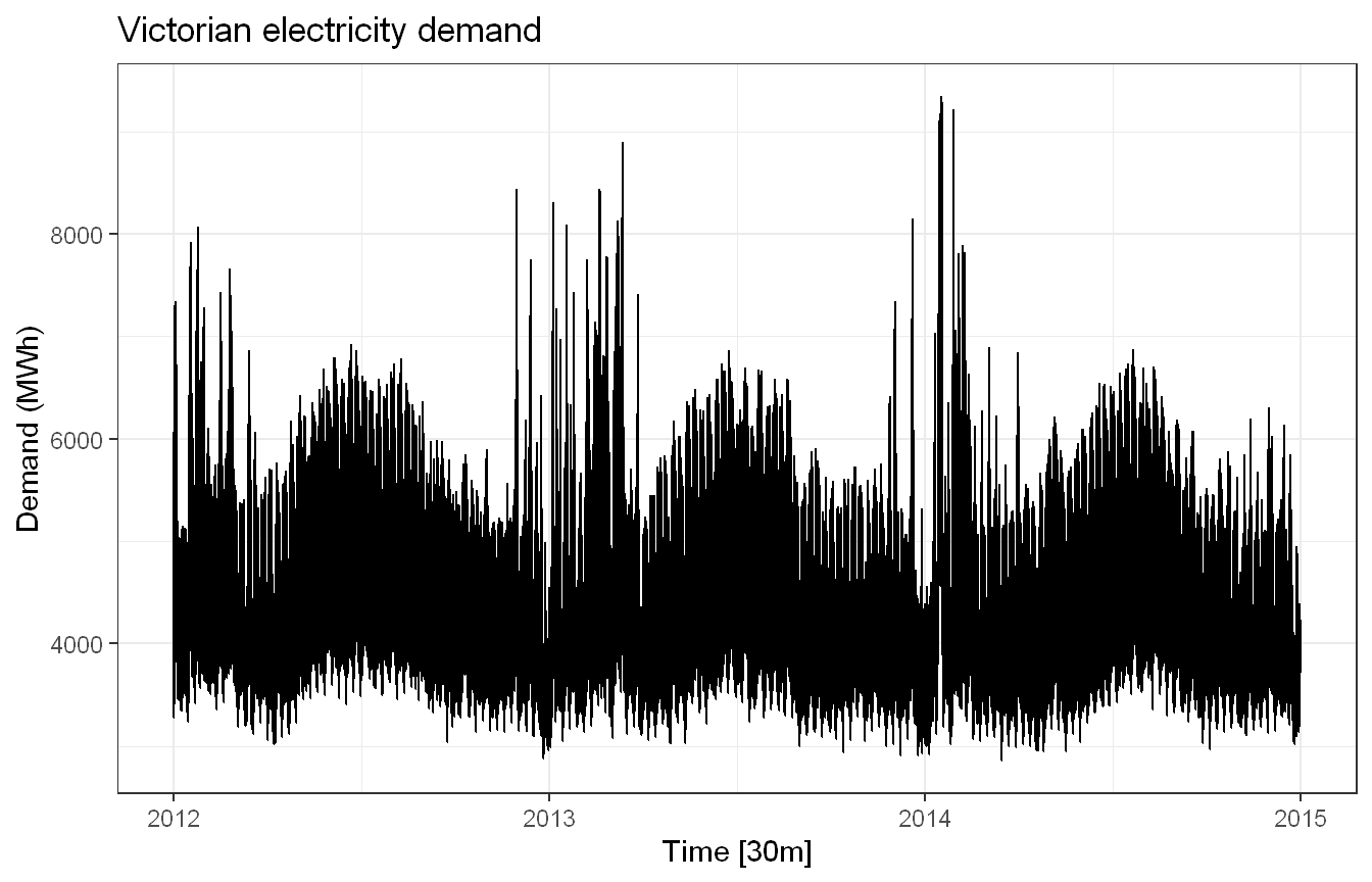
Half-hourly demand, 2012 to 2014. The amplitude of the swings is broadly similar across the three years rather than growing with the level, so a Box-Cox transformation would not help much. The real complication here is multiple seasonality (daily, weekly, and annual cycles), which a single power transform does not address. This series is left untransformed.
Approach: We plotted gas production and since the seasonal swings clearly grow with the level, applied a Box-Cox transformation using the Guerrero method.
Show code
aus_production |>autoplot(Gas) +labs(title ="Australian gas production (raw)") +theme_bw()
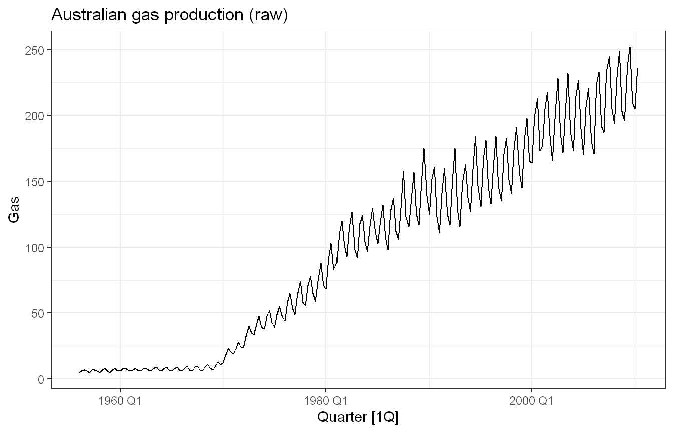
Quarterly gas production shows a strong upward trend with seasonal swings that grow markedly with the level of the series, small in the 1950s-60s and very large by the 2000s. That increasing seasonal variation is the textbook signal for a transformation. We select lambda with the guerrero feature and apply a Box-Cox transformation.
Show code
lambda <- aus_production |>features(Gas, features = guerrero) |>pull(lambda_guerrero)aus_production |>autoplot(box_cox(Gas, lambda)) +labs(y ="",title =paste0("Transformed gas production (lambda = ",round(lambda, 2), ")")) +theme_bw()
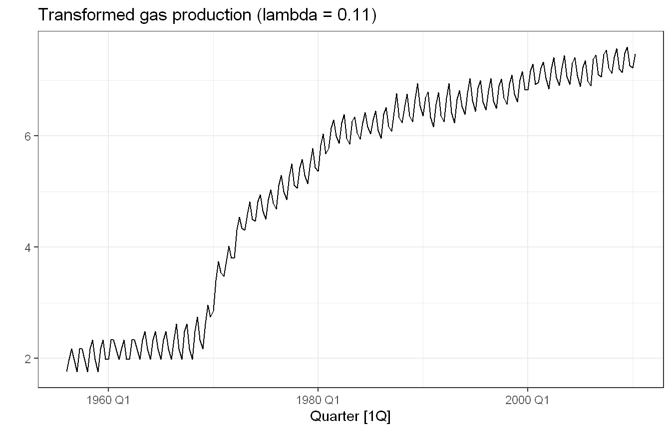
The Guerrero method selects lambda around 0.11 (close to a log). After the transformation the seasonal swings are roughly the same size across the whole series and the funnel shape disappears, which is exactly what we want before decomposing or modelling. This is the one series of the four where transforming clearly helps.
Exercise HA 3.7.7
Consider the last five years of the Gas data from aus_production.
gas <-tail(aus_production, 5*4) |>select(Gas)
Plot the time series. Can you identify seasonal fluctuations and/or a trend-cycle?
Use classical_decomposition with type=multiplicative to calculate the trend-cycle and seasonal indices.
Do the results support the graphical interpretation from part a?
Compute and plot the seasonally adjusted data.
Change one observation to be an outlier (e.g., add 300 to one observation), and recompute the seasonally adjusted data. What is the effect of the outlier?
Does it make any difference if the outlier is near the end rather than in the middle of the time series?
Code and Discussion
Approach: We subset the last 20 quarters of the Gas series and plotted it to look for trend and seasonality.
Show code
gas <-tail(aus_production, 5*4) |>select(Gas)gas |>autoplot(Gas) +labs(title ="Australian gas production - last 5 years") +theme_bw()
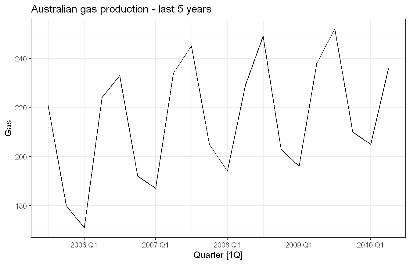
Yes, there is a clear upward trend-cycle across the five years and a strong, regular seasonal pattern, with production peaking in Q3 of each year and dipping in Q1. The seasonal swings also appear to grow slightly as the level rises, which is consistent with using a multiplicative decomposition.
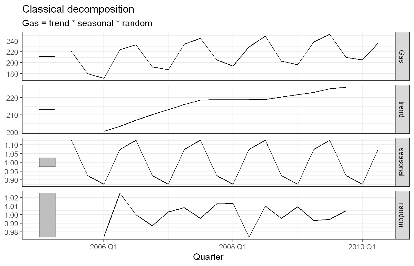
Approach: We ran a multiplicative classical decomposition to calculate the trend-cycle and seasonal indices.
Show code
gas |>model(classical_decomposition(Gas, type ="multiplicative")) |>components() |>autoplot() +theme_bw()
The decomposition separates the series into a smooth upward trend, a repeating seasonal component (indices above 1 in the high quarters and below 1 in the low quarters), and a small random remainder centred on 1.
Yes, the results support the graphical interpretation from part 1. The estimated trend-cycle rises steadily, matching the upward drift seen in the raw plot, and the seasonal indices reproduce the Q3-high / Q1-low pattern we identified by eye. The remainder is small and shows no obvious leftover structure, so the multiplicative decomposition is a good description of the series.
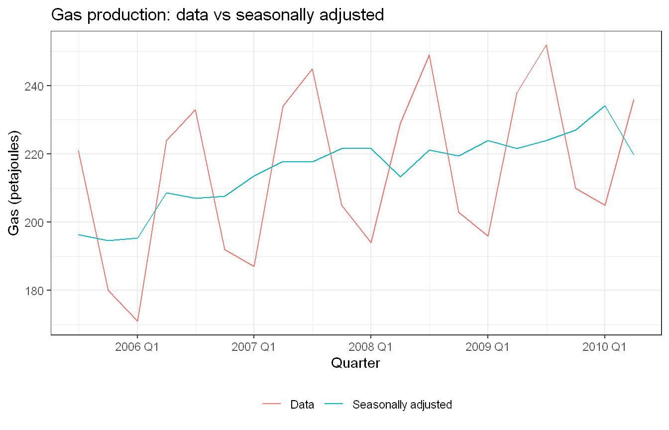
Approach: We computed and plotted the seasonally adjusted data from the same decomposition.
Show code
gas |>model(classical_decomposition(Gas, type ="multiplicative")) |>components() |>ggplot(aes(x = Quarter)) +geom_line(aes(y = Gas, colour ="Data")) +geom_line(aes(y = season_adjust, colour ="Seasonally adjusted")) +labs(y ="Gas (petajoules)", colour =NULL,title ="Gas production: data vs seasonally adjusted") +theme_bw() +theme(legend.position ="bottom")
Removing the seasonal component leaves a much smoother series that follows the underlying trend-cycle. The regular quarterly zig-zag of the raw data is gone, making the long-run upward movement easy to read.
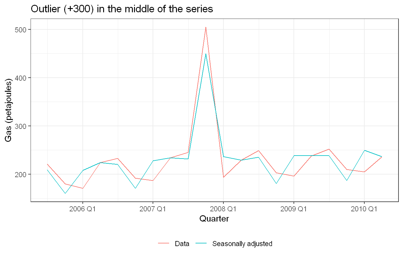
Approach: We added a +300 outlier to an observation in the middle of the series and recomputed the seasonally adjusted data.
Show code
gas_mid <- gas |>mutate(Gas =if_else(row_number() ==10, Gas +300, Gas))gas_mid |>model(classical_decomposition(Gas, type ="multiplicative")) |>components() |>ggplot(aes(x = Quarter)) +geom_line(aes(y = Gas, colour ="Data")) +geom_line(aes(y = season_adjust, colour ="Seasonally adjusted")) +labs(y ="Gas (petajoules)", colour =NULL,title ="Outlier (+300) in the middle of the series") +theme_bw() +theme(legend.position ="bottom")
The outlier produces a large spike in the seasonally adjusted series at that point, because the jump is not seasonal and so passes straight through into season_adjust. It also contaminates the estimate around it. The centred moving average used for the trend-cycle smears the spike across the neighbouring quarters, and because the seasonal indices are averages over all years, the index for that quarter is nudged too. So a single outlier distorts the trend-cycle in a small neighbourhood and slightly biases the seasonal pattern, not just the one point.
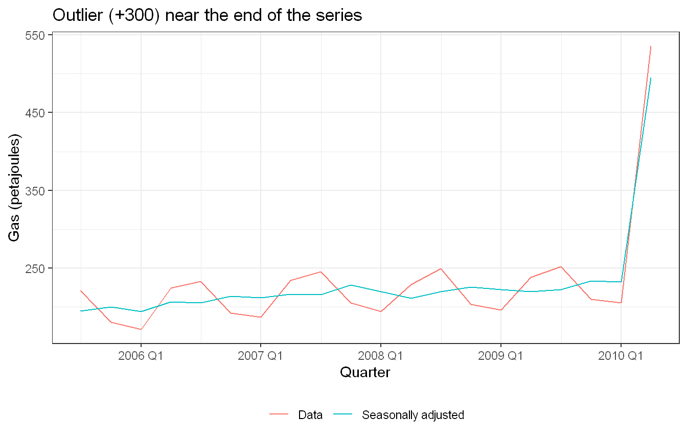
Approach: We repeated the outlier test, this time placing the +300 outlier at the end of the series rather than in the middle.
Show code
gas_end <- gas |>mutate(Gas =if_else(row_number() ==n(), Gas +300, Gas))gas_end |>model(classical_decomposition(Gas, type ="multiplicative")) |>components() |>ggplot(aes(x = Quarter)) +geom_line(aes(y = Gas, colour ="Data")) +geom_line(aes(y = season_adjust, colour ="Seasonally adjusted")) +labs(y ="Gas (petajoules)", colour =NULL,title ="Outlier (+300) near the end of the series") +theme_bw() +theme(legend.position ="bottom")
Yes, it makes a difference. Classical decomposition estimates the trend-cycle with a centred moving average, which cannot be computed for the first two and last two quarters. An outlier at the very end therefore falls where the trend is not estimated and is included in fewer averaging windows. The result is that the spike still appears in the seasonally adjusted value at that point, but the surrounding trend-cycle is distorted less than when the outlier sat in the middle. An outlier in the interior therefore contaminates more of the decomposition than one at the boundary.
Exercise HA 3.7.10
This exercise uses the canadian_gas data (monthly Canadian gas production in billions of cubic metres, January 1960 - February 2005).
Plot the data using autoplot(), gg_subseries() and gg_season() to look at the effect of the changing seasonality over time.
Do an STL decomposition of the data. You will need to choose a seasonal window to allow for the changing shape of the seasonal component.
How does the seasonal shape change over time? (Hint: Try plotting the seasonal component using gg_season().)
Can you produce a plausible seasonally adjusted series?
Compare the results with those obtained using SEATS and X-11. How are they different?
Code and Discussion
Approach: We explored the series three ways, autoplot(), gg_subseries(), and gg_season(), to see the seasonal pattern and how it evolves over time.
Show code
canadian_gas |>autoplot(Volume) +labs(y ="Volume (bcm)", title ="Canadian gas production") +theme_bw()
Show code
canadian_gas |>gg_subseries(Volume) +theme_bw()
Show code
canadian_gas |>gg_season(Volume) +theme_bw()
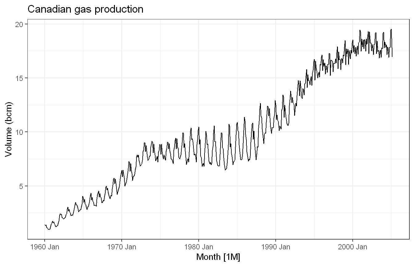
Production rises steeply from 1960 and flattens somewhat in the early 1990s. The seasonal swings clearly change size over the period. The amplitude is small in the early 1960s but grows substantially through the 1970s and 1980s.
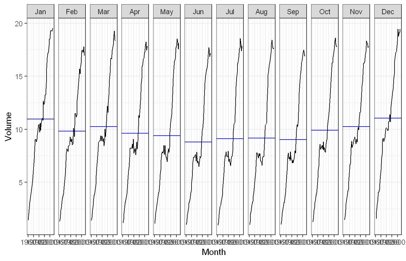
The subseries plot (one mini-panel per month) shows every month trending upward, with the winter months sitting higher than the summer months, but the gap between high and low months widens and then narrows over the decades.
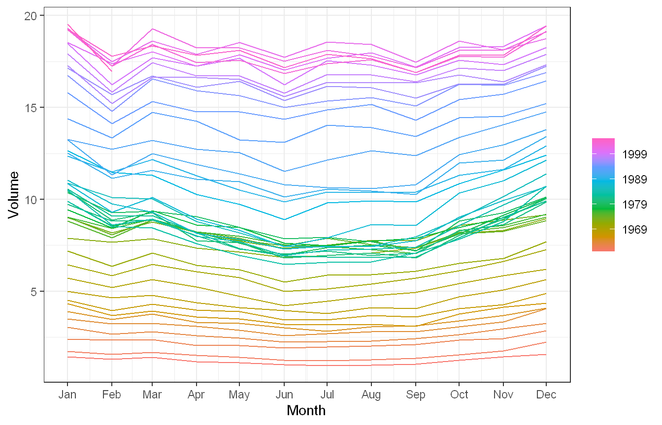
The seasonal plot overlays each year’s within-year shape. Early years are nearly flat, later years show a pronounced winter-high / summer-low curve, confirming the seasonal pattern is not constant.
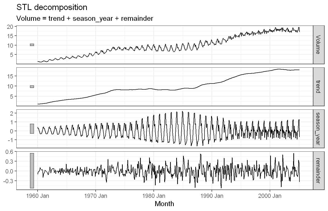
Approach: We ran an STL decomposition with a moderately short seasonal window so the seasonal shape is allowed to change over time.
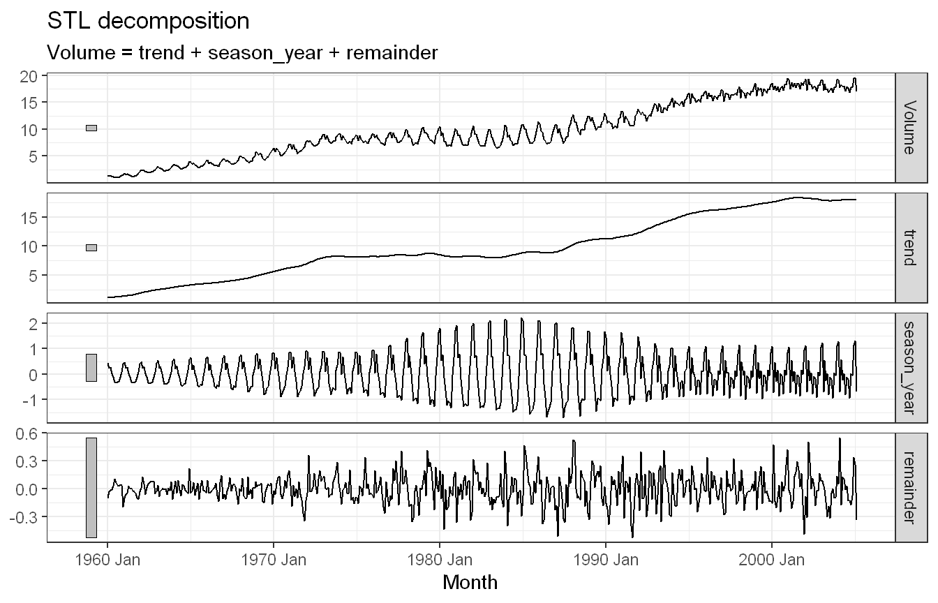
A relatively short seasonal window (window = 7) lets the seasonal component evolve from year to year instead of being forced to repeat identically (a large window or "periodic" would lock the shape). The decomposition gives a smooth rising trend, a seasonal component whose amplitude visibly grows then stabilises, and a small remainder.
Approach: We plotted the STL seasonal component with gg_season() to see how its shape changes over time.
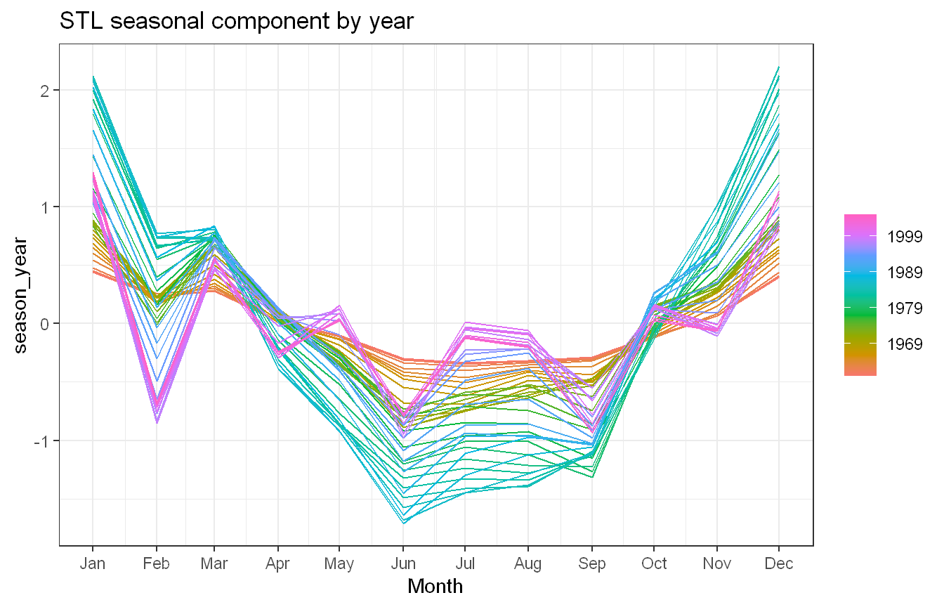
Show code
canadian_gas |>model(STL(Volume ~season(window =7))) |>components() |>gg_season(season_year) +labs(title ="STL seasonal component by year") +theme_bw()
Plotting the seasonal component with gg_season() shows the shape morphing over time. In the 1960s the seasonal effect is small and fairly flat, it grows into a strong winter-peak / summer-trough pattern through the 1970s and 1980s, and then the amplitude eases and the shape shifts again toward the end. The book notes this evolution is likely linked to changes in the regulation of gas prices.
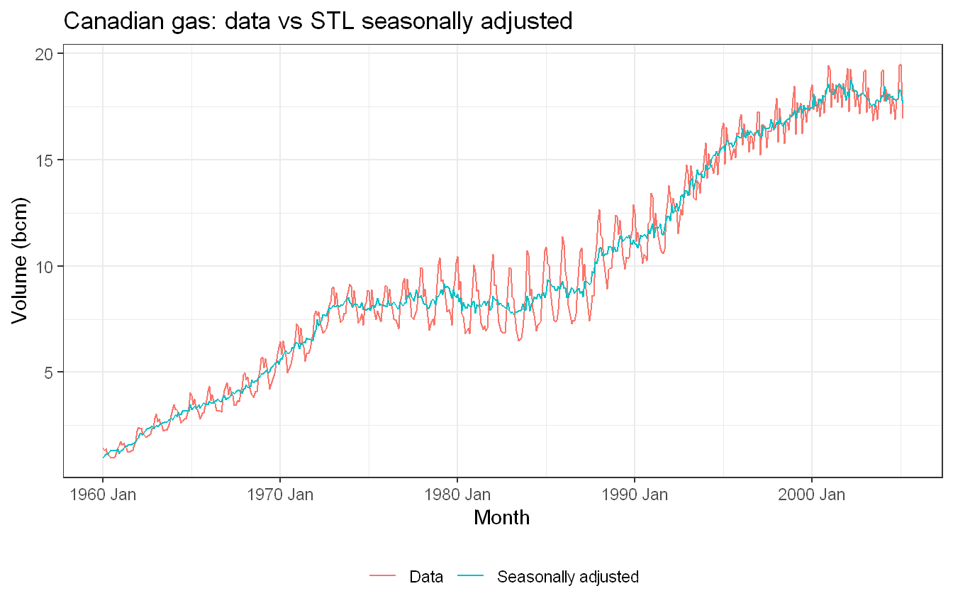
Approach: We constructed the seasonally adjusted series by removing the STL seasonal component.
Yes. Subtracting the STL seasonal component yields a plausible seasonally adjusted series that tracks the trend closely with the regular monthly cycle removed, leaving only the trend and a little irregular movement.
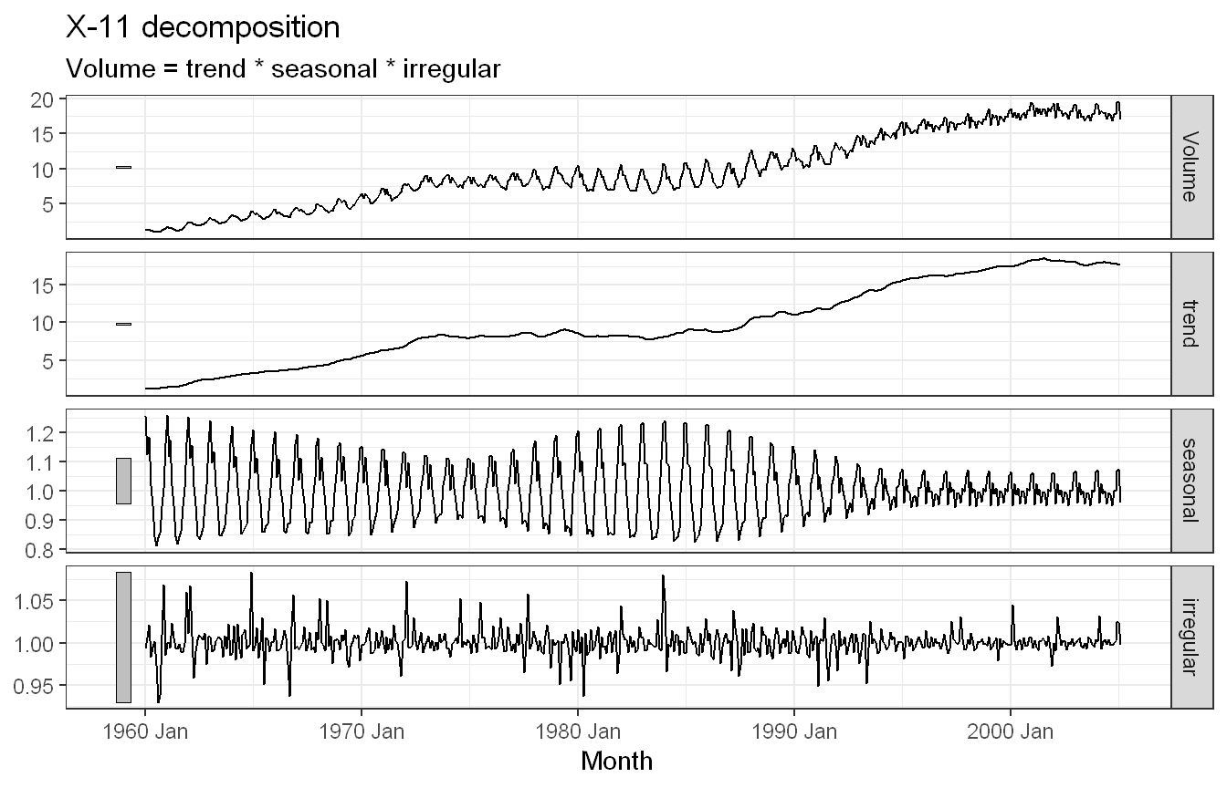
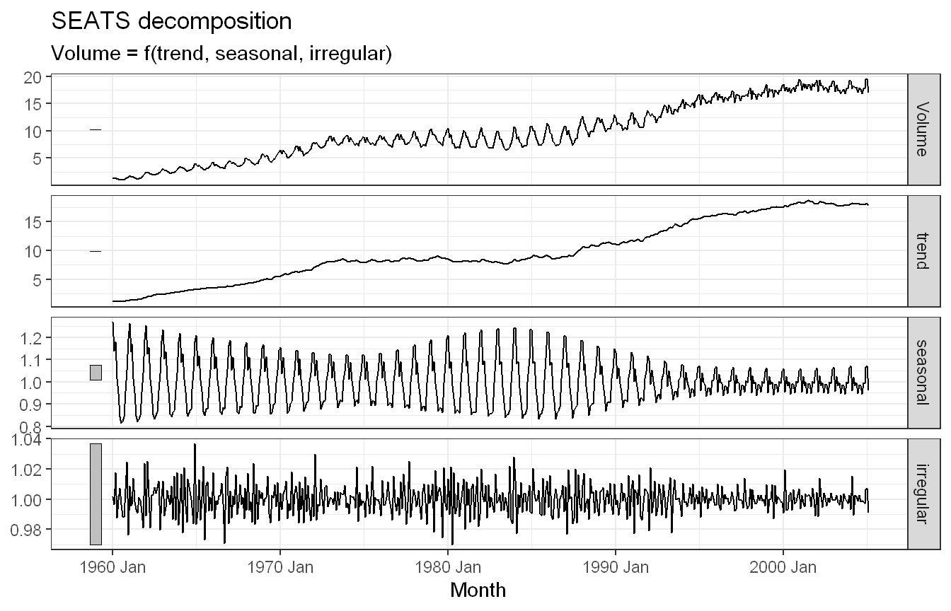
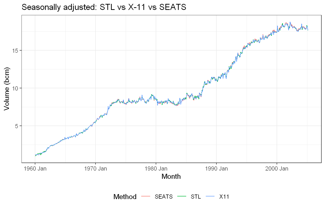
Approach: We compared the STL decomposition against SEATS and X-11 from X_13ARIMA_SEATS() (requires the seasonal package), then compared the seasonally adjusted series produced by all three methods.
fit_all |>components() |>ggplot(aes(x = Month, y = season_adjust, colour = .model)) +geom_line() +labs(y ="Volume (bcm)", colour ="Method",title ="Seasonally adjusted: STL vs X-11 vs SEATS") +theme_bw() +theme(legend.position ="bottom")
The three decomposition plots each show their components cleanly. All three methods identify the same strong upward trend and the growing-then-stabilising seasonal pattern.
In the seasonally adjusted comparison, the three lines track each other closely across the full 1960-2005 period, confirming that all three remove roughly the same seasonal signal. The largest visible spread between methods appears in the early 1960s when the seasonal amplitude is still small and each smoother’s assumptions matter more.
The key structural differences are in how each method handles the evolving seasonality. STL adapts at the rate set by season(window = 7) and is transparent about that choice. X-11 uses an iterative ratio-to-moving-average filter that adjusts somewhat faster to local changes, which can make its seasonal and irregular components look slightly noisier. SEATS derives components from an ARIMA model fitted to the series, which typically produces the smoothest trend and most regularised seasonal estimate. For a long series like canadian_gas with clearly evolving seasonality all three are broadly equivalent; differences between them tend to matter more in shorter series or where the seasonal pattern changes abruptly.
Exercise HA 4.6.2
Use GGally::ggpairs() to look at the relationships between the STL-based features for the holiday series in the tourism data. Change seasonal_peak_year and seasonal_trough_year to factors, as shown in Figure 4.3. Which is the peak quarter for holidays in each state?
Code and Discussion
Approach: We filtered tourism to the holiday series only and computed the STL-based feature set with features(Trips, feature_set(tags = "stl")), which returns one row per Region/State with trend strength, seasonal strength, the peak and trough quarters, spikiness, linearity, curvature, and the remainder ACF features.
This gives the nine STL-based features for each of the 76 holiday series (one per region). The key columns for the seasonality question are seasonal_strength_year, seasonal_peak_year and seasonal_trough_year.
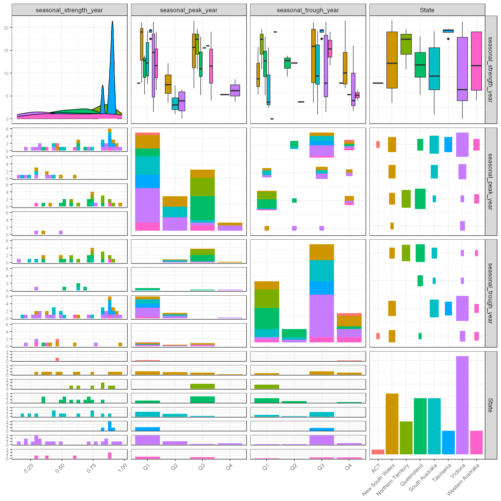
Approach: Following Figure 4.3 in the text, we converted seasonal_peak_year and seasonal_trough_year to quarter-labelled factors (the features encode the quarters as 0-3, where 0 means Q4, so we recode 0 to 4 before labelling) and passed the feature columns to GGally::ggpairs(), mapping State to colour.
The pairwise plot shows the seasonal features against each other with one colour per state. Converting the peak and trough quarters to labelled factors is what makes the plot readable. Instead of being treated as continuous numbers 0-3, they appear as bar charts showing how many regions in each state peak in each quarter. The seasonal strength panels show holiday travel is strongly seasonal nearly everywhere, and the coloured bars in the seasonal_peak_year column already hint that the peak quarter splits the country into two groups.
Approach: We recoded the peak quarter and counted the most common peak quarter by state to answer the question directly.
Show code
holiday_features |>mutate(seasonal_peak_year = seasonal_peak_year +4*(seasonal_peak_year==0) ) |>count(State, seasonal_peak_year) |>group_by(State) |>slice_max(n, n =1) |>flextable() |>colformat_double(digits =0) |>fontsize(size =9, part ="all") |>autofit()
State
seasonal_peak_year
n
ACT
1
1
New South Wales
1
5
Northern Territory
3
7
Queensland
3
9
South Australia
1
7
Tasmania
1
5
Victoria
1
13
Western Australia
1
3
With the quarters recoded so the table reads directly (1 = Q1, …, 4 = Q4), the most common peak quarter for holiday travel is Q1 (summer) across the southern states, namely ACT, New South Wales, South Australia, Tasmania, Victoria and Western Australia. Queensland and the Northern Territory peak in Q3 (winter, the dry season). This matches the intuition that Australians holiday at the beach in the southern summer, while the tropical north attracts visitors in the southern winter when its weather is dry and mild.
Exercise KJ 3.1
The UC Irvine Machine Learning Repository contains a dataset related to glass identification. The data consist of 214 glass samples labeled as one of seven class categories. There are nine predictors, including the refractive index and percentages of eight elements: Na, Mg, Al, Si, K, Ca, Ba, and Fe. The data can be accessed via:
Show code
library(mlbench)data(Glass)str(Glass)
'data.frame':   214 obs. of  10 variables:
 $ RI  : num  1.52 1.52 1.52 1.52 1.52 ...
 $ Na  : num  13.6 13.9 13.5 13.2 13.3 ...
 $ Mg  : num  4.49 3.6 3.55 3.69 3.62 3.61 3.6 3.61 3.58 3.6 ...
 $ Al  : num  1.1 1.36 1.54 1.29 1.24 1.62 1.14 1.05 1.37 1.36 ...
 $ Si  : num  71.8 72.7 73 72.6 73.1 ...
 $ K   : num  0.06 0.48 0.39 0.57 0.55 0.64 0.58 0.57 0.56 0.57 ...
 $ Ca  : num  8.75 7.83 7.78 8.22 8.07 8.07 8.17 8.24 8.3 8.4 ...
 $ Ba  : num  0 0 0 0 0 0 0 0 0 0 ...
 $ Fe  : num  0 0 0 0 0 0.26 0 0 0 0.11 ...
 $ Type: Factor w/ 6 levels "1","2","3","5",..: 1 1 1 1 1 1 1 1 1 1 ...
Using visualizations, explore the predictor variables to understand their distributions as well as the relationships between predictors.
Do there appear to be any outliers in the data? Are any predictors skewed?
Are there any relevant transformations of one or more predictors that might improve the classification model?
Code and Discussion
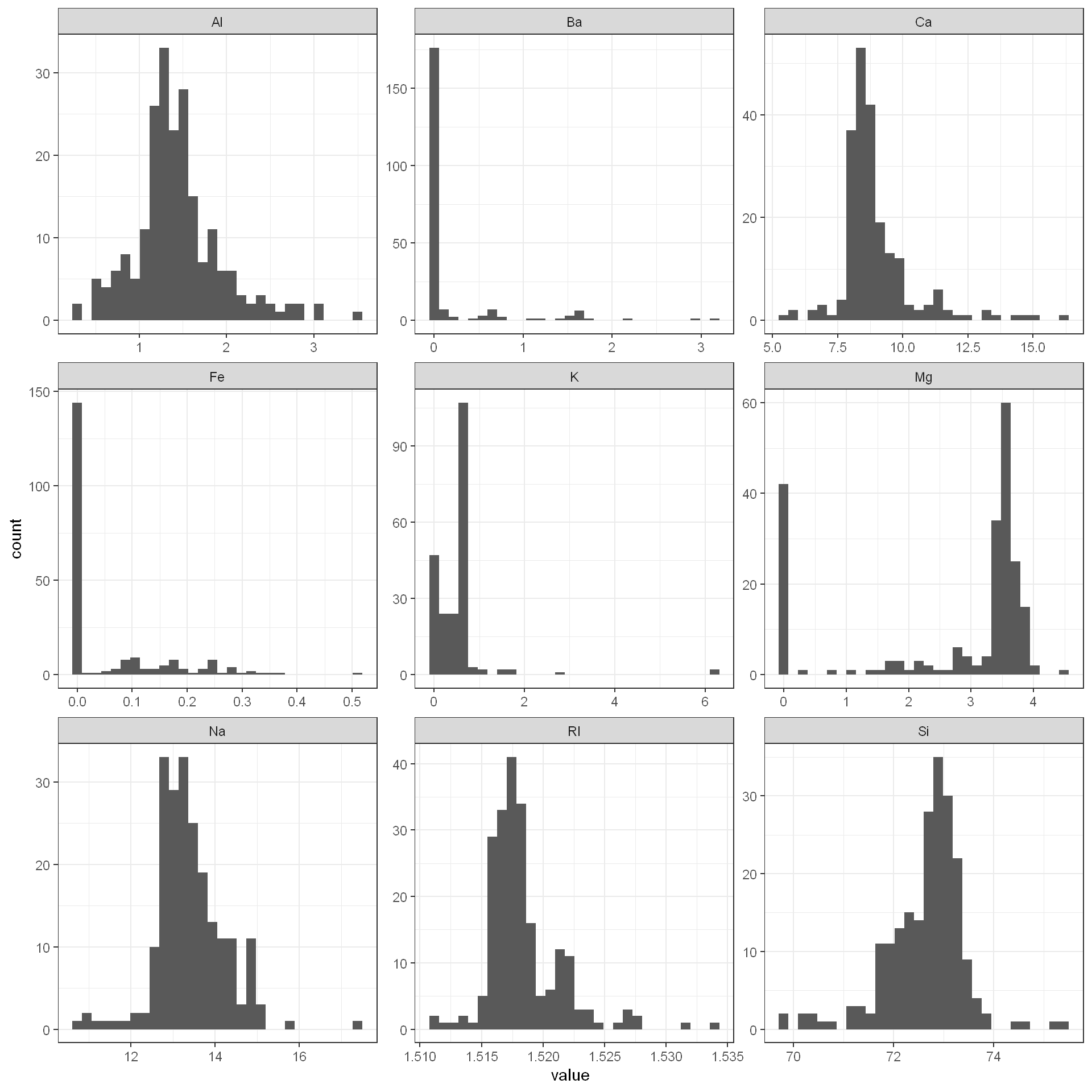
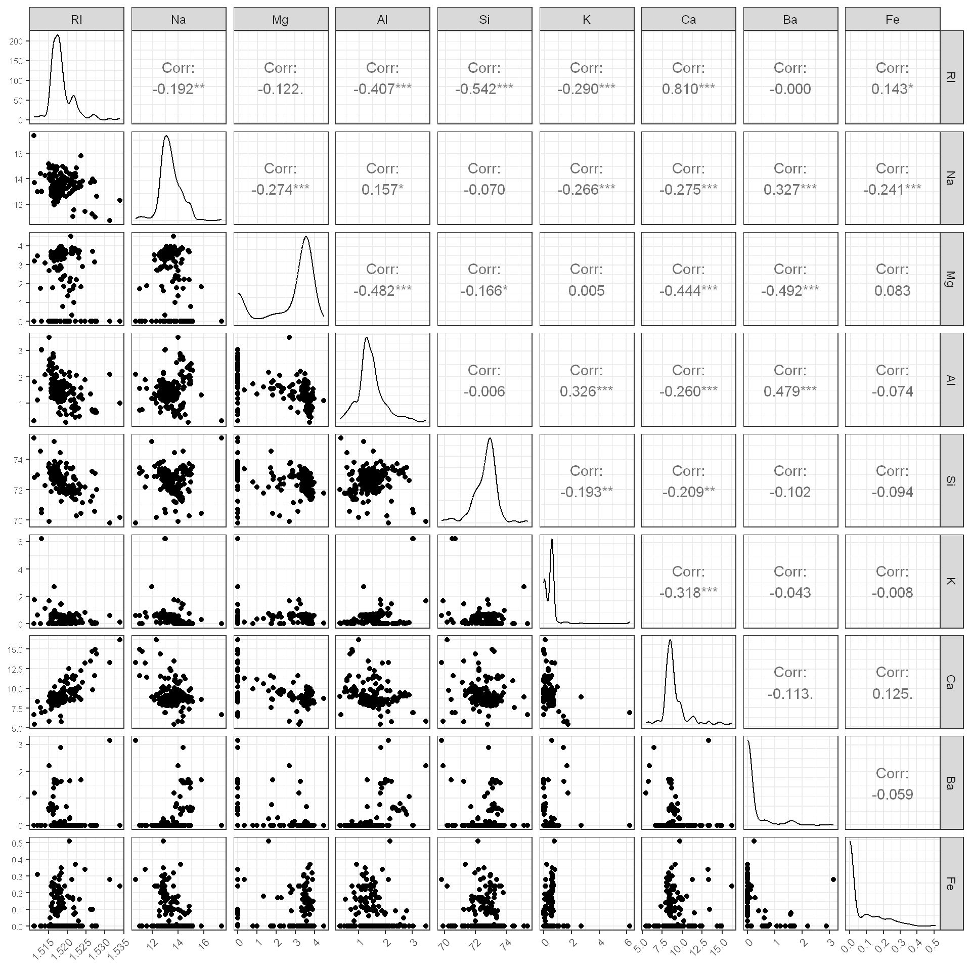
Approach: We loaded the Glass dataset and visualized each of the nine numeric predictors individually using histograms, then examined relationships between all pairs of predictors using a scatterplot matrix with correlation coefficients.
The histograms show that most predictors have distributions that are far from symmetric. Several elements, Ba, Fe, K, and Mg, show a large spike at or near zero, with a long right tail of nonzero values. This suggests that for many glass samples, these elements are essentially absent, while a smaller subset of samples contains meaningful concentrations. RI, Na, Al, Ca, and Si look closer to unimodal and roughly bell-shaped, though Ca and RI both show a secondary smaller bump and a few values trailing off to the right, and Na has a couple of high outlying values around 17.
The pairwise scatterplot matrix reveals several notable relationships. RI and Ca are strongly positively correlated (0.81), which makes physical sense since calcium oxide increases a glass’s refractive index. RI is also negatively correlated with Si (-0.54) and Al (-0.41), consistent with how silica and alumina content typically lower the refractive index relative to other oxides. Mg shows strong negative correlations with both Al (-0.48) and Ba (-0.49), and Ba is positively correlated with Al (0.48), suggesting some shared compositional structure between the glass types, since certain glass categories tend to use Ba and Al together while substituting away from Mg. Most other pairwise correlations are weak, below 0.3 in magnitude.
Overall, the predictors show a mix of distribution shapes (some smooth and unimodal, some sparse with a zero-spike), and several meaningful pairwise relationships exist, most notably the RI-Ca and Mg-Al-Ba structure, which likely reflects the underlying chemistry of how different glass types are formulated.
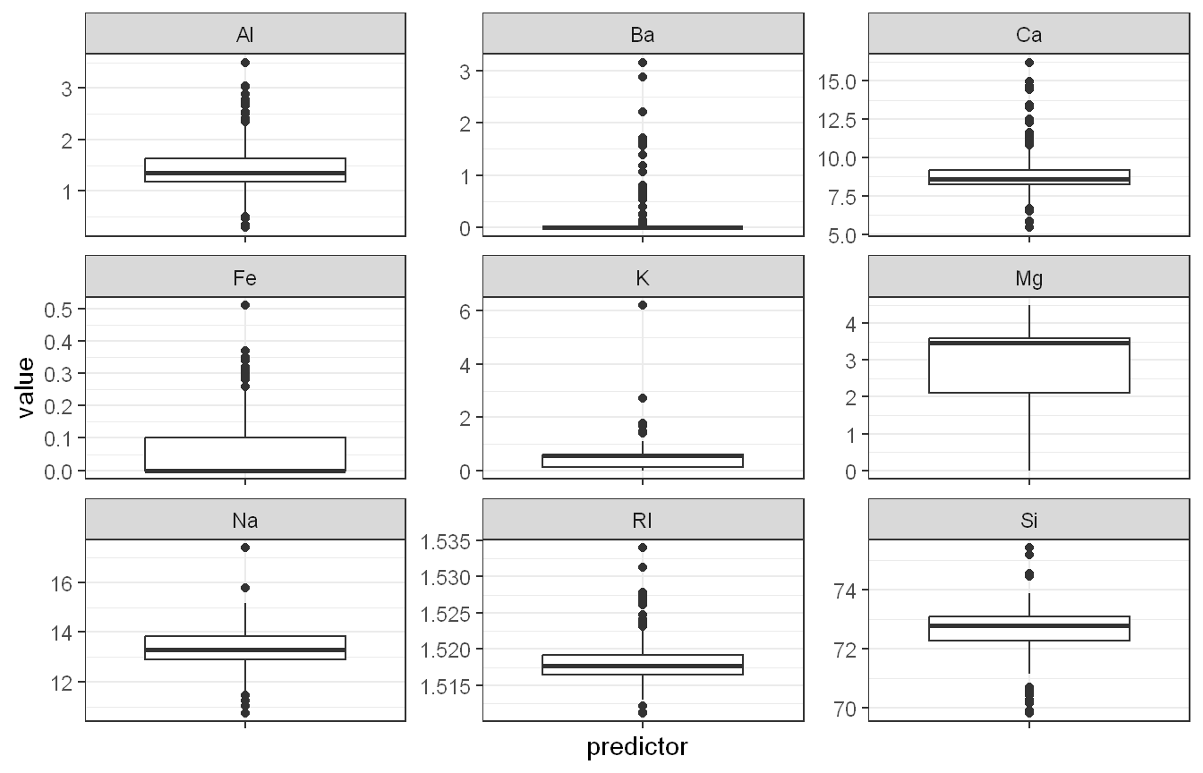
Approach: We computed the skewness of each predictor using e1071::skewness() and visualized potential outliers using boxplots for each predictor.
Outliers are present in nearly every predictor, as shown by the numerous points beyond the whiskers in the boxplots. RI, Ca, Ba, K, and Fe all show multiple high-value outliers, while Al, Na, and Si show outliers on both ends. Mg is the one exception, its boxplot shows no flagged outliers, though it has an unusual distribution shape (discussed below) rather than isolated extreme points.
The skewness values confirm what the boxplots and histograms suggested. K is extremely right-skewed (6.46), driven by the small number of samples with unusually high potassium content. Ba (3.37) and Ca (2.02) are also strongly right-skewed, consistent with their boxplots showing many high outliers above a compressed lower range. RI (1.60), Fe (1.73), and Al (0.895) show moderate to strong right skew as well. Mg stands out as the only predictor with negative skew (-1.14), reflecting its distribution being concentrated at higher values with a spike of zeros pulling the tail to the left rather than the right. Si is mildly left-skewed (-0.720), and Na is only mildly right-skewed (0.448), making it the most symmetric predictor of the nine.
Taken together, most predictors are skewed, several severely so, and most also contain a meaningful number of outliers. The combination of heavy skew and zero-inflation in predictors like Ba, K, and Fe suggests these are not well described by a normal distribution, which has implications for any classification model assuming approximately normal or symmetric predictors.
Approach: We checked each predictor for zero or negative values to determine whether a standard Box-Cox transformation was applicable, then used caret::preProcess() to estimate Box-Cox lambdas for the predictors with no zeros, and Yeo-Johnson lambdas for the remaining zero-containing predictors.
Created from 214 samples and 2 variables

Pre-processing:
  - ignored (0)
  - Yeo-Johnson transformation (2)

Lambda estimates for Yeo-Johnson transformation:
2.24, -0.98
For the five predictors with no zero values (RI, Na, Al, Si, Ca), a Box-Cox transformation was applied directly. The estimated lambda values varied substantially across predictors: -2 for RI, -0.1 for Na, 0.5 for Al, 2 for Si, and -1.1 for Ca. These differing lambdas confirm that no single transformation suits all predictors equally; each requires its own degree of correction given its individual skewness.
For Mg and K, which contain zeros but enough nonzero variation to estimate a stable transformation, a Yeo-Johnson transformation was used since it can handle zero values directly. Mg received a lambda of 2.24, and K received a lambda of -0.98, both representing notable departures from no transformation (lambda = 1).
Ba and Fe, however, could not be transformed at all. The Yeo-Johnson procedure silently excluded both from transformation, likely because 176 and 144 of the 214 observations (82% and 67%, respectively) are exactly zero. With so little nonzero variation to work with, no power transformation can meaningfully reshape these distributions. Rather than forcing an unstable transformation, we flag Ba and Fe as candidates for alternative treatment, such as converting them to a binary presence/absence indicator, or evaluating whether they carry enough signal to be worth retaining at all given their near-zero-variance structure.
Overall, five of the nine predictors benefit from a standard Box-Cox transformation, two more benefit from a Yeo-Johnson transformation, and two (Ba and Fe) require a fundamentally different strategy due to their extreme zero-inflation rather than ordinary skewness.
Exercise KJ 3.2
The soybean data can also be found at the UC Irvine Machine Learning Repository. Data were collected to predict disease in 683 soybeans. The 35 predictors are mostly categorical and include information on the environmental conditions (e.g., temperature, precipitation) and plant conditions (e.g., leaf spots, mold growth). The outcome labels consist of 19 distinct classes.
The data can be loaded via:
Show code
library(mlbench)data(Soybean)## See ?Soybean for details
Investigate the frequency distributions for the categorical predictors. Are any of the distributions degenerate in the ways discussed earlier in this chapter?
Roughly 18% of the data are missing. Are there particular predictors that are more likely to be missing? Is the pattern of missing data related to the classes?
Develop a strategy for handling missing data, either by eliminating predictors or imputation.
Code and Discussion
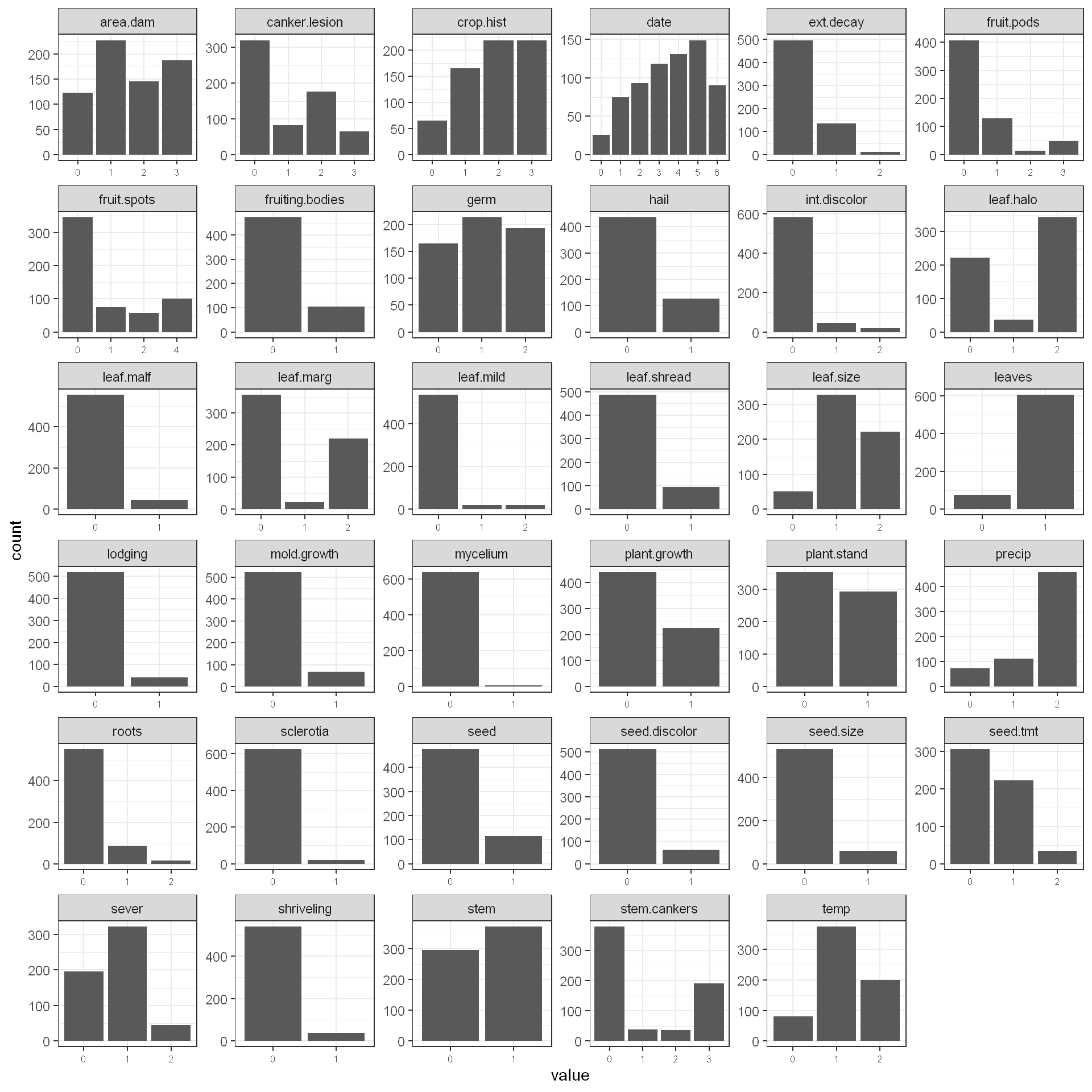
Approach: We visualized the frequency distribution of each categorical predictor using faceted bar charts, then used caret::nearZeroVar() to formally identify predictors with degenerate, near-constant distributions.
The bar charts show a wide range of distribution shapes across the 35 categorical predictors. Some predictors, like crop.hist, date, and leaf.size, have categories that are fairly evenly distributed. Many others are heavily lopsided, with one category accounting for the overwhelming majority of observations: mycelium, sclerotia, leaf.mild, leaf.malf, lodging, and shriveling all show one dominant bar with only a handful of observations in the remaining categories.
The nearZeroVar() output confirms this formally. Three predictors are flagged as near-zero variance (nzv = TRUE): leaf.mild (freqRatio 26.75), mycelium (freqRatio 106.5), and sclerotia (freqRatio 31.25). A freqRatio this high means the most common category occurs over 25 times more often than the second most common category, which matches what the bar charts show visually for these three predictors. None of the predictors have zero variance outright (zeroVar = FALSE across the board), meaning every predictor does have at least some variation, just heavily skewed toward one level.
Several other predictors come close to degenerate without crossing the default caret::nearZeroVar() threshold: int.discolor (13.2), leaf.malf (12.3), lodging (12.4), shriveling (14.2), and seed.size (9.0) all show fairly extreme imbalance and would be worth watching even though they weren’t formally flagged.
In summary, leaf.mild, mycelium, and sclerotia are the clearest examples of degenerate distributions in this dataset and are strong candidates for removal before modeling, since a predictor that is almost always the same value provides very little discriminating information.
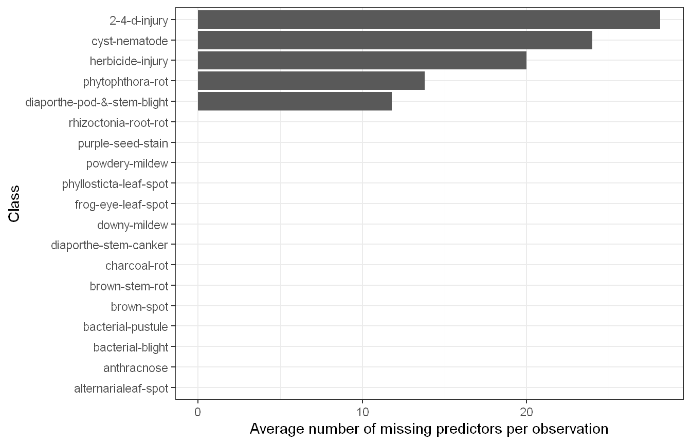
Approach: We calculated the percentage of missing values for each predictor, then examined whether missingness varies systematically by class by computing the average number of missing predictors per observation within each class.
Soybean |>mutate(n_missing =rowSums(is.na(across(everything())))) |>group_by(Class) |>summarise(total_missing =sum(n_missing), n =n(), avg_missing = total_missing / n) |>arrange(desc(avg_missing)) |>ggplot(aes(x =reorder(Class, avg_missing), y = avg_missing)) +geom_col() +coord_flip() +labs(x ="Class", y ="Average number of missing predictors per observation") +theme_bw()
Missing data is heavily concentrated in a small number of predictors and classes rather than scattered randomly throughout the dataset. Roughly 18% of the data overall is missing, but the predictor-level breakdown shows the missingness is far from uniform. hail, sever, seed.tmt, and lodging each have about 17.7% missing values, the highest of any predictors, while date and area.dam have almost none (0.15%). Most predictors fall somewhere in the 5% to 16% range.
The class-level breakdown is even more striking. Only five of the nineteen classes have any missing data at all: 2-4-d-injury (averaging nearly 28 missing predictors per observation), cyst-nematode (about 24), herbicide-injury (about 20), phytophthora-rot (about 14), and diaporthe-pod-&-stem-blight (about 12). The remaining fourteen classes have zero missing values across every predictor for every observation in that class.
This is a strong and clear relationship between missingness and class. It isn’t that individual predictors are randomly unrecorded; instead, entire classes have systematically incomplete predictor profiles, likely because those particular diseases or conditions were documented less thoroughly than the others, or because certain symptom categories simply don’t apply or weren’t assessed for those classes. This pattern is important since it means missingness itself carries information about class membership, which has implications for how missing data should be handled in part 3.
Approach: We compared mode imputation against mice using a classification tree method (cart) by imputing missing values both ways, then examining the imputed distribution of hail, one of the most heavily missing predictors, across the five classes where it actually had missing values.
Given that missingness in this dataset is concentrated in specific classes rather than missing at random, the choice of imputation method matters more than usual. Eliminating the affected predictors or the five classes with missing data is not an attractive option here, since the predictors are likely informative for classification when present, and removing entire classes would shrink an already modest 19-class outcome down to 14, discarding real diagnostic categories rather than addressing the underlying data quality issue. Imputation is the more defensible path, but the method chosen still needs to respect the fact that missingness tracks class.
Simple mode imputation replaces every missing value in a predictor with that predictor’s single most frequent category across the entire dataset, ignoring any relationship between the missing values and the observation’s class or other predictor values. This risks washing out exactly the kind of class-specific signal we found in part 2, since classes with heavy missingness may have systematically different predictor profiles than the dataset average.
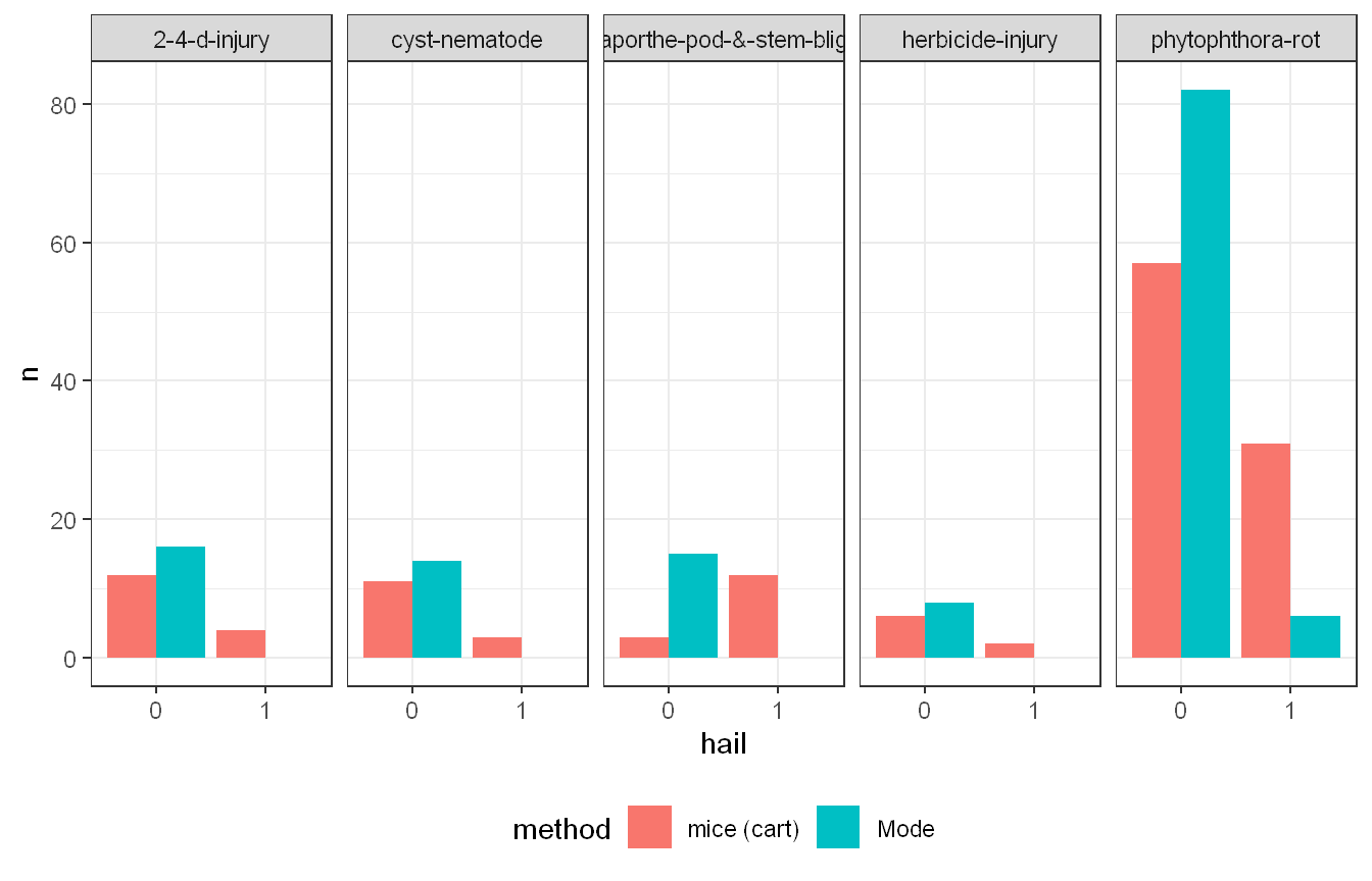
mice with a classification tree method (cart) instead imputes each missing value based on a model fit using the other available predictors, allowing the imputed value to reflect patterns specific to that observation rather than defaulting to a single global mode. The comparison for hail across all five classes where it has missing values, 2-4-d-injury, cyst-nematode, diaporthe-pod-&-stem-blight, herbicide-injury, and phytophthora-rot, shows a consistent pattern: mode imputation always assigns more observations to category 0 than mice does, because mode imputation collapses every missing case to whichever category happens to be most common overall. mice instead distributes the imputed values more proportionally between categories 0 and 1, better reflecting the variation that likely exists within each class rather than forcing every missing observation toward the global mode. This gap is most visible in phytophthora-rot, which has by far the largest number of affected observations of the five classes, where mode imputation pushes far more cases into category 0 than mice does, while mice still assigns a meaningfully larger share to category 1 than mode allows for at all.
This matters substantively because if hail damage or any other predictor is genuinely associated with class membership, mode imputation would artificially shrink that association by making every imputed observation look identical, while mice preserves more of the natural variation. For a categorical dataset like Soybean with class-dependent missingness, mice with a tree-based method is the more defensible strategy. Mode imputation should generally be avoided here since it would bias the relationship between predictors and class precisely in the cases where missingness is non-random.
One caveat: the mice run logged 170 events, which typically indicates issues like constant predictors within certain imputation subsets or perfect separation in the underlying tree models. These should be reviewed before relying on the imputed dataset for modeling, since they may signal that some predictor/class combinations have too little data to support a reliable model-based imputation. This is most likely due to the near-zero variance predictors that were identified previously, such as mycelium and sclerotia. Given this, it is best practice to drop these degenerate predictors before running the imputation.
Exercise HA 5.11.2
Use the Facebook stock price (data set gafa_stock) to do the following:
Produce a time plot of the series.
Produce forecasts using the drift method and plot them.
Show that the forecasts are identical to extending the line drawn between the first and last observations.
Try using some of the other benchmark functions to forecast the same data set. Which do you think is best? Why?
Code and Discussion
Approach: We filtered gafa_stock to the Facebook ticker only and plotted the Close price to inspect the series before forecasting.
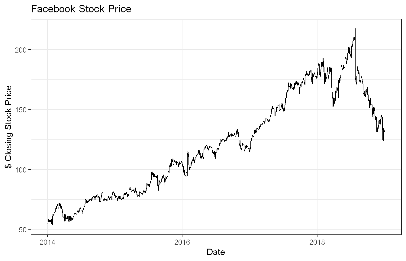
The Facebook (closing) stock price shows a strong upward trend from 2014 through mid-2018, rising from around $50 to nearly $200. A sharp decline follows in the second half of 2018, likely reflecting the data privacy concerns and regulatory scrutiny the company faced that year (https://www.cnbc.com/2018/11/20/facebooks-scandals-in-2018-effect-on-stock.html). There is no apparent seasonality, which is typical for stock price data. The irregular nature of the trading calendar also means the series has gaps on weekends and holidays, making it an unequally spaced time series.
Approach: Since gafa_stock is an irregular tsibble (trading days only), we re-indexed the series by trading day number so it could be treated as a regular time series, then fit a drift model and forecast 90 trading days ahead.
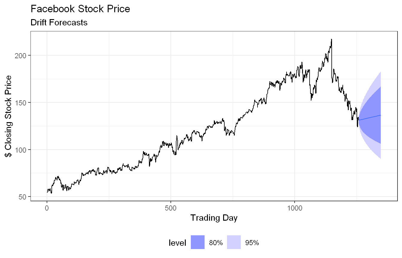
The drift method forecasts by extrapolating the average change observed across the full historical series. Since Facebook’s stock trended strongly upward over the entire period, the drift forecast continues that upward trajectory into the next 60 trading days. However, given the sharp decline seen in 2018, this forecast is likely overly optimistic and highlights a key limitation of the drift method: it assumes the historical average trend will persist, making it sensitive to the overall direction of the training data rather than recent behavior.
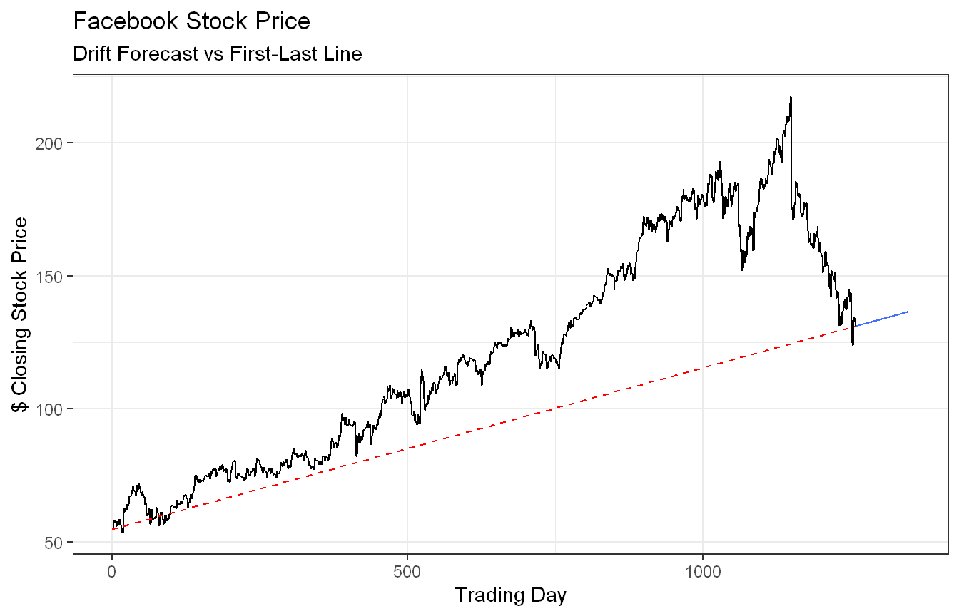
Approach: To verify the drift forecast equals the line connecting the first and last observations, we overlaid a dashed line between those two points on top of the drift forecast.
Show code
fb_stock |>model(Drift =RW(Close ~drift())) |>forecast(h =90) |>autoplot(fb_stock, level =NULL) +geom_line(data =slice(fb_stock, c(which.min(trading_day), which.max(trading_day))), aes(x = trading_day, y = Close), color ="red", linetype ="dashed") +labs(title ="Facebook Stock Price",subtitle ="Drift Forecast vs First-Last Line",x ="Trading Day", y ="$ Closing Stock Price") +theme_bw()
As stated above, drift method produces forecasts that are mathematically equivalent to drawing a straight line between the first and last observations of the training data. This is because the drift term is estimated as the average change per period, which simplifies to the total change divided by the number of periods, which is exactly the slope of the line connecting the two endpoints. The plot confirms this visually, with the red dashed line and the forecast path matching slope.
Approach: We fit the mean, naive and drift benchmark methods on the same series and compared their forecasts.
Among the three benchmark methods (discussed in chapter 5, and ignoring seasonal naive), the naive method is arguably the most appropriate. The mean method performs poorly here since it forecasts a constant value based on the historical average, which is well below recent prices. The drift method produces an optimistic upward forecast, but as noted earlier, it is heavily influenced by the overall direction of the training period. The naive method makes no assumption about direction, which aligns better with the unpredictable nature of stock prices. That said, none of these methods would be considered adequate for real forecasting; at best they serve as baselines for sophisticated models.
Exercise HA 5.11.6
Are the following statements true or false? Explain your answer.
Good forecast methods should have normally distributed residuals.
A model with small residuals will give good forecasts.
The best measure of forecast accuracy is MAPE.
If your model doesn’t forecast well, you should make it more complicated.
Always choose the model with the best forecast accuracy as measured on the test set.
Discussion
Approach: This exercise is conceptual, so no code is required. Each statement is evaluated against the properties of good forecast methods and residual diagnostics covered in the text.
True. Normally distributed residuals are useful but not necessary for a good forecast method. The essential properties of good residuals are that they are uncorrelated and have zero mean. Constant variance and normality are desirable additional properties, particularly for computing valid prediction intervals, but a forecast method is not considered poor simply because its residuals are not normally distributed. However, this is a matter of semantics. The statement says “should” rather than “must”, so treating it as true is not unreasonable.
False. Small residuals on training data indicate a good fit to historical data, not necessarily good forecasts. A model can overfit the training data and perform poorly out of sample.
False. MAPE has well known limitations. It is undefined/unstable when actual values are zero, puts a heavier penalty on positive errors than negative ones, and can be misleading when the scale of the data varies. Other measures like RMSE or MASE are often more appropriate.
False. Adding complexity does not guarantee better forecasts and often makes things worse through overfitting. A simpler model that captures the main patterns in the data will generally outperform a needlessly complex one.
False. Test set accuracy is important but should not be the only criterion. A model that performs best on one particular test set may not generalize well to future data. Other factors like residual diagnostics, interpretability, and whether the test set is representative of future conditions should also be considered. Additionally, a more complex model carries real costs including longer computation time, more parameters to estimate, and reduced robustness when conditions change. If a simpler model performs nearly as well, the added complexity is rarely justified.
Exercise HA 5.11.11
We will use the Bricks data from aus_production (Australian quarterly clay brick production 1956-2005) for this exercise.
Use an STL decomposition to calculate the trend-cycle and seasonal indices. (Experiment with having fixed or changing seasonality.)
Compute and plot the seasonally adjusted data.
Use a naive method to produce forecasts of the seasonally adjusted data.
Use decomposition_model() to reseasonalise the results, giving forecasts for the original data.
Do the residuals look uncorrelated?
Repeat with a robust STL decomposition. Does it make much difference?
Compare forecasts from decomposition_model() with those from SNAIVE(), using a test set comprising the last 2 years of data. Which is better?
Code and Discussion
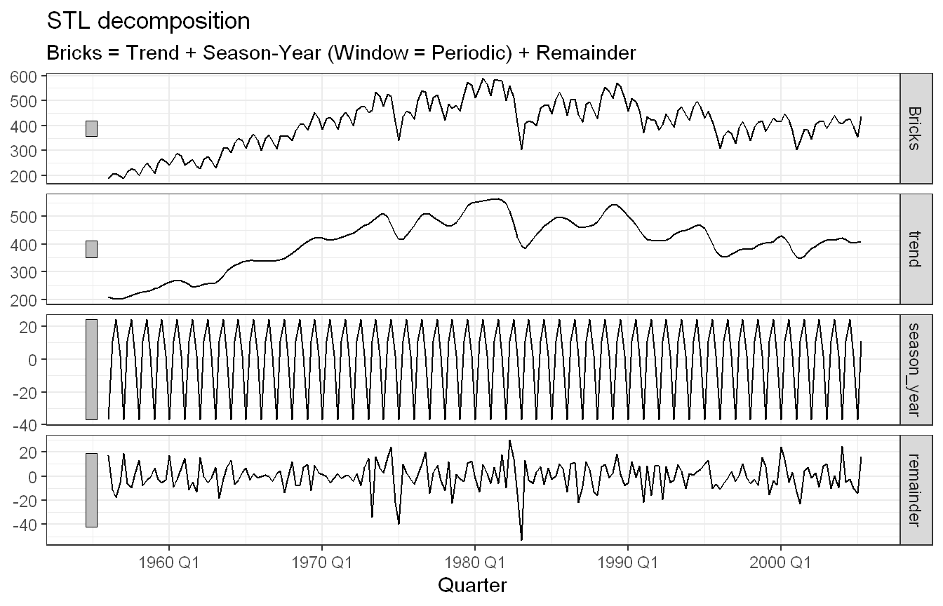
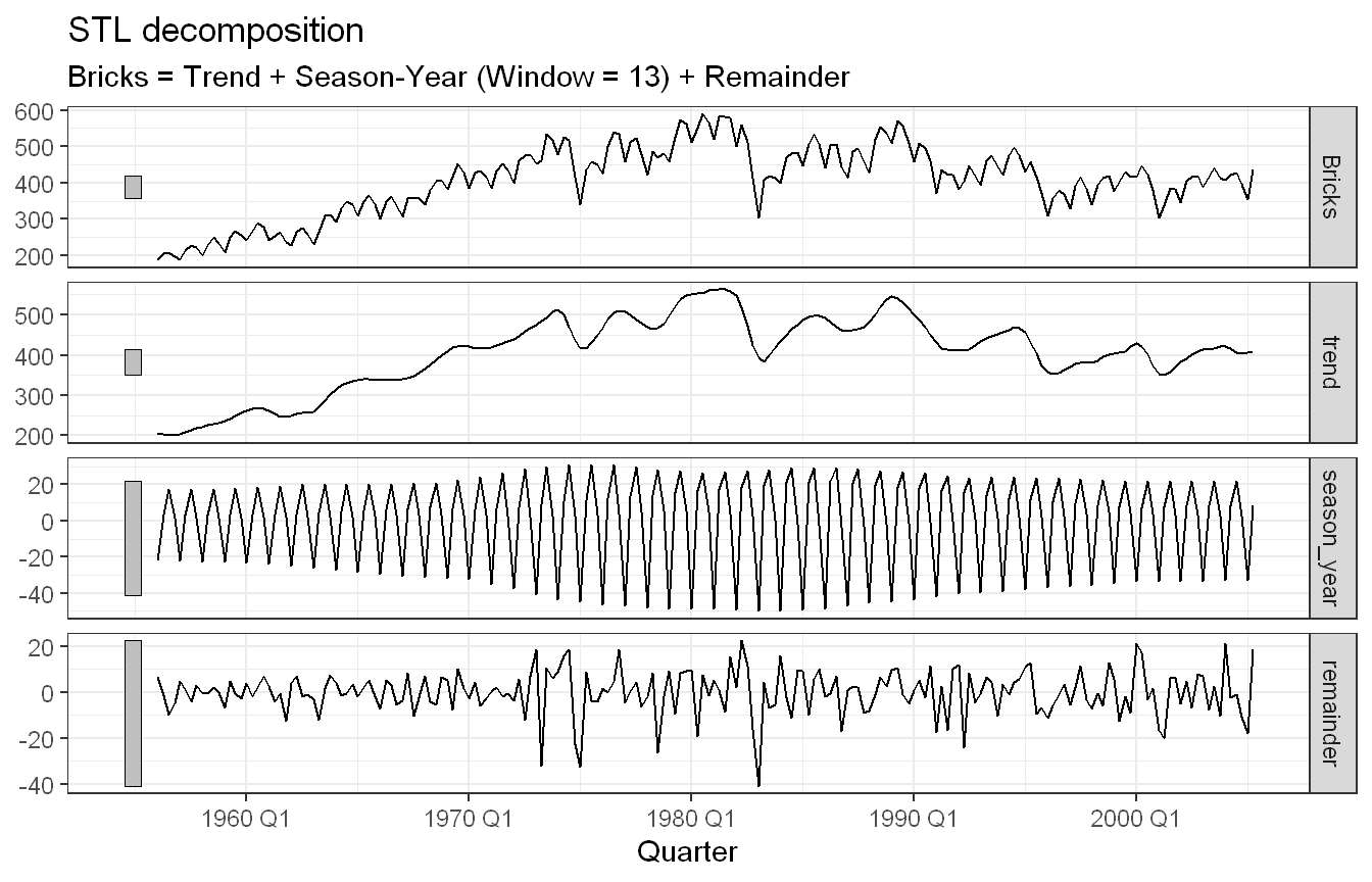
Approach: We filtered aus_production to the Bricks series and ran STL decomposition twice, once with a fixed periodic seasonal window and once with a flexible window, to compare how each handles the seasonal component.
The STL decomposition reveals a clear trend and seasonal pattern in Australian clay brick production. The trend shows strong growth from the late 1950s through the late 1970s, peaking around 1980, followed by a decline and a partial recovery through the 2000s. The seasonal component shows consistent quarterly fluctuations throughout the series. The remainder component appears relatively small compared to the trend and seasonal components (for the most part), suggesting the decomposition captures the main structure of the series well.
Comparing the two decomposition methods, using a fixed seasonal window (window = "periodic") produces a slightly smaller remainder than the flexible window (window = 13), indicating it fits the seasonal component marginally better. This is consistent with the visual evidence that the seasonal pattern in brick production is stable over time and does not change meaningfully from decade to decade, making a fixed seasonality assumption reasonable for this series.
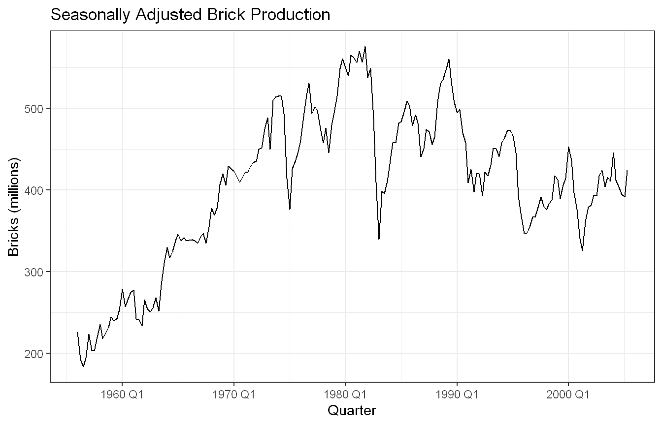
Approach: Using the periodic STL decomposition, we extracted and plotted the seasonally adjusted series.
The seasonally adjusted series removes the quarterly fluctuations, leaving the underlying trend and irregular components. The long-term growth in brick production from the late 1950s through 1980 is now more clearly visible, as is the sharp decline following the early 1980s recession and the subsequent volatility through the 1990s and 2000s. Without the seasonal noise, the cyclical nature of the construction industry in recent years becomes more apparent.
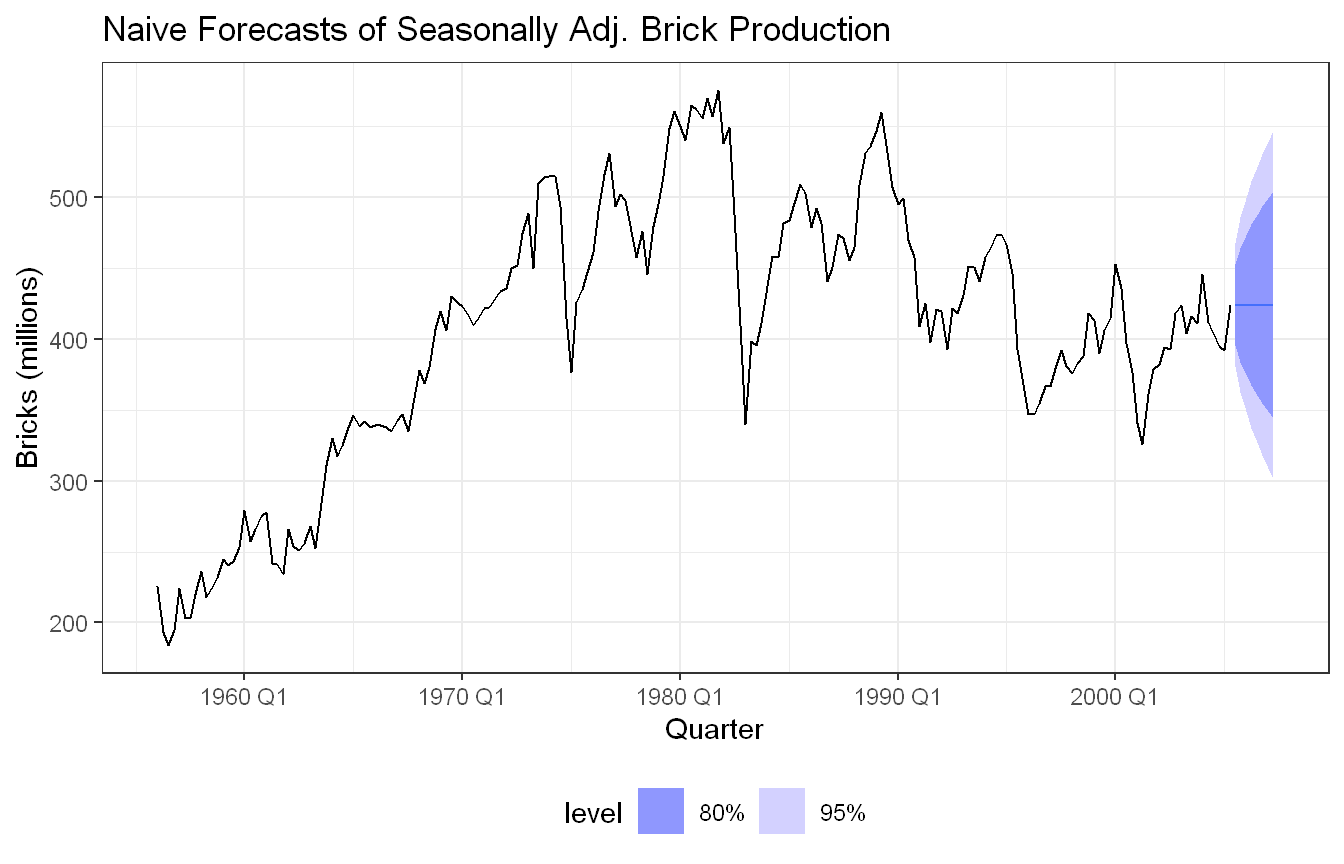
Approach: We stored the seasonally adjusted series and fit a naive model directly on it to forecast the next two years.
The naive method forecasts the seasonally adjusted series by carrying forward the last observed value. The forecast is flat at around 420 million bricks, which reflects the most recent level of production. The prediction intervals widen over time, capturing the increasing uncertainty of the forecast horizon. Given the volatility in the series, particularly the large swings seen through the 1980s and 1990s, the wide intervals are not surprising. The naive method makes no assumption about future direction, which is reasonable here since there is no clear trend in the most recent period of the data.
Approach: We used decomposition_model() to combine the STL decomposition with a naive forecast of the seasonally adjusted component, then reseasonalised to obtain forecasts on the original scale.
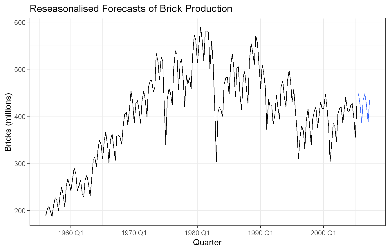
The decomposition_model() function reapplies the seasonal component back onto the naive forecasts of the seasonally adjusted data, producing forecasts for the original brick production series. Compared to part 3, the forecasts now reflect the expected quarterly fluctuations rather than a flat line, making them more realistic and interpretable. The prediction intervals are wider than in part 3 since they now account for uncertainty in both the seasonal and the seasonally adjusted components. The forecast level sits around 420 million bricks, consistent with recent production, with the seasonal pattern giving the forecasts their characteristic up and down shape across quarters.
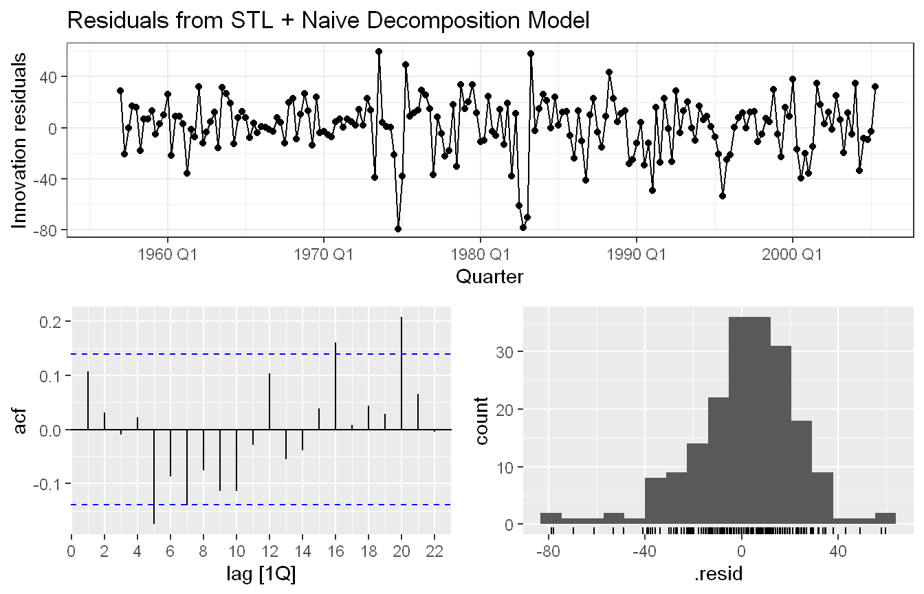
Approach: We checked whether the residuals from the decomposition model in part 4 are uncorrelated using residual diagnostic plots.
The residuals look mostly uncorrelated. Most ACF spikes fall within the confidence bounds, though there are a couple of marginally significant spikes at lags 5, 16, and 20. The residuals fluctuate around zero with no obvious pattern, which is good. The histogram is roughly bell-shaped but has a slight left skew, with a few large negative residuals visible in the time plot, likely reflecting the economic downturn during 80s. Overall the residuals are acceptable but not ideal.
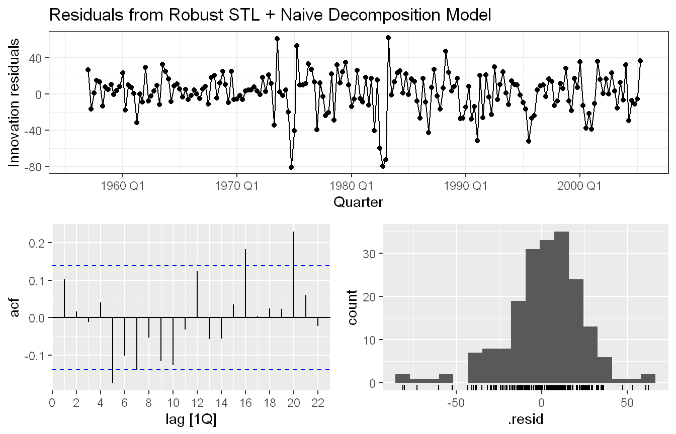
Approach: We repeated the decomposition with robust = TRUE to down-weight outliers, and compared the resulting residuals to the standard version.
The robust STL decomposition produces somewhat different residuals compared to the standard version. The residual range narrows from roughly -80 to 40 down to -50 to 50, reflecting the robust method’s down-weighting of large outliers around the late 1970s, which gets absorbed into the trend component rather than left in the remainder. However, the ACF shows slightly larger spikes in the robust version, suggesting that by reducing the influence of outliers, the robust decomposition exposes a bit more autocorrelation structure in the residuals. The histogram shape remains similarly left-skewed in both cases. Overall the robust version does make a modest difference for this dataset, though neither decomposition produces fully uncorrelated residuals.
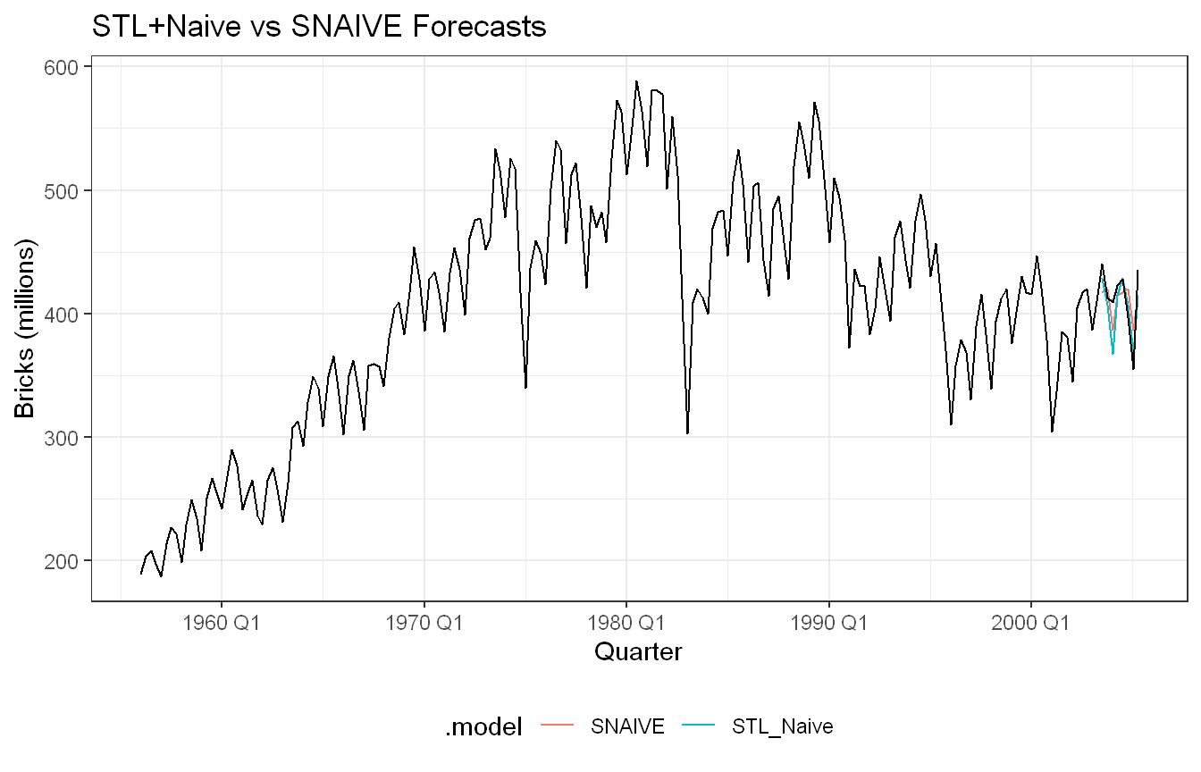
Approach: We split the data into a training set excluding the last two years and a test set of the final two years, then compared the decomposition model against SNAIVE() on forecast accuracy.
Based on the accuracy table, STL+Naive performs better than SNAIVE on RMSE (18.10 vs 20.00) and MAE (13.75 vs 18.25), though SNAIVE has a smaller ME (2.75 vs 8.00), indicating less bias overall. Looking at the test period more closely, the two models perform differently depending on the part of the series. SNAIVE tracks the first smaller dip more accurately, while STL+Naive follows the second larger dip better. This suggests the two models capture different aspects of the variation in the test period, and neither is uniformly superior. On balance, STL+Naive edges out SNAIVE on most aggregate accuracy measures, but the choice between them may depend on which part of the forecast horizon matters most and requires more testing.
Exercise HA 8.8.1
Consider the number of pigs slaughtered in Victoria, available in the aus_livestock dataset.
Use the ETS() function to estimate the equivalent model for simple exponential smoothing. Find the optimal values of alpha and l0, and generate forecasts for the next four months.
Compute a 95% prediction interval for the first forecast using y-hat plus or minus 1.96s where s is the standard deviation of the residuals. Compare your interval with the interval produced by R.
Code and Discussion
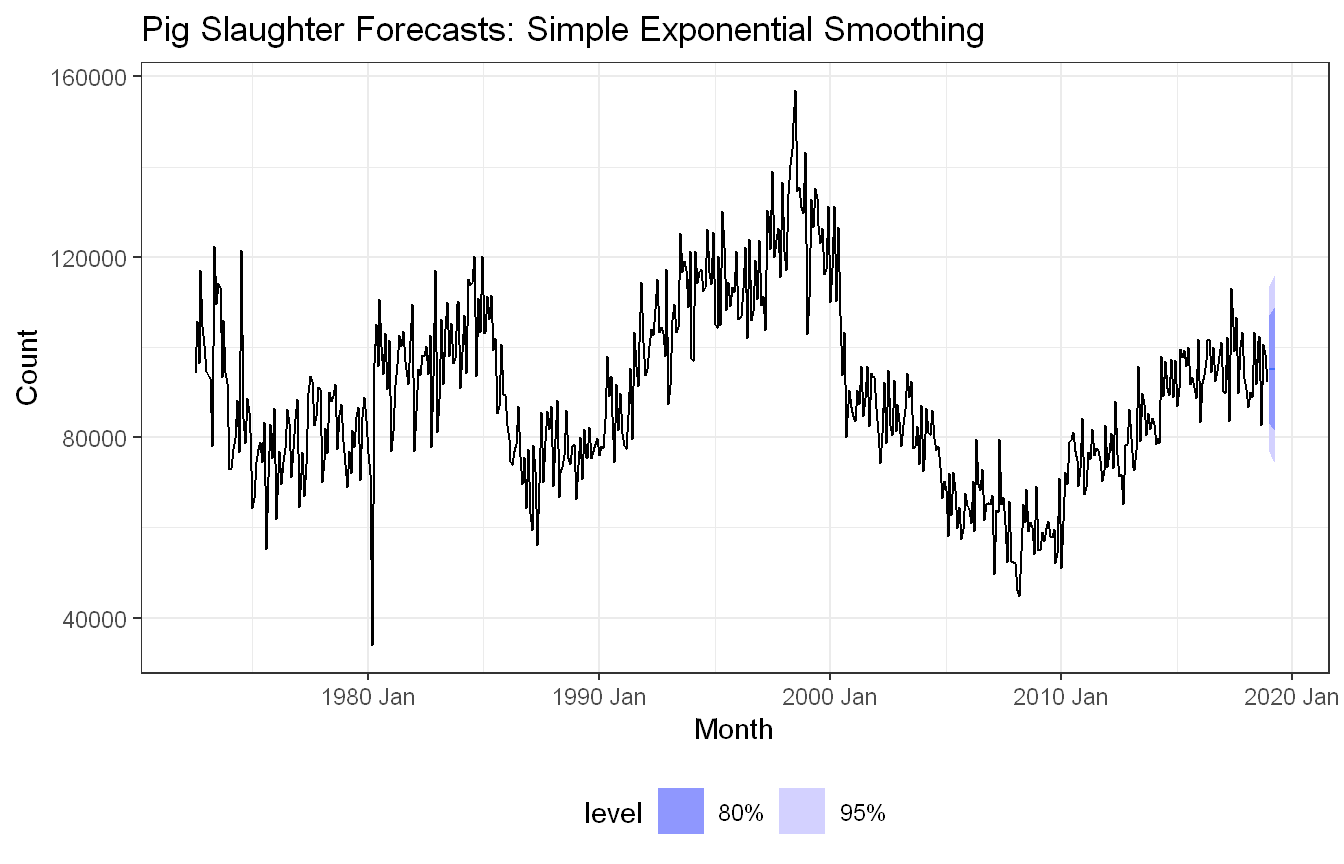
Approach: We filtered aus_livestock to Victorian pig slaughter counts and fit an ETS(A,N,N) model, which is equivalent to simple exponential smoothing, letting R optimize alpha and the initial level by maximum likelihood.
The ETS(A,N,N) model finds the optimal values by minimizing the log-likelihood and estimates alpha of 0.322, meaning roughly 32% of the weight is placed on the most recent observation and the remainder on the historical average. The initial level l[0] is estimated at 100,647. The relatively moderate alpha suggests the model does not react too aggressively to recent changes, which is reasonable given the noisy nature of the series. The forecasts are flat at around 90,000 pigs, which is consistent with simple exponential smoothing having no trend or seasonal component. The wide prediction intervals reflect the considerable variability in the historical data.
Approach: We computed a manual 95% prediction interval for the first forecast using the residual standard deviation, then compared it against R’s interval from hilo().
Manual 95% PI: [76871.01, 113502.10]
R      95% PI: [76854.79, 113518.33]
The manual interval (76,871 to 113,502) is very close to R’s interval (76,855 to 113,519), with only a small difference due to R using the theoretical standard deviation based on the model’s \(sigma^2\) rather than the empirical standard deviation of the residuals. The two approaches converge to nearly the same result, which validates the manual calculation. The interval is quite wide, spanning around 37,000 pigs, which reflects the high variability in the series seen in the plot.
Exercise HA 8.8.5
Data set global_economy contains the annual Exports from many countries. Select one country to analyse.
Plot the Exports series and discuss the main features of the data.
Use an ETS(A,N,N) model to forecast the series, and plot the forecasts.
Compute the RMSE values for the training data.
Compare the results to those from an ETS(A,A,N) model. (Remember that the trended model is using one more parameter than the simpler model.) Discuss the merits of the two forecasting methods for this data set.
Compare the forecasts from both methods. Which do you think is best?
Calculate a 95% prediction interval for the first forecast for each model, using the RMSE values and assuming normal errors. Compare your intervals with those produced using R.
Code and Discussion
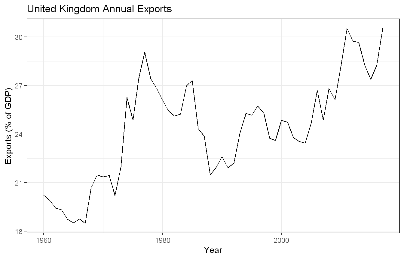
Approach: We selected the United Kingdom from global_economy and plotted its Exports series (% of GDP) to inspect the main features before modelling.
Show code
uk_economy <- global_economy |>filter(Country =="United Kingdom")uk_economy |>autoplot(Exports) +labs(title ="United Kingdom Annual Exports",x ="Year", y ="Exports (% of GDP)") +theme_bw()
UK exports as a percentage of GDP show an overall upward trend from around 19% in 1960s to just over 30% by the mid-2010s. The series is not smooth, with notable volatility throughout. A sharp rise occurs in the mid-1970s, likely linked to North Sea oil exports and currency effects following the 1973 oil crisis, followed by a significant decline through the early 1980s during the recession (https://en.wikipedia.org/wiki/Economy_of_the_United_Kingdom). A second period of growth begins in the mid-1980s, interrupted again around 2009 during the global financial crisis. There is no apparent seasonal pattern given the data is annual. The overall trend suggests increasing openness of the UK economy to international trade over the period.
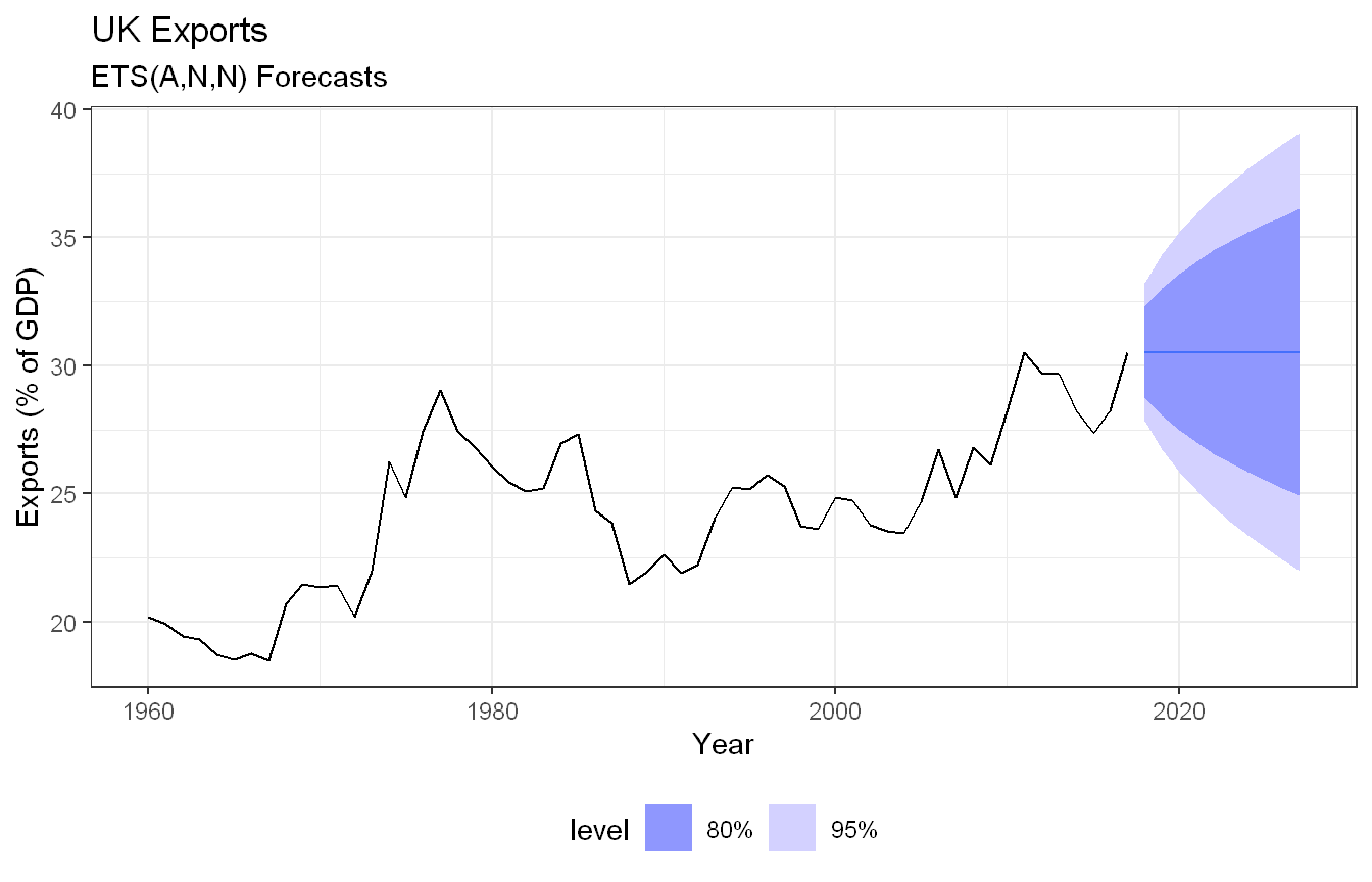
Approach: We fit an ETS(A,N,N) model, equivalent to simple exponential smoothing, and forecast 10 years ahead.
The ETS(A,N,N) model produces a flat forecast at around 30.5% of GDP, carrying forward the most recent level with no trend. The prediction intervals widen considerably over the 10-year horizon, reflecting the substantial variability in the historical series. Given the volatility seen in the data, the wide intervals are not surprising, though they limit the practical usefulness of the forecast.
Approach: We extracted the training RMSE for the ETS(A,N,N) model from accuracy().
Show code
fit_ann |>accuracy() |>pull(RMSE) |> (\(rmse_ann) cat(sprintf("ETS(A,N,N) Training RMSE: %.4f\n", rmse_ann)))()
ETS(A,N,N) Training RMSE: 1.3545
The ETS(A,N,N) model achieves a training RMSE of 1.3545, meaning the model’s fitted values deviate from the actual exports by about 1.35 percentage points of GDP on average.
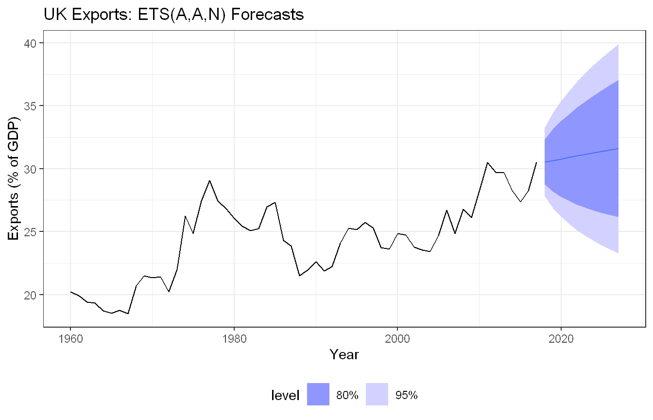
Approach: We fit an ETS(A,A,N) model, which adds an additive trend component, and compared its training RMSE to the simpler ETS(A,N,N) model.
fit_aan |>accuracy() |>pull(RMSE) |> (\(rmse_aan) cat(sprintf("ETS(A,A,N) Training RMSE: %.4f\n", rmse_aan)))()
ETS(A,A,N) Training RMSE: 1.3509
The ETS(A,A,N) model adds a trend component to the simple exponential smoothing model, using one additional parameter. The training RMSE drops only marginally from 1.3545 to 1.3509, suggesting the trend component contributes very little improvement in fit. This is consistent with the visual evidence: the series does have a long-term upward trend, but it is noisy and irregular enough that the additive trend parameter does not materially help on the training data. The added complexity of ETS(A,A,N) is hard to justify given the negligible gain.
Approach: We plotted both models’ forecasts together on the same axes to compare their projected paths.
Show code
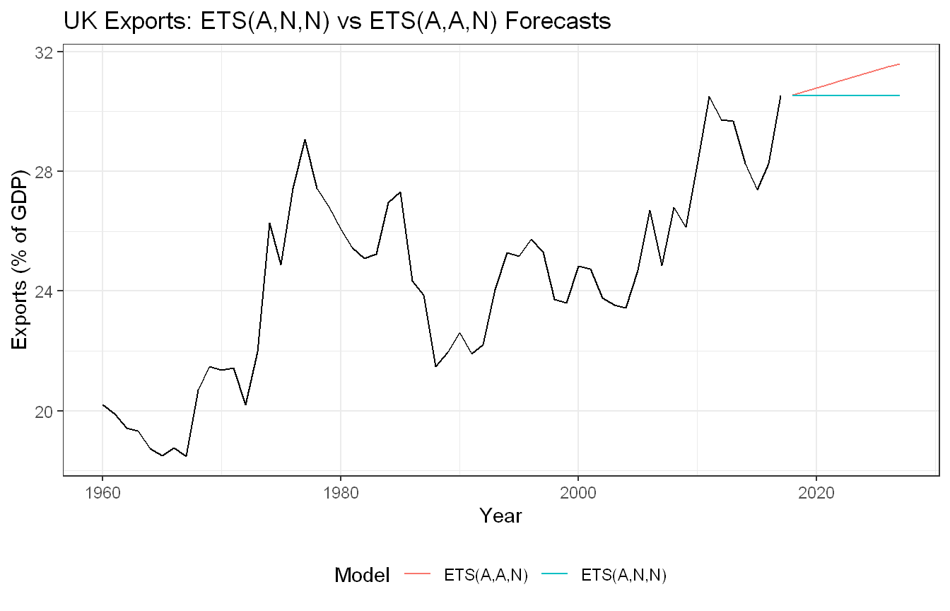
uk_economy |>model(`ETS(A,N,N)`=ETS(Exports ~error("A") +trend("N") +season("N")),`ETS(A,A,N)`=ETS(Exports ~error("A") +trend("A") +season("N")) ) |>forecast(h =10) |>autoplot(uk_economy, level =NULL) +labs(title ="UK Exports: ETS(A,N,N) vs ETS(A,A,N) Forecasts",x ="Year", y ="Exports (% of GDP)", color ="Model") +theme_bw() +theme(legend.position ="bottom")
The two models produce notably different forecasts despite similar training RMSE values. ETS(A,N,N) produces a flat forecast at around 30.5%, while ETS(A,A,N) projects a continued upward trend reaching around 32% by 2027. Given the overall upward trend visible in the historical data, ETS(A,A,N) produces a more intuitive forecast. However, the series is volatile and the recent data shows some flattening, so the flat forecast from ETS(A,N,N) is not unreasonable either. On balance, ETS(A,A,N) is arguably the better choice given the long-term trend in the data, but the difference in training RMSE is too small to be decisive on its own.
Approach: We computed manual 95% prediction intervals for the first forecast of each model using the training RMSE, and compared them to the intervals R produces analytically.
The manual intervals are close to R’s but not identical. For ETS(A,N,N) the difference is small, around 0.05 percentage points on each side. For ETS(A,A,N) the gap is slightly larger, around 0.10 percentage points. This is because the manual calculation uses the training RMSE as a substitute for the theoretical forecast standard deviation, while R derives the intervals analytically from the model’s error variance and the forecast horizon. The ETS(A,A,N) discrepancy is larger because the trended model’s forecast variance grows with the horizon in a more complex way that the simple RMSE approximation does not fully capture.
Exercise HA 8.8.10
Compute the total domestic overnight trips across Australia from the tourism dataset.
Plot the data and describe the main features of the series.
Decompose the series using STL and obtain the seasonally adjusted data.
Forecast the next two years of the series using an additive damped trend method applied to the seasonally adjusted data. (This can be specified using decomposition_model().)
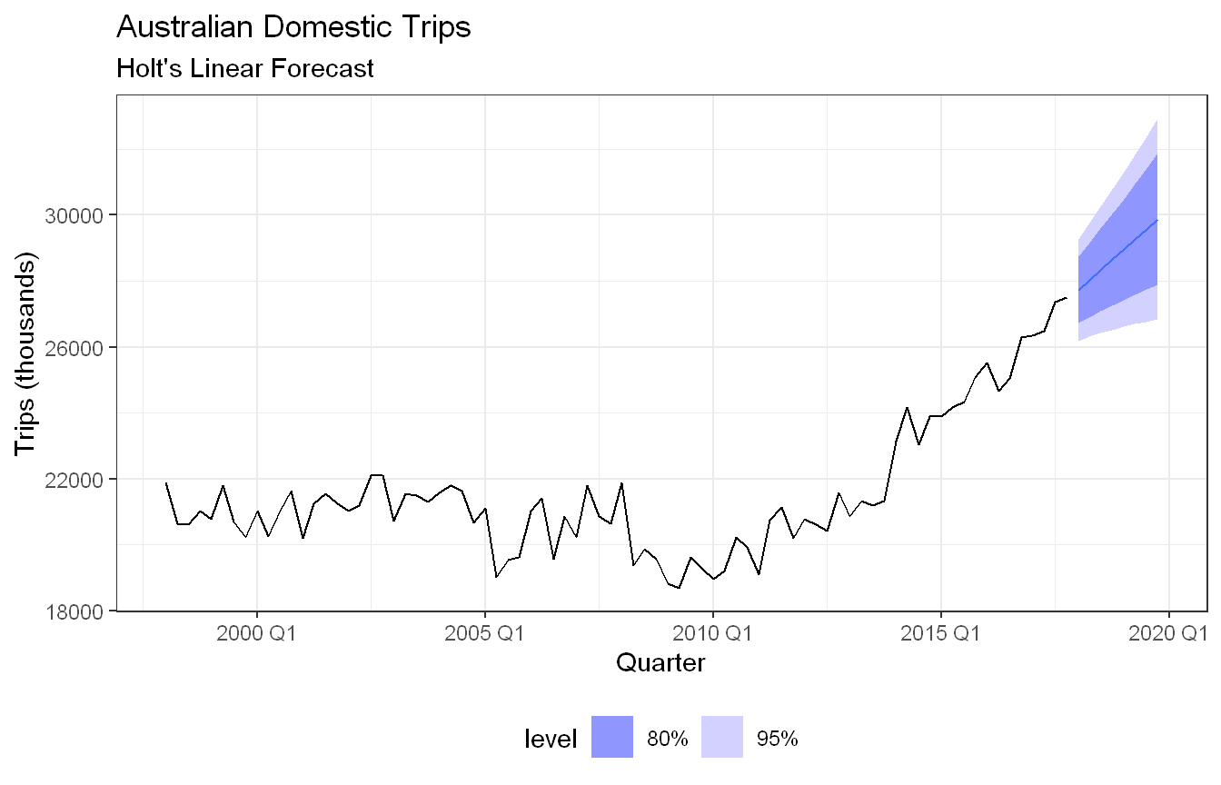
Forecast the next two years of the series using an appropriate model for Holt’s linear method applied to the seasonally adjusted data (as before but without damped trend).
Now use ETS() to choose a seasonal model for the data.
Compare the RMSE of the ETS model with the RMSE of the models you obtained using STL decompositions. Which gives the better in-sample fits?
Compare the forecasts from the three approaches? Which seems most reasonable?
Check the residuals of your preferred model.
Code and Discussion
Approach: We aggregated tourism across all regions and purposes to get total domestic overnight trips for Australia, then plotted the series.
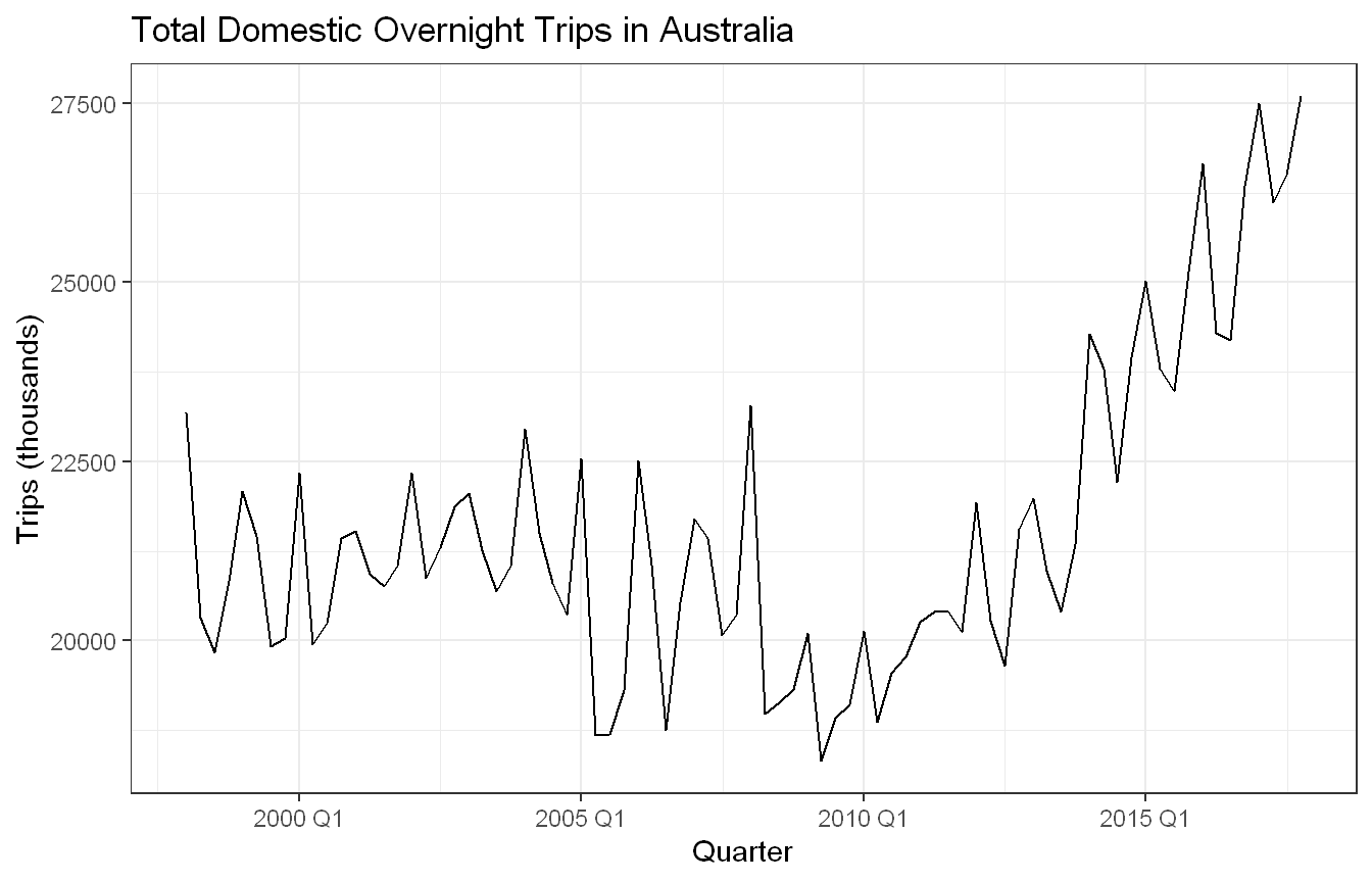
Show code
aus_trips <- tourism |>summarise(Trips =sum(Trips))aus_trips |>autoplot(Trips) +labs(title ="Total Domestic Overnight Trips in Australia",x ="Quarter", y ="Trips (thousands)") +theme_bw()
The series shows a clear upward trend from early 2010’s onwards, while the earlier period from 1998 to 2013 appears relatively flat with no consistent direction. There is a strong seasonal pattern throughout, with regular quarterly fluctuations visible across the entire series. A notable dip occurs around 2008 to 2010, likely reflecting the impact of the global financial crisis on domestic travel. The combination of stable seasonality and a more recent upward trend suggests a model that can handle both components would be appropriate.
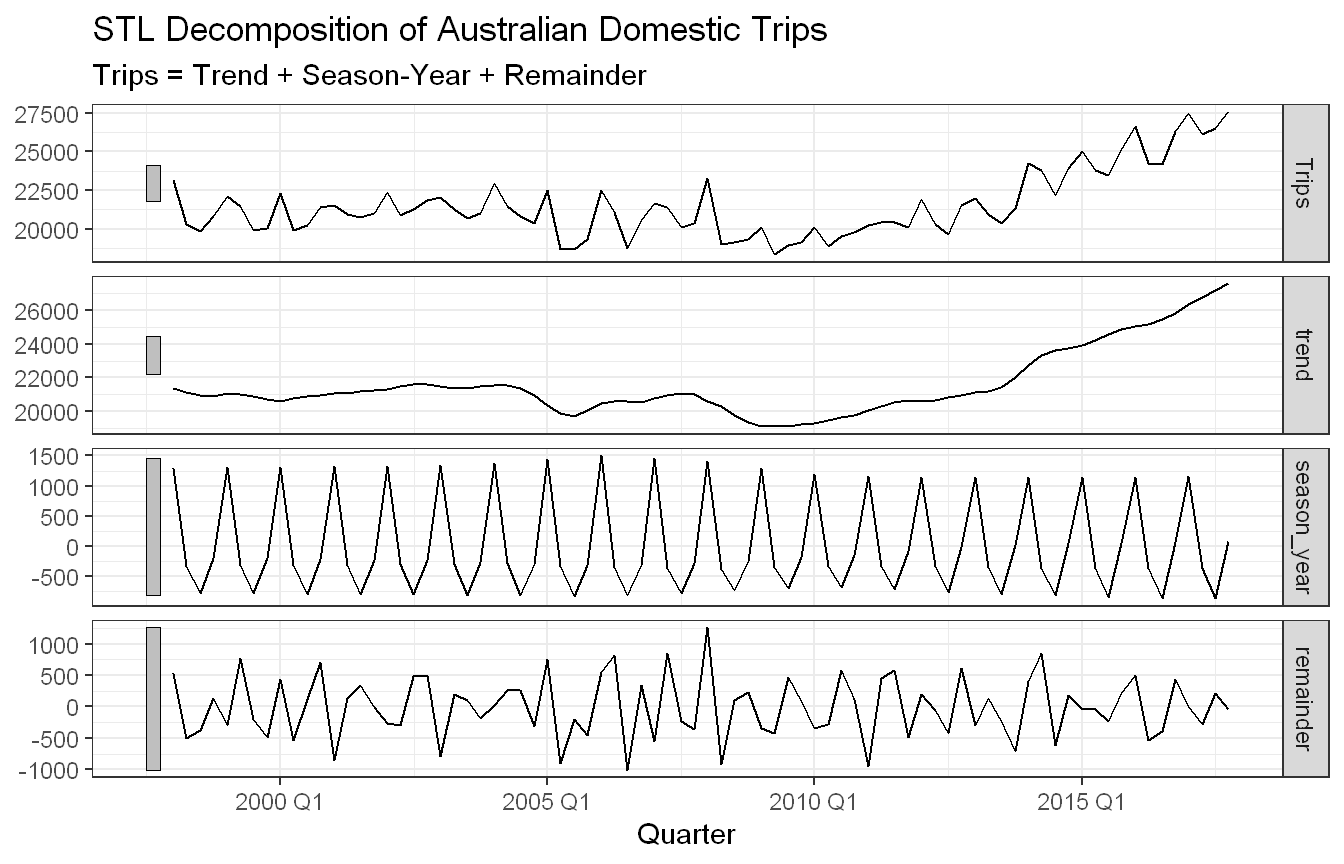
Approach: We ran an STL decomposition with a flexible seasonal window and extracted the seasonally adjusted component for use in later parts.
The STL decomposition clearly separates the three components. The trend component confirms the flat period from the late 1990s through around 2010, followed by a strong upward movement through to 2017. The seasonal component shows consistent quarterly fluctuations throughout the series with relatively stable amplitude, suggesting the seasonality does not change much over time, which supports the choice of window = 13. The remainder is small relative to the trend and seasonal components, indicating the decomposition captures the main structure of the series well.
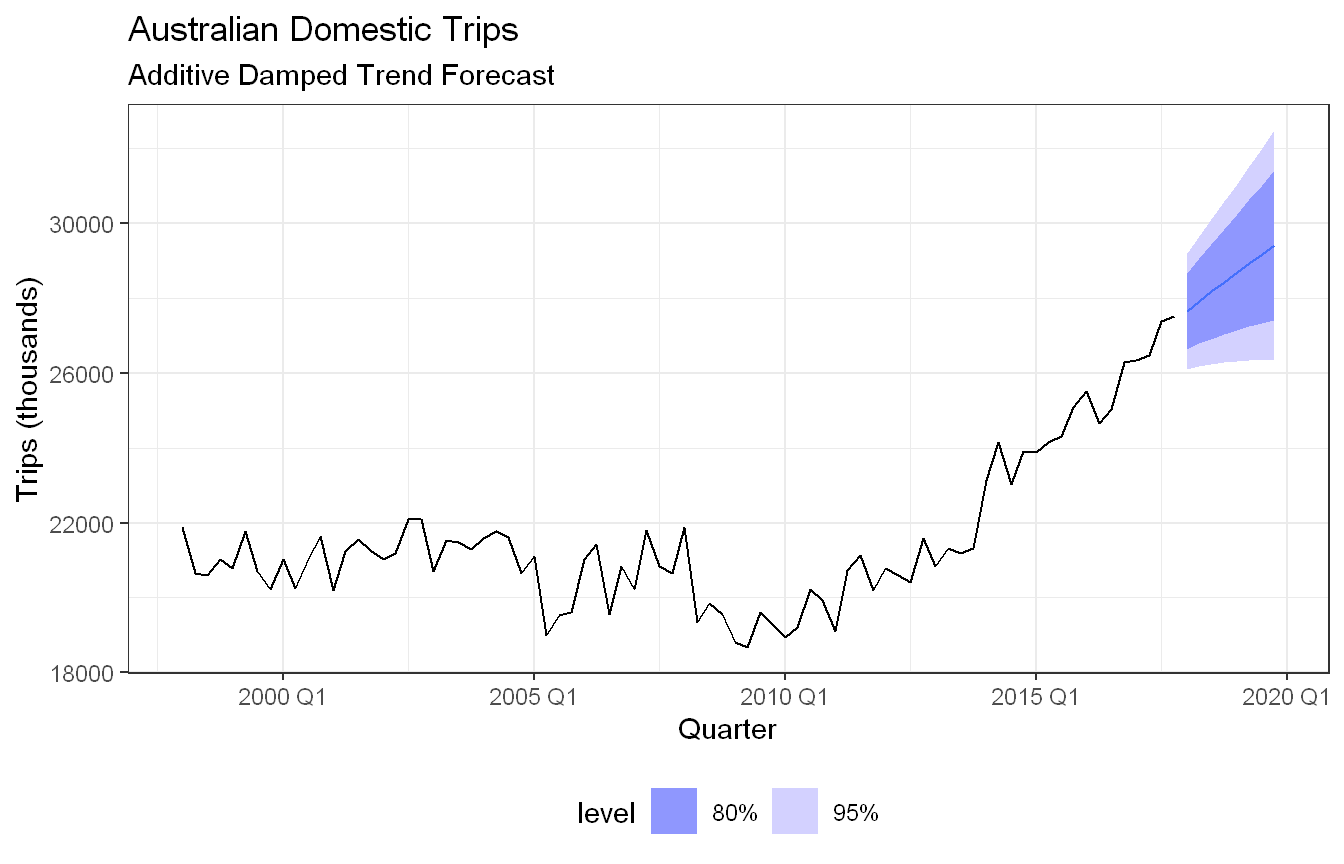
Approach: We fit an ETS model with additive damped trend on the seasonally adjusted series and forecast two years ahead.
The additive damped trend model forecasts continued growth in seasonally adjusted trips over the next two years, but at a gradually slowing rate due to the damping parameter. The forecast reaches around 28,000 thousand trips by the end of the horizon, with the damping pulling the trend back from the steep growth seen in the most recent years. The prediction intervals are relatively tight, reflecting the strong and consistent trend in the recent data.
Approach: We fit Holt’s linear method (additive trend, no damping) on the same seasonally adjusted series for comparison.
Holt’s linear method produces a steeper forecast compared to the damped trend model, projecting continued growth at a constant rate through the two year horizon. The forecast reaches slightly higher values than the damped version since there is no dampening pulling the trend back. The prediction intervals are also slightly wider, reflecting the greater uncertainty of assuming the recent steep trend will continue unchanged. Whether this is realistic depends on whether the strong growth seen from 2013 onward is expected to persist.
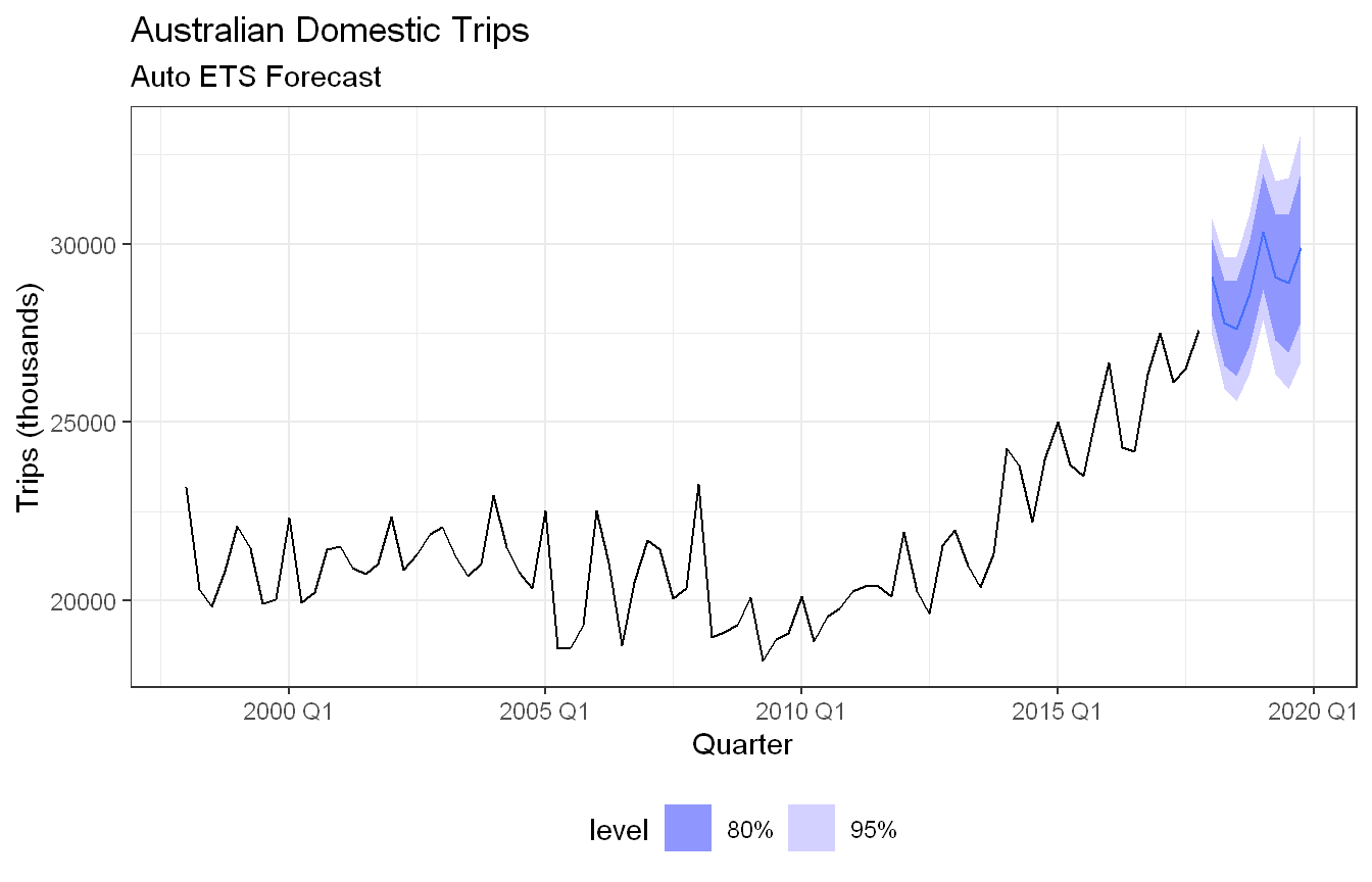
Approach: We let ETS() automatically select the best seasonal model for the original (non-adjusted) series.
ETS() selected an ETS(A,A,A) model, meaning additive error, additive trend, and additive seasonality. This is a fuller model than the STL-based approaches in parts 3 and 4 since it handles seasonality directly rather than on the adjusted series. The smoothing parameters show a moderate alpha (0.45), a small beta (0.04) indicating the trend changes slowly, and a near-zero gamma (0.0001) meaning the seasonal pattern is essentially fixed over time. The forecast shows continued upward growth with the seasonal pattern reapplied, and the prediction intervals widen noticeably over the horizon reflecting the compounding uncertainty from all three components.
Approach: We compared training RMSE across the auto ETS model and the two STL-based models from parts 3 and 4.
The STL-based models both outperform the automatic ETS(A,A,A) on training RMSE, with Holt’s linear method edging out the damped trend very slightly (765.49 vs 766.14). The ETS(A,A,A) RMSE is notably higher at 793.67, suggesting the STL decomposition approach fits the training data better. However, the differences are relatively small and training RMSE alone does not tell the full story since the STL models are fitted on the seasonally adjusted series while ETS(A,A,A) is fitted on the original data, making a direct comparison somewhat imperfect.
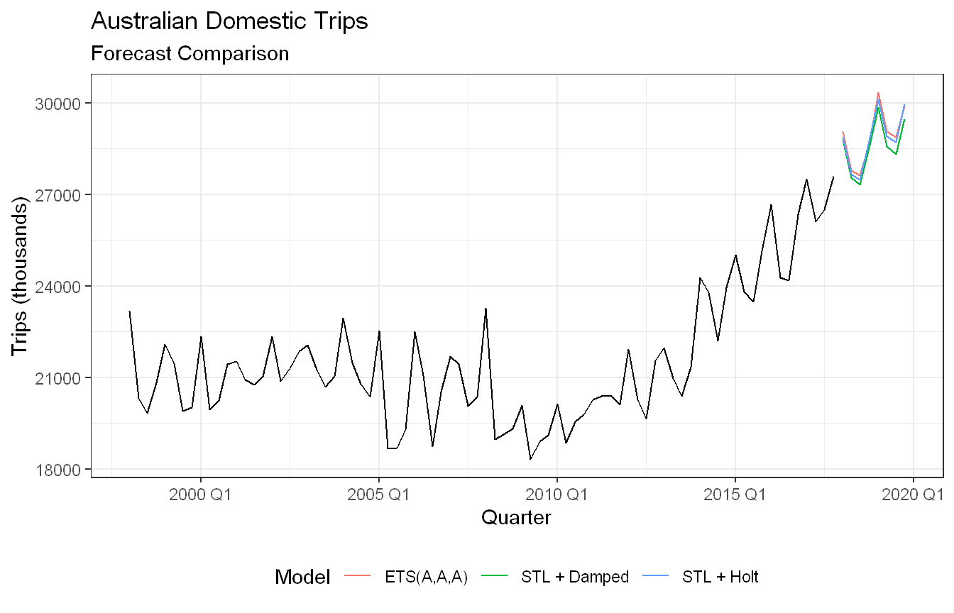
Approach: We plotted forecasts from all three approaches together to compare their shapes and levels.
All three models produce similar forecasts, with the seasonal pattern clearly visible in all of them. The STL + Holt and ETS(A,A,A) forecasts track closely together, while STL + Damped sits slightly lower due to the damping pulling the trend back. The differences between the three are small, suggesting all three approaches are capturing the main features of the series similarly. Given the strong and consistent upward trend in the recent data, the undamped models may be slightly more appropriate, though the damped trend offers more conservative forecasts which could be preferable if there is uncertainty about whether the recent growth will persist.
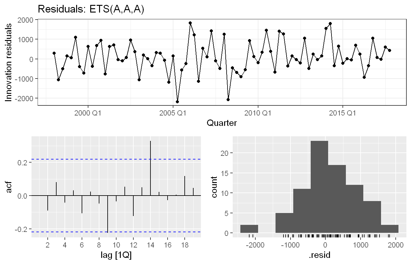
Approach: We selected ETS(A,A,A) as the preferred model and examined its residuals for autocorrelation and normality.
The residuals from the ETS(A,A,A) model fluctuate around zero with no obvious pattern, which is a good sign. ETS(A,A,A) was selected as the preferred model as it handles trend and seasonality jointly (and produced the most symmetric residual distribution among the three approaches). However, the ACF shows a significant spike at lag 14, indicating some remaining autocorrelation the model has not fully captured. The histogram is roughly symmetric but has a slight left skew, driven by a few large negative residuals visible around 2005. Overall the residuals are acceptable but not ideal, and the lag 14 spike is worth noting as a potential area for improvement.
Exercise HA 8.8.13
Compare ETS(), SNAIVE() and decomposition_model(STL, ???) on the following five time series. You might need to use a Box-Cox transformation for the STL decomposition forecasts. Use a test set of three years to decide what gives the best forecasts.
Beer and bricks production from aus_production.
Cost of drug subsidies for diabetes (ATC2 == "A10") and corticosteroids (ATC2 == "H02") from PBS.
Total food retailing turnover for Australia from aus_retail.
Code and Discussion
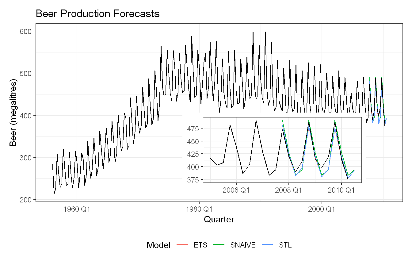
Approach: We split Beer production into a training set excluding the last three years and fit ETS, SNAIVE and an STL decomposition model, then compared accuracy on the held-out test set. No Box-Cox transformation was used since the seasonal variance does not grow noticeably with the level.
Show code
beer <- aus_production |>select(Quarter, Beer) |>filter(!is.na(Beer))beer_train <- beer |>filter(Quarter <yearquarter("2007 Q4"))fit_beer <- beer_train |>model(ETS =ETS(Beer),SNAIVE =SNAIVE(Beer),STL =decomposition_model(STL(Beer ~trend() +season(window ="periodic")),ETS(season_adjust) ) )p_full <- fit_beer |>forecast(h =12) |>autoplot(beer, level =NULL) +labs(title ="Beer Production Forecasts",x ="Quarter", y ="Beer (megalitres)",color ="Model") +theme_bw() +theme(legend.position ="bottom")p_zoom <- fit_beer |>forecast(h =12) |>autoplot(beer |>filter(Quarter >=yearquarter("2005 Q1")), level =NULL) +labs(title =NULL, x =NULL, y =NULL, color =NULL) +theme_bw() +theme(legend.position ="none")p_full +inset_element(p_zoom, left =0.4, bottom =0.02, right =0.9, top =0.5)
ETS and STL are very close across all metrics, with STL edging out ETS on RMSE (11.58 vs 11.60) and RMSSE (0.590 vs 0.591), while ETS has a slight edge on MAE (9.58 vs 9.92). SNAIVE performs notably worse on all metrics. The inset plot confirms this, with all three models capturing the seasonal pattern reasonably well, though SNAIVE tends to forecast slightly higher peaks while ETS and STL track the actual values more closely through the test period. The near-identical performance of ETS and STL suggests both are capturing the series structure equally well. Given the marginal differences, either ETS or STL would be a reasonable choice, but SNAIVE is clearly the weakest of the three for beer production.
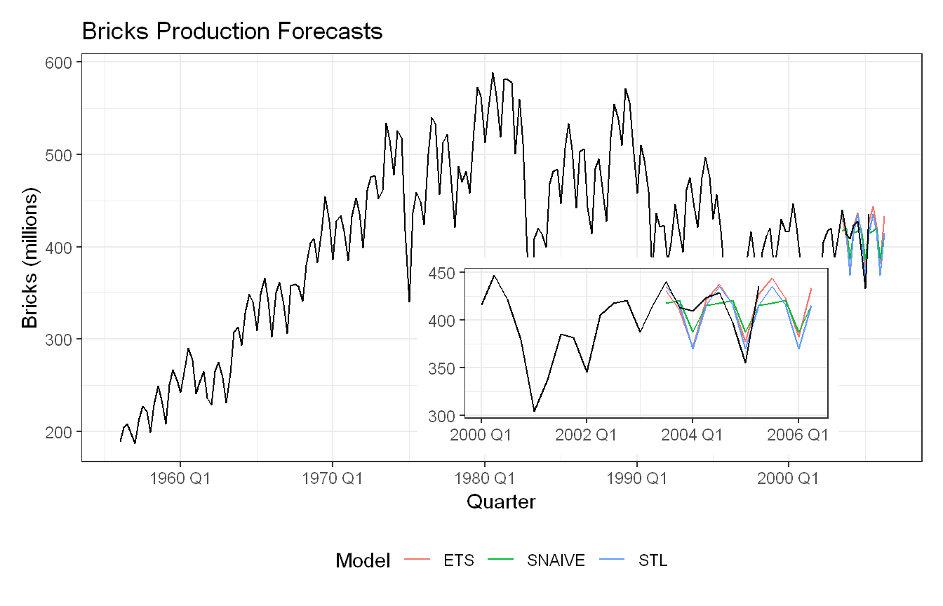
Approach: We repeated the same three-model comparison for Bricks production using a three-year test set. No Box-Cox transformation was applied since the seasonal variance is fairly stable over time.
Show code
bricks <- aus_production |>select(Quarter, Bricks) |>filter(!is.na(Bricks))bricks_train <- bricks |>filter(Quarter <yearquarter("2003 Q3"))fit_bricks <- bricks_train |>model(ETS =ETS(Bricks),SNAIVE =SNAIVE(Bricks),STL =decomposition_model(STL(Bricks ~trend() +season(window ="periodic")),ETS(season_adjust) ) )p_full <- fit_bricks |>forecast(h =12) |>autoplot(bricks, level =NULL) +labs(title ="Bricks Production Forecasts",x ="Quarter", y ="Bricks (millions)",color ="Model") +theme_bw() +theme(legend.position ="bottom")p_zoom <- fit_bricks |>forecast(h =12) |>autoplot(bricks |>filter(Quarter >=yearquarter("2000 Q1")), level =NULL) +labs(title =NULL, x =NULL, y =NULL, color =NULL) +theme_bw() +theme(legend.position ="none")p_full +inset_element(p_zoom, left =0.4, bottom =0.02, right =0.9, top =0.5)
ETS performs best across almost all metrics, with the lowest RMSE (17.68), MAE (13.67), MASE (0.38) and RMSSE (0.360). STL comes in second, performing noticeably better than SNAIVE but trailing ETS on all measures. SNAIVE is again the weakest of the three. The inset plot shows all three models tracking the seasonal pattern in the test period reasonably well, with ETS and STL following the actual values more closely while SNAIVE overshoots slightly on the peaks. ETS is the clear winner for bricks production.
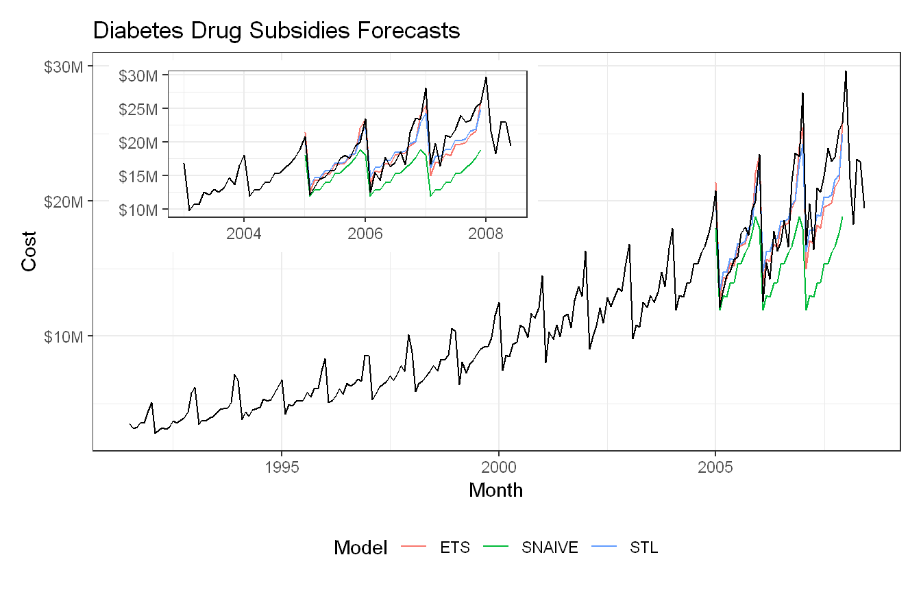
Approach: Since seasonal variation in diabetes drug subsidy costs grows visibly with the level of the series, we applied a Box-Cox transformation (lambda selected via the guerrero method) before the STL decomposition, then compared all three models on a three-year test set.
STL performs best with the lowest RMSE (1.73M) and MAE (1.43M), while ETS is close behind. SNAIVE performs very poorly, with RMSE and ME several times larger than the other two models, which is consistent with the plot where SNAIVE clearly underforecasts and fails to capture the upward trend. The inset shows ETS and STL tracking the actual values much more closely, with STL having a slight edge particularly in capturing the seasonal spikes.
A Box-Cox transformation was applied to the STL model since the seasonal variation in diabetes drug costs grows visibly with the level of the series over time. Without the transformation, the seasonal component estimated from the early lower-cost period would be too small to adequately represent the larger fluctuations seen in later years. The guerrero method was used to automatically select the optimal lambda value.
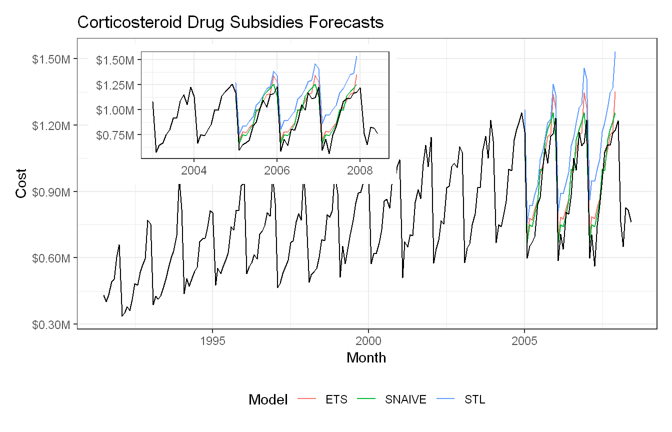
Approach: We applied the same Box-Cox and three-model comparison to the corticosteroid subsidy series, since its seasonal swings also appear to grow somewhat with the level.
Interesting reversal here. Unlike the diabetes series, SNAIVE actually performs best on RMSE (84,872) and MAE (74,006), with ETS coming in second. STL performs worst by a considerable margin, which is surprising given it did well on the diabetes data. The plot helps explain why: the inset shows STL overshooting the peaks significantly in the test period, while ETS and SNAIVE track the actual values more closely. The Box-Cox transformation may not have been the right call here (however it underperforms regardless). For corticosteroids, SNAIVE is the best performing model.
Approach: Since the seasonal spikes in food retailing turnover grow substantially with the level of the series, we applied a Box-Cox transformation before STL decomposition and compared all three models on a three-year test set.
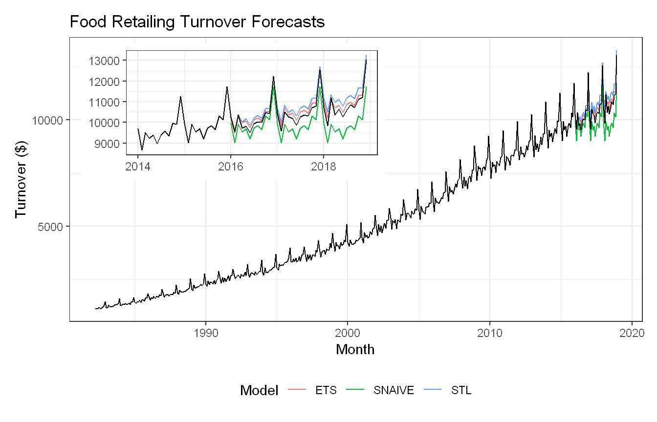
ETS is the clear winner here, with the lowest RMSE (193.8), MAE (169.7), MASE (0.639) and RMSSE across all three models. STL performs reasonably with a RMSE of 380.2, while SNAIVE is again the weakest by a large margin with RMSE of 699.1. The inset plot confirms this, with ETS tracking the actual values most closely throughout the test period, while SNAIVE clearly underforecasts and fails to capture the upward trend. STL captures the trend better than SNAIVE but still overshoots relative to ETS. The Box-Cox transformation helped STL handle the growing variance but was not enough to match ETS on this series.
Summary: Across the five series, ETS consistently performs well, winning or coming close on most accuracy metrics for beer, bricks, diabetes and food retailing. STL with Box-Cox transformation is competitive on series with strong growing variance like diabetes, where it edges out ETS slightly. SNAIVE is the weakest model overall, performing poorly on all series except corticosteroids where it surprisingly outperforms both ETS and STL. This highlights an important point: no single method dominates across all series. The choice of model should be guided by the characteristics of the data, and visual inspection of the series before modelling is essential for deciding whether transformations like Box-Cox are warranted.
Exercise HA 9.11.2
A classic example of a non-stationary series is stock prices. Plot the daily closing prices for Amazon stock (contained in gafa_stock), along with the ACF and PACF. Explain how each plot indicates that the series is non-stationary and should be differenced.
Code and Discussion
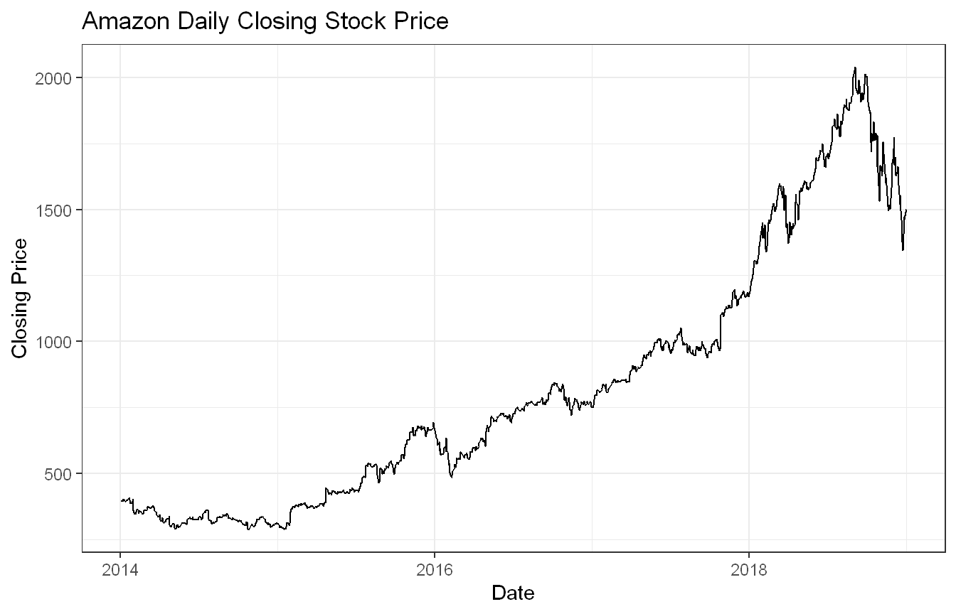
Approach: We filtered gafa_stock to the Amazon ticker and plotted the closing price series.
The time series plot of Amazon’s daily closing stock price shows frequent short-term fluctuations, but the overall direction of the series is upward for much of the time period. Near the end of 2018, the stock price declines noticeably. Because the series does not fluctuate around a constant level and instead shows changing trends over time, it appears to be non-stationary.
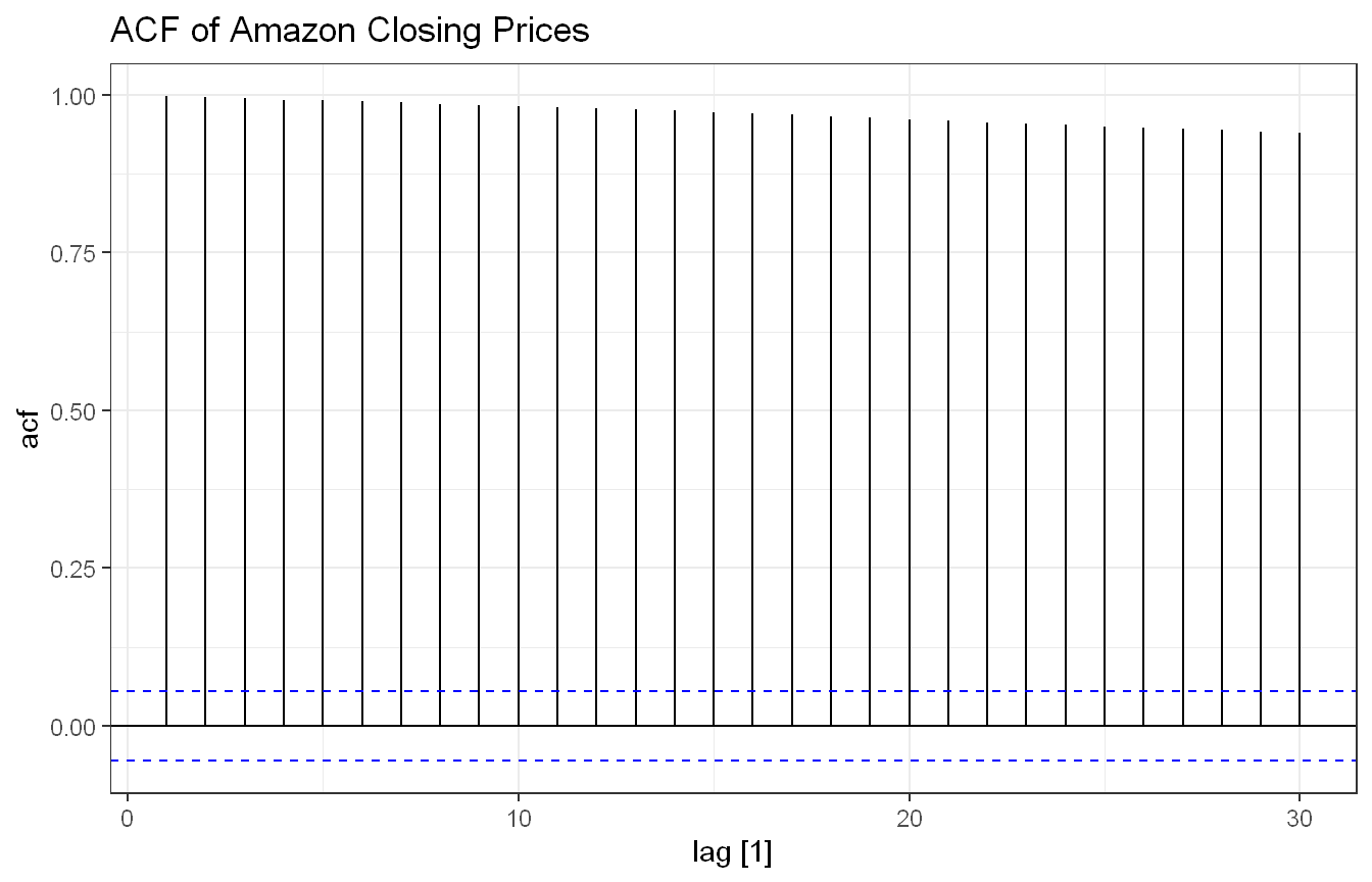
Approach: We produced an ACF plot of the closing price to examine its autocorrelation structure.
Show code
amazon_stock |>ACF(Close) |>autoplot() +labs(title ="ACF of Amazon Closing Prices") +theme_bw()
The ACF plot shows large positive autocorrelations that decline slowly across multiple lags. This indicates that the closing prices remain strongly related to previous values for an extended period. A slow decline in the ACF is commonly associated with non-stationary time series data and suggests that differencing is needed before fitting an ARIMA model. More importantly, every spike up to lag 30 remains well outside the blue confidence bounds without ever tapering back inside them, indicating significant autocorrelation persists at every lag tested rather than fading out, which is a strong signal that the series has a unit root and requires differencing. In general, Financial asset prices almost universally follow a “random walk” where today’s price is just yesterday’s price plus some random shock.
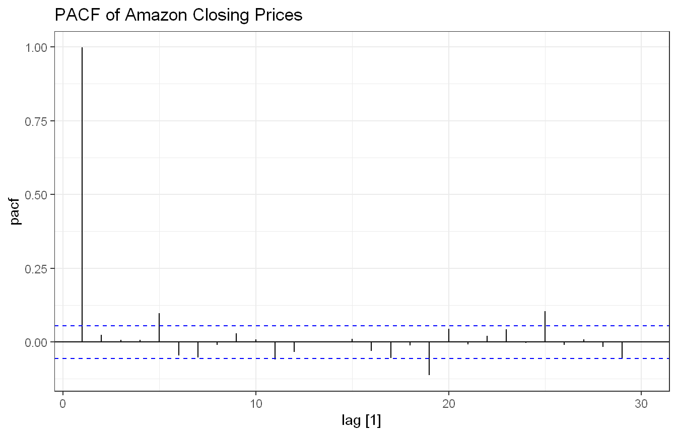
Approach: We produced a PACF plot of the closing price for the same purpose.
Show code
amazon_stock |>PACF(Close) |>autoplot() +labs(title ="PACF of Amazon Closing Prices") +theme_bw()
The PACF plot shows a large spike at lag 1, followed by several smaller significant spikes. The strong relationship with previous observations suggests persistence in the series, consistent with a non-stationary process and supporting the need for differencing.
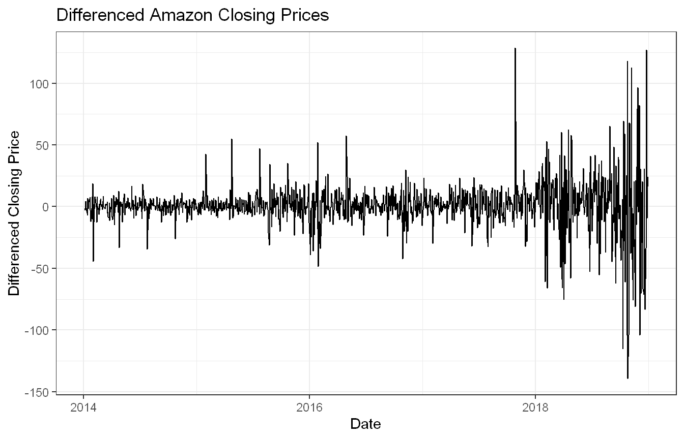
Approach: We applied first differencing to the closing price to assess whether the resulting series looks more stationary.
After differencing the Amazon closing prices, the strong upward movement observed in the original series is reduced. The differenced series fluctuates around zero with both positive and negative values, rather than continuing in a persistent upward trend. Although several large spikes remain, the differenced series focuses on changes in the stock price rather than the price level itself, making it more appropriate for ARIMA modeling. The differenced series resembles a stationary process more closely because it fluctuates around a relatively constant mean rather than exhibiting a persistent trend.
The Amazon daily closing stock price series is non-stationary because it exhibits changing trends over time and strong autocorrelation across multiple lags. The original time series plot shows a changing level, while the ACF plot declines slowly and the PACF plot shows significant spikes. These findings indicate that the series should be differenced before fitting an ARIMA model.
Exercise HA 9.11.8
For the United States GDP series from global_economy:
If necessary, find a suitable Box-Cox transformation for the data.
Fit a suitable ARIMA model to the transformed data using ARIMA().
Try other plausible models by experimenting with the orders chosen.
Choose what you think is the best model and check the residual diagnostics.
Produce forecasts of your fitted model. Do the forecasts look reasonable?
Compare the results with what you would obtain using ETS() (with no transformation).
Code and Discussion
Approach: We filtered global_economy to the United States and plotted the GDP series to assess whether a transformation was needed.
Show code
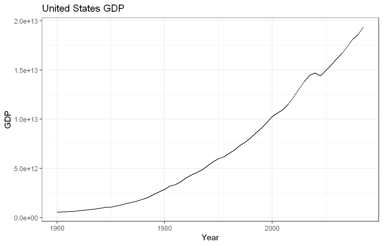
us_gdp <- global_economy |>filter(Country =="United States")us_gdp |>autoplot(GDP) +labs(title ="United States GDP", y ="GDP", x ="Year") +theme_bw()
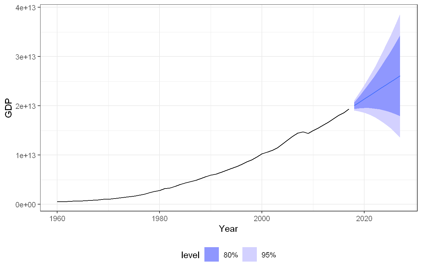
The GDP series shows a smooth upward trend over time with only a few minor declines. Because the series does not fluctuate around a constant level and instead continues to increase throughout the observed period, it appears non-stationary. The increasing level of the series suggests that a transformation and differencing may be necessary before fitting an ARIMA model.
Approach: We used the Guerrero method to select a Box-Cox transformation parameter, then fit an ARIMA model to the transformed series.
The Guerrero method produced a Box-Cox transformation parameter of lambda = 0.282. Because the value is substantially below 1, a Box-Cox transformation was applied to stabilize the variance. The automatic ARIMA procedure selected ARIMA(1,1,0) with drift. This model includes first differencing to remove the trend and a first-order autoregressive component to capture the remaining autocorrelation structure.
Approach: To check whether a different order would fit better, we compared the automatically selected model against several other plausible orders using AIC, AICc, and BIC.
The automatically selected ARIMA(1,1,0) model and ARIMA(1,1,0) without drift (fit as ARIMA101) tied for the lowest AICc (657) and BIC (663). ARIMA(0,1,1) came in slightly behind (AICc 659, BIC 665), while ARIMA(1,1,1) and ARIMA(2,1,0) performed worst among the candidates, both with AICc of 659 and BIC of 667. Since the additional AR and MA terms in the more complex models did not lower the information criteria, the automatically selected ARIMA(1,1,0) with drift remains the best choice, confirming that the simpler model is preferred on both fit and parsimony grounds.
Approach: We checked the residual diagnostics of the selected model.
Show code
gg_tsresiduals(fit_arima)
The residual plot appears largely random and centered around zero. Most residual values fall between approximately -100 and 100, with no obvious trend remaining. The residual ACF shows all spikes remaining within the confidence bounds, indicating little remaining autocorrelation. The histogram is approximately bell-shaped, suggesting that the residuals are reasonably close to a normal distribution. The Ljung-Box test produced a p-value of 0.955. Since the p-value is substantially greater than 0.05, there is insufficient evidence of residual autocorrelation. This suggests that the selected ARIMA model adequately captures the structure of the GDP series.
Approach: We produced a 10-year forecast from the selected ARIMA model.
The ARIMA forecast continues the historical upward trend observed in the GDP series. The forecast intervals widen as the forecast horizon increases, creating a feather-like pattern that reflects increasing uncertainty further into the future. The forecasts appear reasonable because they extend the long-term growth pattern present in the historical data.
Approach: We fit an ETS model with no transformation and compared its forecasts to the ARIMA model.
The ETS forecast also projects continued GDP growth and shows a similar overall trend to the ARIMA model. However, the forecast intervals widen more rapidly, indicating greater uncertainty. Both models produce reasonable forecasts, though the ARIMA model yields somewhat tighter prediction intervals.
The United States GDP series shows a strong upward trend and is therefore non-stationary. A Box-Cox transformation with lambda = 0.282 was applied before fitting ARIMA models. The selected ARIMA(1,1,0) model with drift provided an adequate fit, as indicated by residual diagnostics and the Ljung-Box test. Both ARIMA and ETS produced reasonable forecasts that continued the historical growth trend, though the ARIMA model generated narrower prediction intervals and appeared slightly more precise.
Exercise HA 9.11.9
Consider the quarterly number of international visitors to Australia from several countries, as shown in aus_arrivals. Select one country and use ARIMA modeling techniques to analyze the series, evaluate candidate models, and produce forecasts.
Code and Discussion
Approach: We selected Japan from the aus_arrivals dataset and plotted the time series.
Show code
japan_arrivals <- aus_arrivals |>filter(Origin =="Japan")japan_arrivals |>autoplot(Arrivals) +labs(title ="Quarterly Arrivals from Japan", y ="Arrivals", x ="Quarter") +theme_bw()
The time plot exhibits a strong long-term trend and clear seasonal variation. Arrivals increase steadily for many years, reaching their highest levels during the mid-to-late 1990s before entering a prolonged decline. Throughout the series, recurring seasonal peaks and valleys are evident, indicating strong quarterly seasonality.
Approach: We produced a seasonal plot to examine the shape of the seasonal pattern more closely.
Show code
japan_arrivals |>gg_season(Arrivals) +labs(title ="Seasonal Plot of Japan Arrivals") +theme_bw()
The seasonal plot confirms this pattern more directly, showing arrivals consistently peaking in the same quarters across most years, with the relative shape of the seasonal cycle staying fairly stable even as the overall level rises and falls over time.
Approach: We applied seasonal differencing (lag 4) to obtain a more stationary series.
Show code
japan_arrivals |>mutate(diff_arrivals =difference(Arrivals, lag =4)) |>autoplot(diff_arrivals) +labs(title ="Seasonally Differenced Arrivals from Japan",y ="Seasonally Differenced Arrivals", x ="Quarter") +theme_bw()
After seasonal differencing, the series fluctuates around a more stable level and no longer exhibits the strong long-term trend observed in the original data. The differenced series appears substantially more stationary and is more suitable for ARIMA modeling.
Approach: We examined the ACF and PACF of the seasonally differenced series to identify candidate ARIMA structures.
Show code
japan_arrivals |>mutate(diff_arrivals =difference(Arrivals, lag =4)) |>ACF(diff_arrivals, na.action = na.omit) |>autoplot() +labs(title ="ACF of Differenced Arrivals") +theme_bw()
Show code
japan_arrivals |>mutate(diff_arrivals =difference(Arrivals, lag =4)) |>PACF(diff_arrivals, na.action = na.omit) |>autoplot() +labs(title ="PACF of Differenced Arrivals") +theme_bw()
The ACF plot contains several significant spikes outside the confidence bounds, indicating that autocorrelation remains present after differencing. These significant correlations suggest that moving-average and seasonal components may be needed within the ARIMA model. The PACF plot contains several significant spikes, particularly at lower lags and seasonal lags. This indicates that autoregressive relationships remain in the differenced series and supports the use of an ARIMA model containing both regular and seasonal components.
Approach: We fit an ARIMA model using the automatic model selection procedure and evaluated it with residual diagnostics and the Ljung-Box test.
augment(fit_japan) |>features(.innov, ljung_box, lag =12)
# A tibble: 1 × 4
  Origin .model          lb_stat lb_pvalue
  <chr>  <chr>             <dbl>     <dbl>
1 Japan  ARIMA(Arrivals)    13.7     0.317
The automatic ARIMA procedure selected ARIMA(0,1,1)(1,1,1)[4]. The selected model includes both regular and seasonal differencing, along with non-seasonal and seasonal moving-average components. The model is designed to capture both short-term and seasonal relationships in the arrivals data.
The residual plot shows most residual values fluctuating around zero without a clear trend. The residual ACF contains only one significant spike, indicating that most autocorrelation has been removed. The histogram is approximately centered around zero and resembles a roughly bell-shaped distribution. Overall, the residual diagnostics suggest that the model provides an adequate fit. The Ljung-Box test produced a p-value of 0.317. Since the p-value exceeds 0.05, there is insufficient evidence of remaining autocorrelation in the residuals.
Approach: We produced an eight-quarter forecast from the selected model.
Show code
fc_japan <- fit_japan |>forecast(h =8)autoplot(fc_japan, japan_arrivals) +labs(title ="Forecast of Japan Arrivals", y ="Arrivals", x ="Quarter") +theme_bw() +theme(legend.position ="bottom")
The forecast continues the seasonal fluctuations observed in the historical data while maintaining the overall level implied by the fitted model. The prediction intervals widen as the forecast horizon increases, reflecting greater uncertainty further out. The forecasts remain below the historical peak levels observed in the 1990s and appear reasonable given the series’ long-term behavior.
The Japan arrivals series exhibits strong seasonality and a changing long-term trend. Seasonal differencing successfully reduced the trend and produced a more stationary series. The automatic ARIMA procedure selected an ARIMA(0,1,1)(1,1,1)[4] model, which provided an adequate fit based on residual diagnostics and the Ljung-Box test. The resulting forecasts preserved the seasonal structure of the data and appeared reasonable based on the historical pattern of international arrivals from Japan.
Exercise HA 9.11.11
Choose one series from aus_production and develop an appropriate ARIMA model. Consider transformations, stationarity, model selection, residual diagnostics, forecasting, and comparison with an ETS model.
Code and Discussion
Approach: We selected the Electricity series from aus_production and plotted it to assess trend and seasonality.
Show code
electricity <- aus_production |>select(Quarter, Electricity)electricity |>autoplot(Electricity) +labs(title ="Australian Electricity Production", y ="Electricity", x ="Year") +theme_bw()
The electricity production series shows a clear upward trend and strong seasonality. The series resembles a staircase pattern with recurring peaks and valleys that rise over time. Because the series does not fluctuate around a constant level and shows increasing variability, it appears non-stationary.
Approach: We used the Guerrero method to select a Box-Cox transformation parameter and plotted the transformed series.
The Box-Cox transformation reduced the magnitude of the seasonal fluctuations and helped stabilize the variance. However, the transformed series still exhibited an upward trend and therefore remained non-stationary. The Guerrero method produced lambda = 0.520. Since the value is well below 1, a Box-Cox transformation was considered appropriate.
Approach: We applied seasonal differencing (lag 4) to the transformed series to assess stationarity.
Show code
electricity_bc |>mutate(diff_elec =difference(Elec_bc, lag =4)) |>autoplot(diff_elec) +labs(title ="Seasonally Differenced Electricity Series",y ="Differenced Electricity", x ="Year") +theme_bw()
After seasonal differencing with a lag of 4, the strong upward trend was largely removed. The differenced series fluctuates around a relatively stable level and appears substantially more stationary, making it more suitable for ARIMA modeling.
Approach: We examined the ACF and PACF of the differenced series to identify candidate model structures.
The ACF plot shows several significant spikes outside the confidence bounds, indicating that autocorrelation persists after differencing. These correlations suggest that additional autoregressive or moving-average components may be needed. The PACF plot shows significant spikes at both lower and seasonal lags, indicating that autoregressive relationships persist in the differenced series. These results support using an ARIMA model with seasonal structure.
Approach: We fit an ARIMA model using the automatic model selection procedure on the Box-Cox transformed series and evaluated the residuals.
The automatic ARIMA procedure selected ARIMA(0,1,5)(0,1,0)[4]. The model includes both regular and seasonal differencing and relies primarily on moving-average terms to capture residual autocorrelation in the series.
The residuals fluctuate around zero with no obvious trend. Most residuals fall within a relatively narrow range. The residual ACF shows only one significant spike at lag 22, indicating that most autocorrelation has been removed. The histogram is approximately bell-shaped with only a slight right skew. The Ljung-Box test produced a p-value of 0.220. Since the p-value exceeds 0.05, there is insufficient evidence of remaining autocorrelation in the residuals.
Approach: We produced a 24-quarter forecast from the selected ARIMA model.
The forecast continues the upward seasonal pattern observed in the historical series. Seasonal peaks and troughs remain visible throughout the forecast horizon. The prediction intervals widen over time, reflecting greater uncertainty further into the future. The forecast appears reasonable because it extends both the trend and seasonality observed in the historical data.
Approach: We fit an ETS model and compared its forecast against the ARIMA model.
The ETS forecast shows a seasonal pattern and an upward trend similar to those of the ARIMA model. However, its prediction intervals widen more rapidly, indicating greater forecast uncertainty. Both models appear reasonable, though the ARIMA model yields somewhat narrower prediction intervals.
The Australian electricity production series exhibits both trend and seasonality, so it required transformation and differencing before modeling. A Box-Cox transformation with lambda = 0.282 was applied, followed by seasonal differencing. The automatic ARIMA procedure selected an ARIMA(0,1,5)(0,1,0)[4] model, which provided an adequate fit according to residual diagnostics and the Ljung-Box test. Both ARIMA and ETS produced reasonable forecasts, though the ARIMA model generated narrower prediction intervals and appeared slightly more precise.
Exercise HA 9.11.13
The tourism dataset includes quarterly overnight trips across Australian regions and by travel purpose. Fit ARIMA models to the tourism series and generate forecasts. Examine the forecasts for Snowy Mountains and Melbourne and assess whether they appear reasonable.
Code and Discussion
Approach: We filtered the tourism dataset to the Snowy Mountains and Melbourne regions, then fit ARIMA models to each travel purpose within those regions and generated forecasts.
The Snowy Mountains forecasts appear reasonable and preserve the historical seasonal patterns observed in the data. The Holiday series shows the most consistent behavior, with relatively uniform peaks and troughs throughout. The seasonal pattern is highly predictable and remains stable over time. The Business, Visiting, and Other travel categories show greater variability and less consistent seasonal patterns. Although these series continue to exhibit recurring fluctuations, the peaks and valleys are less uniform than those in the Holiday series. These differences align with expected travel behavior and suggest that the forecasts are plausible.
Approach: We filtered the same set of forecasts to Melbourne to examine its forecasts across the four travel purposes.
The Melbourne forecasts also appear reasonable. All four travel purposes show similar long-term behavior, starting at lower levels and generally increasing over time. Business and Other travel display comparable patterns, though the Other category shows somewhat wider fluctuations. Holiday travel appears more stable and predictable, while Visiting combines characteristics of the other categories and shows moderate variability. Overall, the forecasts preserve the historical growth patterns and seasonal structure observed in the Melbourne tourism series.
The forecasts for both Snowy Mountains and Melbourne appear reasonable because they extend the historical trends and seasonal patterns observed in the original data. Snowy Mountains shows greater variation across travel purposes, with Holiday travel exhibiting the most regular seasonal behavior. Melbourne shows more consistent growth across all travel purposes, with all categories generally trending upward over time. In both regions, the forecasts preserve realistic patterns and avoid abrupt changes that would be inconsistent with the historical series.
The ARIMA models produced forecasts consistent with historical tourism patterns in both the Snowy Mountains and Melbourne. The Snowy Mountains exhibited greater variation across travel purposes, particularly in the highly regular Holiday series. Melbourne showed more uniform growth across travel purposes, with all categories displaying similar long-term upward trends. Overall, the forecasts appear reasonable because they preserve the underlying trends and seasonal behavior observed in the data.