A chemical manufacturing process for a pharmaceutical product was discussed in Sect. 1.4. In this problem, the objective is to understand the relationship between biological measurements of the raw materials (predictors), measurements of the manufacturing process (predictors), and the response of product yield. Biological predictors cannot be changed but can be used to assess the quality of the raw material before processing. On the other hand, manufacturing process predictors can be changed in the manufacturing process. Improving product yield by 1% will boost revenue by approximately one hundred thousand dollars per batch:
The matrix processPredictors contains the 57 predictors (12 describing the input biological material and 45 describing the process predictors) for the 176 manufacturing runs. yield contains the percent yield for each run.
A small percentage of cells in the predictor set contain missing values. Use an imputation function to fill in these missing values (e.g., see Sect. 3.8).
Split the data into a training and a test set, pre-process the data, and tune a model of your choice from this chapter. What is the optimal value of the performance metric?
Predict the response for the test set. What is the value of the performance metric and how does this compare with the resampled performance metric on the training set?
Which predictors are most important in the model you have trained? Do either the biological or process predictors dominate the list?
Explore the relationships between each of the top predictors and the response. How could this information be helpful in improving yield in future runs of the manufacturing process?
Code and Discussion
Approach: We load the chemical manufacturing data, inspect dimensions and missing values across predictors, and examine the distribution of the response variable before modeling.
# missing by predictormissing_summary <- cmp |>summarise(across(everything(), ~sum(is.na(.)))) |> tidyr::pivot_longer(everything(),names_to ="Predictor",values_to ="Missing") |>filter(Missing >0) |>arrange(desc(Missing))missing_summary |> (\(df) janitor::adorn_totals( df, where ="row", name = glue::glue("Total processes with missing: {nrow(df)}") ))() |>slice(1:5, n()) |>flextable_defaults(digits =0)
Predictor
Missing
ManufacturingProcess03
15
ManufacturingProcess11
10
ManufacturingProcess10
9
ManufacturingProcess25
5
ManufacturingProcess26
5
Total processes with missing: 28
106
Show code
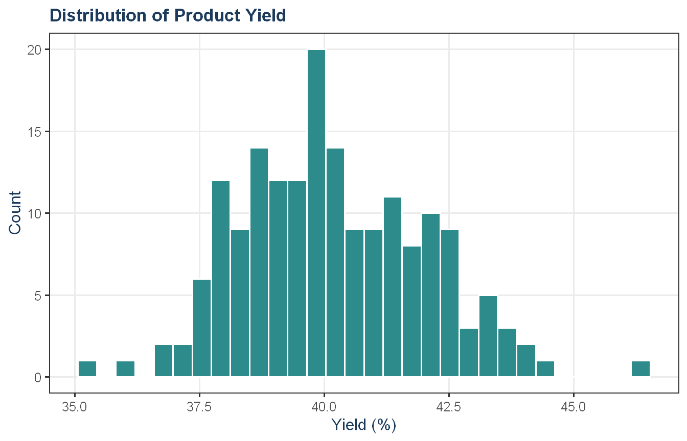
# yield distributionggplot(cmp, aes(x = Yield)) +geom_histogram(bins =30, fill = proj_teal, color ="white") +labs(title ="Distribution of Product Yield",x ="Yield (%)", y ="Count") +theme_proj()
The dataset contains 176 manufacturing runs and 57 predictors (12 biological and 45 process). Missing values appear exclusively in 28 of the 45 manufacturing process predictors, with ManufacturingProcess03 having the highest count at 15 missing observations (roughly 8.5% of runs). The biological predictors are fully observed, suggesting measurement gaps in process instrumentation rather than random missingness. Yield ranges from approximately 35% to 47%, centered around 40%, with a roughly symmetric distribution and a small number of low-end outliers. Given that a 1% improvement in yield translates to approximately $100,000 per batch, even modest predictive accuracy has meaningful business value.
Approach: We split the data first, then fit a knn imputation on the training set only to address part (b), before passing preprocessing into train() for clean cross-validation.
Show code
set.seed(42)X <- cmp |>select(-Yield)Y <- cmp$Yield# 80/20 splittrain_idx <-createDataPartition(Y, p =0.8, list =FALSE)X_train <- X[train_idx, ]X_test <- X[-train_idx, ]Y_train <- Y[train_idx]Y_test <- Y[-train_idx]# fit imputation on training only to satisfy part (b)pre_impute <-preProcess(X_train, method ="knnImpute")X_train_imp <-predict(pre_impute, X_train)X_test_imp <-predict(pre_impute, X_test)cat("Training rows: ", nrow(X_train), "\n","Test rows: ", nrow(X_test), "\n","Missing values remaining in training: ", sum(is.na(X_train_imp)), sep ="")
Training rows: 144
Test rows: 32
Missing values remaining in training: 0
The data was split into 144 training and 32 test observations using an 80/20 stratified split. A KNN-imputation model was fit on the training set only and applied to both training and test sets, confirming that all missing values were resolved with none remaining. Importantly, this imputation is shown for transparency in addressing part (b). The actual modeling pipeline fits imputation inside train() on each CV fold, ensuring no test set information influences the training process.
Approach: We tune an elastic net over a grid of alpha and lambda values via 10-fold cross-validation, with preprocessing handled inside train() to ensure imputation is fit correctly within each fold.
The elastic net was tuned over a grid of six alpha values and 20 lambda values via 10-fold cross-validation, with preprocessing applied inside train() to ensure imputation was fit within each fold rather than on the full dataset. The optimal configuration used alpha = 0.75 and lambda = 0.23, yielding a cross-validated RMSE of 1.18 and R-squared of 0.60. The top configurations are closely clustered, with several alpha values appearing in the top 10, so the choice of alpha = 0.75 over pure lasso (alpha = 1.00, RMSE 1.19) is marginal rather than decisive. The lean toward lasso-style sparsity is consistent with the data structure; 56 predictors across 144 training observations with known correlations among process variables makes selective shrinkage appropriate.
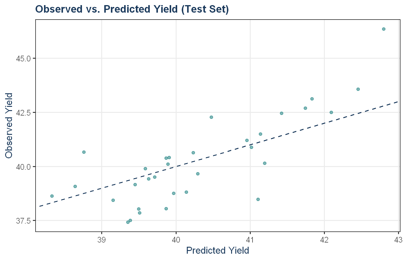
Approach: We evaluate the tuned elastic net on the held-out test set and compare test performance against the cross-validated training performance. We also plot observed versus predicted yield on the test set to visually assess where the model performs well and where it struggles.
The test set RMSE of 1.29 is modestly higher than the cross-validated training RMSE of 1.18, which is the expected direction as CV performance tends to be optimistic relative to a true holdout. The test R-squared of 0.65 is slightly above the CV estimate of 0.60, which is somewhat counterintuitive but not unusual given the small test set of 32 observations where sampling variability can meaningfully affect summary metrics. Overall the training and test performance are reasonably aligned, suggesting the model generalizes without significant overfitting.
Show code
test_plot_df <-data.frame(Observed = Y_test,Predicted = en_pred)ggplot(test_plot_df, aes(x = Predicted, y = Observed)) +geom_point(alpha =0.6, color = proj_teal) +geom_abline(slope =1, intercept =0, linetype ="dashed", color = proj_navy) +labs(title ="Observed vs. Predicted Yield (Test Set)",x ="Predicted Yield", y ="Observed Yield") +theme_proj()
The observed vs. predicted plot confirms the model captures the general direction of yield but with notable scatter around the diagonal. Predictions are compressed relative to the observed range; the model underpredicts high-yield runs and slightly overpredicts low-yield ones, a common characteristic of regularized models that shrink extreme predictions toward the mean. The “outlier” in the upper right, with observed yield near 47 but predicted closer to 43, suggests at least one run with unusually high yield that the model cannot fully explain from the available predictors.
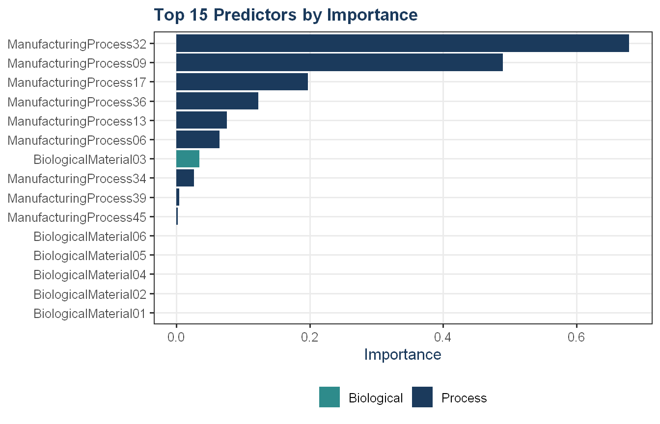
Approach: We extract the top 15 predictors by absolute coefficient magnitude and identify whether biological or process predictors dominate.
ggplot(en_imp_df, aes(x =reorder(Predictor, Overall),y = Overall, fill = Type)) +geom_col() +coord_flip() +scale_fill_manual(values =c("Biological"= proj_teal,"Process"= proj_navy,"Other"= proj_grey )) +labs(title ="Top 15 Predictors by Importance",x =NULL, y ="Importance") +theme_proj()
Process predictors dominate the top 15, with ManufacturingProcess32 and ManufacturingProcess09 showing importance scores far above the rest. Only BiologicalMaterial03 appears among the biological predictors with any meaningful coefficient, while five other biological predictors sit at the bottom with near-zero importance, effectively zeroed out by the elastic net’s sparsity penalty. This pattern is consistent with the manufacturing context: biological predictors describe the raw material quality coming in and cannot be changed, while process predictors reflect controllable steps in production. The dominance of process variables in the model suggests there is meaningful room to improve yield through process adjustments.
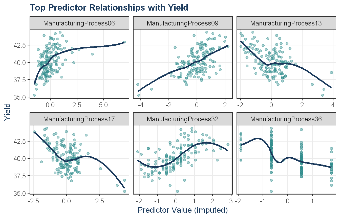
Approach: We plot each of the top 6 predictors against yield to explore whether the relationships are linear, nonlinear, or directionally informative for process improvement.
Show code
top6 <- en_imp_df$Predictor[1:6]train_plot_df <- X_train_imp |>select(all_of(top6)) |>mutate(Yield = Y_train) |> tidyr::pivot_longer(cols =all_of(top6),names_to ="Predictor",values_to ="Value")ggplot(train_plot_df, aes(x = Value, y = Yield)) +geom_point(alpha =0.4, color = proj_teal) +geom_smooth(formula ='y ~ x', method ="loess", se =FALSE, color = proj_navy) +facet_wrap(~ Predictor, scales ="free_x") +labs(title ="Top Predictor Relationships with Yield",x ="Predictor Value (imputed)",y ="Yield") +theme_proj()
The top six process predictors show varied relationships with yield. ManufacturingProcess06 shows a positive association that plateaus at higher values, suggesting diminishing returns beyond a certain operating level; however, this could be due to a single outlier. ManufacturingProcess09 shows a more consistently linear positive relationship throughout its range. ManufacturingProcess13 and ManufacturingProcess17 both show negative relationships with yield. ManufacturingProcess32 shows an overall positive relationship with yield, rising across most of its range before leveling off at the high end. This is consistent with its position as the most important predictor in the model, though there is meaningful scatter around the trend. ManufacturingProcess36 appears to be a discrete or ordinal variable as the data clusters in vertical bands and the smoother’s shape is an artifact of that structure rather than a real continuous trend. For the directional predictors like Process06, Process09, Process13, and Process17, the relationships are clear enough to give the manufacturing team actionable starting points for process adjustment.
As stated in the problem, biological predictors cannot be changed but can be used to assess incoming raw material quality before a batch enters production. Process predictors are more actionable since they reflect controllable steps that the manufacturing team can adjust. This is what the model reinforces, with process variables dominating the top 15 importance rankings. The model is best used as a decision-support tool, flagging runs at risk of low yield and identifying predictors worth investigating further, rather than as a direct prescription for process changes.
Exercise KJ 7.2
Friedman (1991) introduced several benchmark data sets created by simulation. One of these simulations used the following nonlinear equation to create data:
where the \(x\) values are random variables uniformly distributed between \([0, 1]\) (there are also 5 other non-informative variables also created in the simulation). The package mlbench contains a function called mlbench.friedman1 that simulates these data:
Tune several models on these data. Which models appear to give the best performance? Does MARS select the informative predictors (those named X1-X5)?
Code and Discussion
Approach: We simulate the Friedman training and test datasets and examine predictor relationships with the response before modeling.
Show code
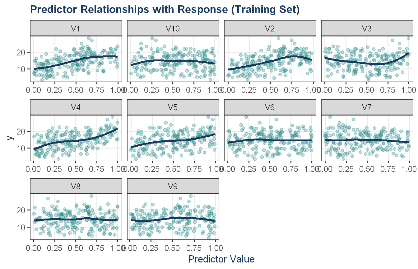
set.seed(200)training_data <-mlbench.friedman1(200, sd =1)training_data$x <-as.data.frame(training_data$x)test_data <-mlbench.friedman1(5000, sd =1)test_data$x <-as.data.frame(test_data$x)train_df <-cbind(training_data$x, y = training_data$y)train_df |> tidyr::pivot_longer(-y, names_to ="predictor", values_to ="value") |>ggplot(aes(x = value, y = y)) +geom_point(alpha =0.3, color = proj_teal) +geom_smooth(method ="loess", se =FALSE, color = proj_navy) +facet_wrap(~ predictor, scales ="free_x") +labs(title ="Predictor Relationships with Response (Training Set)",x ="Predictor Value", y ="y") +theme_proj()
The scatter plots reveal a clear signal-to-noise divide among the 10 predictors. V4 shows the most pronounced positive linear relationship with the response, consistent with its coefficient of 10 in the Friedman equation. V1 and V2 show more modest positive trends as their contributions are partly embedded in the nonlinear interaction term 10 sin(πx1x2), which is harder to recover from marginal plots. V3 displays a subtle nonlinear pattern consistent with the quadratic term 20(x3 - 0.5)^2, and V5 shows a mild positive slope reflecting its coefficient of 5. V6 through V10 are flat with no discernible trend, confirming they carry no signal. With only 200 training observations, the informative signals are noisy but visible, and the challenge for the models in the next step is to recover them reliably.
Approach: We tune KNN, MARS, and SVM models on the Friedman training data using 10-fold cross-validation and compare resampled performance.
MARS achieved the best cross-validated performance with RMSE of 1.63 and R-squared of 0.90, followed by SVM at RMSE 1.91 and R-squared of 0.85. KNN trailed considerably at RMSE 3.09 and R-squared of 0.68. The strong performance of MARS is not surprising given the structure of the Friedman equation: the response is a sum of nonlinear terms including a sine interaction, a quadratic, and two linear components, which maps naturally to MARS’s piecewise linear basis function approach. KNN’s distance-based averaging struggles in higher-dimensional spaces, and with 10 predictors and only 200 training observations the curse of dimensionality shows.
Approach: We evaluate all three models on the large test set and compare test performance against CV results.
The test set rankings mirror the cross-validated results exactly; MARS remains the best performer with RMSE of 1.81 and R-squared of 0.87, followed by SVM at RMSE 2.07 and KNN at 3.12. Test performance is modestly worse than CV for all three models, which is the expected direction. The consistency between CV and test rankings suggests no meaningful overfitting across the three approaches. MARS’s test R-squared of 0.87 on a 5,000-observation holdout is a reliable estimate of its generalization ability, and confirms it as the clear champion model. The large test set eliminates the small-sample variance concerns we noted in earlier exercises.
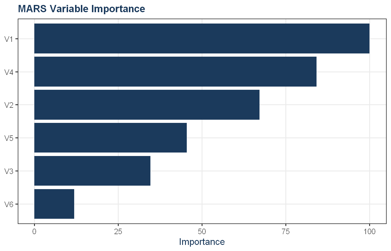
Approach: We extract MARS variable importance to check whether the model selects the informative predictors X1 through X5.
MARS successfully identifies all five informative predictors and excludes most of the noise variables. V1 and V4 rank highest, followed by V2, V5, and V3. V7 through V10 are completely dropped from the model. The ranking broadly reflects the Friedman equation’s structure: V4 and V5 enter linearly with coefficients of 10 and 5 respectively, while V1 and V2 participate in the sine interaction term and V3 contributes through a quadratic. V1’s top ranking likely reflects the fact that it appears in the interaction with V2, giving it opportunities to be selected by multiple basis functions. The near-complete exclusion of noise predictors demonstrates that MARS’s basis function selection acts as an implicit variable selection mechanism which is a useful property when the true model is sparse relative to the number of available predictors, and consistent with the marginal relationships observed in the first plot where the flat predictors showed no visible trend against the response.
Exercise KJ 7.5
Exercise 6.3 describes data for a chemical manufacturing process. Use the same data imputation, data splitting, and pre-processing steps as before and train several nonlinear regression models.
Which nonlinear regression model gives the optimal resampling and test set performance?
Which predictors are most important in the optimal nonlinear regression model? Do either the biological or process variables dominate the list? How do the top ten important predictors compare to the top ten predictors from the optimal linear model?
Explore the relationships between the top predictors and the response for the predictors that are unique to the optimal nonlinear regression model. Do these plots reveal intuition about the biological or process predictors and their relationship with yield?
Code and Discussion
Approach: We recreate the data split and imputation from KJ 6.3 to keep this exercise self-contained.
Approach: We tune several nonlinear regression models on the chemical manufacturing training data using 10-fold cross-validation with preprocessing inside train().
SVM achieved the best cross-validated performance with RMSE of 1.08 and R-squared of 0.64, edging out the elastic net baseline from KJ 6.3 (CV RMSE 1.18). MARS came in third at CV RMSE 1.19, nearly tied with the elastic net, while KNN trailed at 1.28. The margins between SVM and the elastic net are modest, and with only 144 training observations and 56 correlated predictors the CV rankings may not be definitive.
Approach: We evaluate all models on the test set and identify the optimal nonlinear model.
On the test set, MARS takes the top position with RMSE of 1.19 and R-squared of 0.71, reversing the CV ranking where SVM led. SVM finishes second at RMSE 1.26, while the elastic net from KJ 6.3 comes in third at 1.29 with KNN last at 1.30. Notably, the elastic net’s test R-squared of 0.65 exceeds SVM’s 0.62 despite SVM having a lower test RMSE, which reflects differences in where each model’s errors concentrate. With only 32 test observations, small differences in generalization show up clearly. Given the test set result, MARS is carried forward as the champion nonlinear model, though the overall performance differences across all four models are modest.
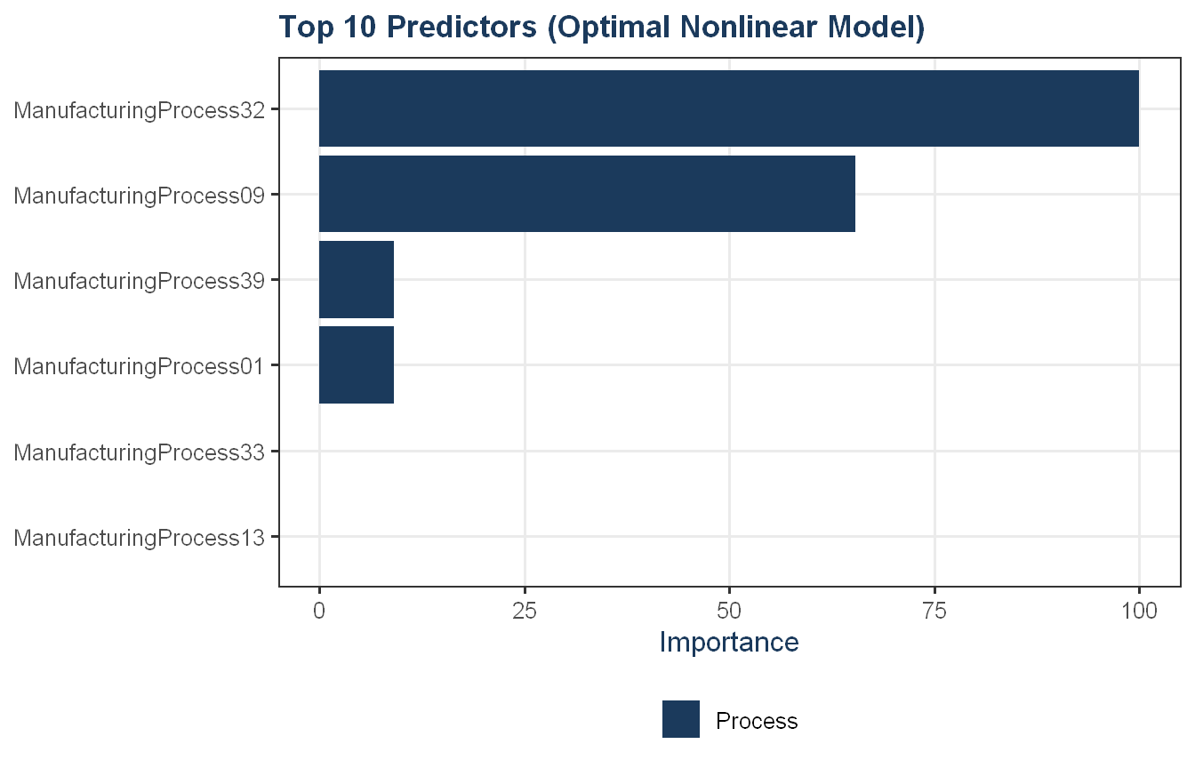
Approach: We extract variable importance from the optimal nonlinear model, compare its top 10 predictors to those from the elastic net in KJ 6.3, and identify predictors unique to the nonlinear model.
MARS selected only 6 predictors, all from the manufacturing process group, in contrast to the elastic net which included BiologicalMaterial03 in its top rankings. ManufacturingProcess32 and ManufacturingProcess09 lead by a wide margin and appear at the top of both models, reinforcing their status as the most robust signals in the data across modeling approaches. ManufacturingProcess13 also appears in both lists at rank 5. The predictors unique to MARS are Process01 and Process33. The steep drop in importance after Process09 suggests MARS is effectively a two-predictor model with four minor contributors, relying heavily on the two dominant process variables to explain most of the yield variation.
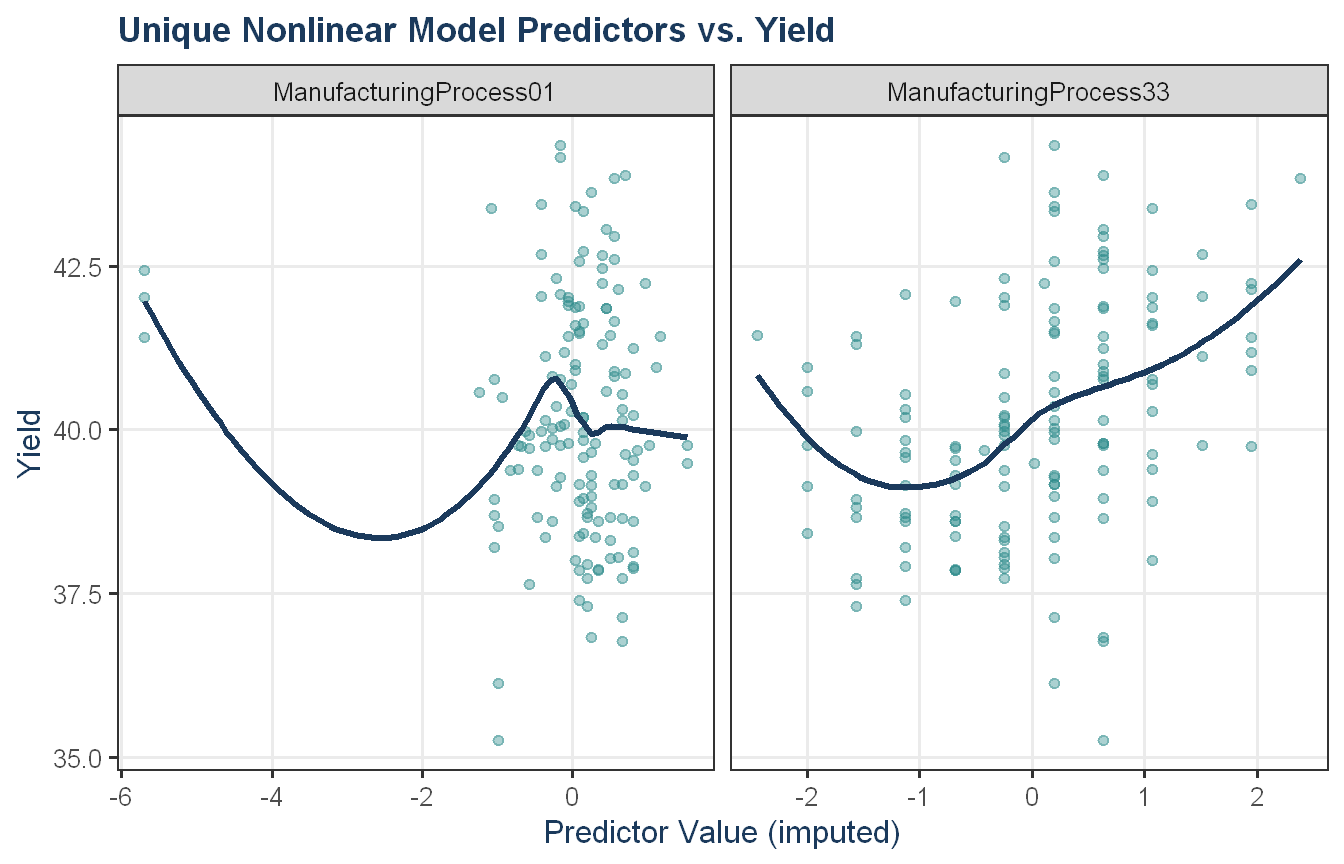
Approach: We plot the relationships between yield and the top predictors unique to the optimal nonlinear model.
Show code
# top 10 from elastic net in 6.3imp_63_top10 <- en_imp$importance |> tibble::rownames_to_column("Predictor") |>arrange(desc(Overall)) |>slice_head(n =10) |>select(Predictor)unique_preds_75 <-setdiff(imp_75_df$Predictor, imp_63_top10$Predictor)pre_impute_75 <-preProcess(X_train_75, method ="knnImpute")X_train_imp_75 <-predict(pre_impute_75, X_train_75)if (length(unique_preds_75) >0) { plot_df_75 <- X_train_imp_75 |>select(all_of(unique_preds_75)) |>mutate(Yield = Y_train_75) |> tidyr::pivot_longer(cols =all_of(unique_preds_75),names_to ="Predictor",values_to ="Value")ggplot(plot_df_75, aes(x = Value, y = Yield)) +geom_point(alpha =0.4, color = proj_teal) +geom_smooth(method ="loess", se =FALSE, color = proj_navy) +facet_wrap(~ Predictor, scales ="free_x") +labs(title ="Unique Nonlinear Model Predictors vs. Yield",x ="Predictor Value (imputed)",y ="Yield") +theme_proj()} else {cat("No predictors unique to the nonlinear model relative to the elastic net top 10.\n")}
The two predictors unique to the MARS model both show nonlinear relationships with yield, which explains why they were selected by MARS but not by the elastic net. ManufacturingProcess01 shows a U-shaped pattern, albeit noisy and clustered. The sparse data at extreme low values means the smoother’s left tail should be interpreted cautiously. ManufacturingProcess33 shows a similar but less pronounced pattern, with yield dipping around -1 before rising steadily at higher values. The ability of MARS to capture these curved relationships through its piecewise basis functions is a meaningful advantage over linear regularization where predictors that appear unimportant to a linear model may carry nonlinear signal that tree-based or spline-based approaches can recover.
Fit another random forest model to these data. Did the importance score for V1 change? What happens when you add another predictor that is also highly correlated with V1?
Use the cforest function in the party package to fit a random forest model using conditional inference trees. The party package function varimp can calculate predictor importance. The conditional argument of that function toggles between the traditional importance measure and the modified version described in Strobl et al. (2007). Do these importances show the same pattern as the traditional random forest model?
Repeat this process with different tree models, such as boosted trees and Cubist. Does the same pattern occur?
Code and Discussion
Approach: We recreate the Friedman simulated data from Exercise 7.2 and fit a random forest to estimate variable importance.
The random forest assigns positive importance to all five informative predictors and near-zero or negative importance to the five noise predictors. V1 leads at 8.73, followed by V4 at 7.62, V2 at 6.42, V5 at 2.02, and V3 at 0.76. V6 through V10 all fall at or below 0.17, with V7 through V10 showing slightly negative values. In random forest importance terms, negative values indicate a predictor performs worse than a random permutation, which is consistent with carrying no signal. The model did not significantly rely on the uninformative predictors, answering the question directly: no, V6 through V10 did not play a meaningful role.
Approach: We add a predictor highly correlated with V1 and assess whether the importance score for V1 changes, then add a second correlated predictor.
Show code
set.seed(200)simulated$duplicate1 <- simulated$V1 +rnorm(200) *0.1cat("Correlation of duplicate1 with V1:",round(cor(simulated$duplicate1, simulated$V1), 4), "\n")
Adding a predictor highly correlated with V1 causes its importance score to drop from 8.73 to 6.01, and adding a second correlated predictor reduces it further to 5.43. The signal that V1 alone captured is now shared across the correlated group and each tree in the forest can split on any of the correlated predictors interchangeably, so the importance gets diluted across them rather than concentrated on the original informative predictor. This is a well-known limitation of the standard random forest importance measure: when predictors are correlated, importance scores become unreliable indicators of true relevance because the forest arbitrarily distributes credit among substitutable predictors. The practical implication is that a manufacturing or research context with correlated measurements could easily understate the importance of a key variable simply because a redundant measurement was included alongside it.
Approach: We fit a conditional inference forest using cforest from the party package and compare conditional vs traditional variable importance.
The conditional inference forest shows a similar overall pattern to the traditional random forest, with V1 through V5 ranking above the noise predictors in both importance measures. Conditional importance reduces the scores of the duplicate predictors relative to traditional importance; duplicate1 drops from 3.80 to 1.76 and duplicate2 from 5.01 to 2.13 which is broadly in the expected direction. However, V1’s conditional importance also drops substantially (6.45 to 3.06), more than might be expected for a genuinely informative predictor. V3’s near-zero conditional importance (-0.059) is also surprising given its quadratic contribution to the Friedman equation. The conditional importance measure reduces but does not eliminate the influence of correlated predictors, and introduces some instability in the scores of the informative predictors as a side effect.
Approach: We repeat the importance comparison using boosted trees and Cubist to assess whether the same pattern of correlated predictor bias holds across model types.
Show code
set.seed(200)gbm_fit_81 <-train( y ~ .,data = simulated,method ="gbm",trControl =trainControl(method ="cv", number =10),verbose =FALSE)cubist_fit_81 <-train( y ~ .,data = simulated,method ="cubist",trControl =trainControl(method ="cv", number =10))gbm_imp_81 <-varImp(gbm_fit_81, scale =FALSE)cubist_imp_81 <-varImp(cubist_fit_81, scale =FALSE)imp_comparison_81 <-data.frame(Predictor =rownames(gbm_imp_81$importance),GBM = gbm_imp_81$importance$Overall,Cubist = cubist_imp_81$importance$Overall) |>arrange(desc(GBM))imp_comparison_81 |>flextable_defaults(digits =0)
Predictor
GBM
Cubist
V4
4,543
49
V2
3,276
44
V1
2,281
72
V5
1,713
36
duplicate1
1,316
0
V3
1,231
54
duplicate2
547
0
V7
236
0
V6
205
25
V10
127
0
V9
123
0
V8
80
0
GBM places four of the five informative predictors (V4, V2, V1, and V5) in its top five, but the correlated duplicate1 edges into fifth place at 1,316 and pushes V3 down to sixth at 1,231. The other duplicate, duplicate2, follows at 547. Both duplicates sit above the pure noise predictors, and the fact that duplicate1 outranks a genuinely informative predictor shows GBM is susceptible to the correlated predictor effect. The noise predictors V6 through V10 also receive non-trivial importance scores ranging from 80 to 236, higher than the random forest assigned them. Cubist handles the duplicates more cleanly. Both duplicate1 and duplicate2 receive exactly zero importance, and its top five predictors are all genuinely informative (V1, V3, V4, V2, and V5). Cubist still assigns a small amount of importance to V6 (25), while V7 through V10 receive zero. The same pattern observed with the standard random forest persists across all methods to varying degrees. Correlated predictors dilute importance away from the true signal variables, though Cubist appears least affected by this problem among the models tested here.
Exercise KJ 8.2
Use a simulation to show tree bias with different granularities.
Code and Discussion
Approach: We simulate four predictors with varying granularity and a noise response, then measure the reduction in SSE that each predictor’s best single split achieves on its own, averaged over many simulated datasets, to expose the selection bias described in Section 8.1.
Show code
set.seed(624)split_improvement <-function(n =500) { d <-data.frame(coarse2 =sample(0:1, n, replace =TRUE),medium10 =sample(1:10, n, replace =TRUE),fine100 =sample(1:100, n, replace =TRUE),continuous =rnorm(n) ) d$y <-rnorm(n) preds <-c("coarse2", "medium10", "fine100", "continuous")sapply(preds, function(p) { fit <-rpart(reformulate(p, "y"), data = d,control =rpart.control(maxdepth =1, cp =0, minsplit =2))if (nrow(fit$frame) ==1) 0elseunname(fit$splits[1, "improve"]) })}imp_mat <-replicate(1000, split_improvement())avg_imp <-data.frame(Predictor =rownames(imp_mat),Mean_Improvement =rowMeans(imp_mat))avg_imp <- avg_imp[order(-avg_imp$Mean_Improvement), ]avg_imp |>flextable_defaults(digits =3)
Predictor
Mean_Improvement
continuous
0.011
fine100
0.009
medium10
0.006
coarse2
0.002
The mean SSE reduction increases steadily with the number of distinct values. The continuous predictor earns the largest average reduction, followed by the 100-value predictor, the 10-value predictor, and finally the two-value predictor. None of the predictors carries any real signal (the response is pure noise), so this ordering is produced entirely by differing granularities. More candidate split points give the exhaustive search more chances to lower SSE by chance alone.
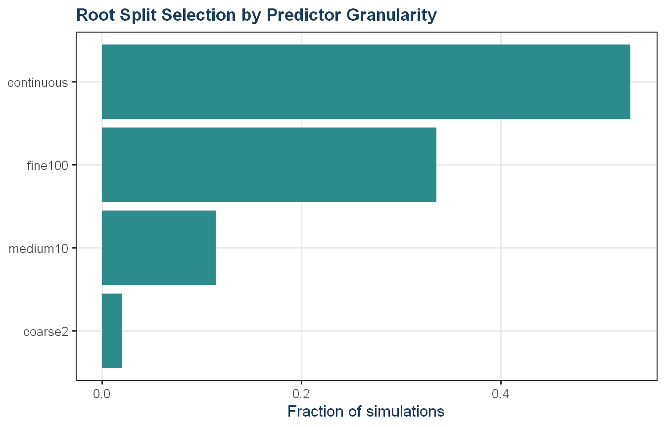
Approach: We let all four predictors compete simultaneously by fitting a one-split tree on all predictors and recording which is chosen at the root across many simulations.
Show code
root_var <-function(n =500) { d <-data.frame(coarse2 =sample(0:1, n, replace =TRUE),medium10 =sample(1:10, n, replace =TRUE),fine100 =sample(1:100, n, replace =TRUE),continuous =rnorm(n) ) d$y <-rnorm(n) fit <-rpart(y ~ ., data = d,control =rpart.control(maxdepth =1, cp =0, minsplit =2))as.character(fit$frame$var[1])}set.seed(624)roots <-replicate(2000, root_var())root_tbl <-as.data.frame(prop.table(table(roots)))names(root_tbl) <-c("Predictor", "Selection_Frequency")root_tbl <- root_tbl[order(-root_tbl$Selection_Frequency), ]root_tbl |>flextable_defaults(digits =3)
Predictor
Selection_Frequency
continuous
0.530
fine100
0.336
medium10
0.114
coarse2
0.020
Show code
ggplot(root_tbl, aes(x =reorder(Predictor, Selection_Frequency),y = Selection_Frequency)) +geom_col(fill = proj_teal) +coord_flip() +labs(x =NULL, y ="Fraction of simulations",title ="Root Split Selection by Predictor Granularity") +theme_proj()
The continuous predictor wins the root split in the large majority of simulations, followed by the 100-value predictor, with the 10-value and 2-value predictors selected only rarely. An unbiased splitter would choose each predictor roughly one quarter of the time. The stark departure from that baseline confirms the selection bias. When a real problem mixes an informative but coarse predictor with granular noise variables, the noise variables can dominate the early splits, distorting both the tree structure and variable importance rankings. This is one motivation for the ensemble methods and unbiased importance measures discussed later in the chapter.
Exercise KJ 8.3
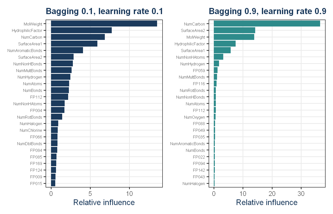
In stochastic gradient boosting the bagging fraction and learning rate will govern the construction of the trees as they are guided by the gradient. Although the optimal values of these parameters should be obtained through the tuning process, it is helpful to understand how the magnitudes of these parameters affect magnitudes of variable importance. Figure 8.24 provides the variable importance plots for boosting using two extreme values for the bagging fraction (0.1 and 0.9) and the learning rate (0.1 and 0.9) for the solubility data. The left-hand plot has both parameters set to 0.1, and the right-hand plot has both set to 0.9:
Why does the model on the right focus its importance on just the first few of predictors, whereas the model on the left spreads importance across more predictors?
Which model do you think would be more predictive of other samples?
How would increasing interaction depth affect the slope of predictor importance for either model in Fig. 8.24?
Code and Discussion
Approach: We reproduce the pattern of Figure 8.24 by fitting two boosting models at the extreme parameter settings on the solubility training data, then compare their variable importance distributions.
The reproduction shows a similar contrast to Figure 8.24. The 0.9 model concentrates its relative influence on a small set of predictors with a sharp drop-off, while the 0.1 model distributes importance more evenly across a wider set. The 90% influence table makes this concrete: the 0.9 model reaches most of its total influence with far fewer predictors than the 0.1 model.
(a) The concentration in the right model comes from both parameters acting in the same direction. A large learning rate of 0.9 means each tree makes a large correction, so the first few trees seize on the strongest predictors and absorb most of the residual variation immediately, leaving little for remaining predictors to explain. A large bagging fraction of 0.9 means every tree sees nearly the same data, so there is little randomness from one tree to the next and the same dominant predictors keep getting chosen. On the left, the small learning rate forces the model to improve in small steps over many trees, giving more predictors a chance to contribute, while the small bagging fraction adds randomness that surfaces different predictors in different subsamples.
(b) The left model, with both parameters at 0.1, should generalize better to new samples. A small learning rate and small bagging fraction both act as regularization. Section 8.6 notes that a small learning rate generally gives better results at the cost of needing more trees, and subsampling reduces variance in the spirit of bagging. The right model learns aggressively and leans on a few predictors, which is the profile of a model that has fit the training set too closely.
(c) Increasing interaction depth allows each tree to split on more predictors and capture higher-order interactions, which distributes importance across a larger set of predictors. The importance curve would become less top-heavy and its slope would flatten. This applies to both models, though the left model would still spread importance more widely since the learning rate and bagging fraction continue to push the two models in opposite directions.
Exercise KJ 8.4
Use a single predictor in the solubility data, such as the molecular weight or the number of carbon atoms and fit several models:
A simple regression tree
A random forest model
Different Cubist models with a single rule or multiple committees (each with and without using neighbor adjustments)
Plot the predictor data versus the solubility results for the test set. Overlay the model predictions for the test set. How do the models differ? Does changing the tuning parameter(s) significantly affect the model fit?
Code and Discussion
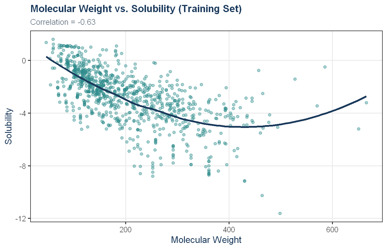
Approach: We first load the solubility data and examine the relationship between molecular weight and solubility in the training set using a scatter plot and correlation coefficient as an exploratory step.
Show code
data(solubility)sol_train <-data.frame(MolWeight = solTrainX$MolWeight, Solubility = solTrainY)sol_test <-data.frame(MolWeight = solTestX$MolWeight, Solubility = solTestY)ggplot(sol_train, aes(x = MolWeight, y = Solubility)) +geom_point(alpha =0.4, color = proj_teal) +geom_smooth(formula ='y ~ x', method ="loess", se =FALSE, color = proj_navy) +labs(title ="Molecular Weight vs. Solubility (Training Set)",subtitle =str_glue("Correlation = {round(with(sol_train, cor(MolWeight, Solubility)), 2)}"),x ="Molecular Weight", y ="Solubility") +theme_proj()
Molecular weight and solubility show a moderate negative correlation of -0.63 in the training set, meaning heavier molecules tend to be less soluble. The scatter plot shows this decline is steepest at lower molecular weights and flattens in the mid-range. The smoother turns upward beyond roughly 500, but this reflects sparse data at the high end rather than a genuine reversal in the relationship. The nonlinear shape and considerable scatter suggest that molecular weight alone will leave substantial unexplained variance, making this a useful single-predictor setting for comparing model flexibility.
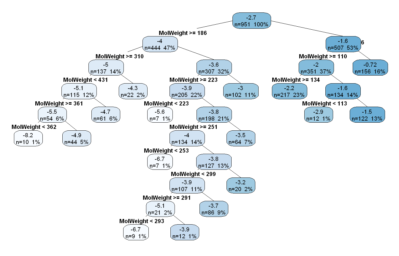
Approach: We fit a regression tree to molecular weight alone using cross-validated tuning of the complexity parameter via caret. We plot the fitted tree structure to visualize the splits selected at the optimal complexity parameter.
CART

951 samples
  1 predictor

No pre-processing
Resampling: Cross-Validated (10 fold)
Summary of sample sizes: 858, 855, 858, 855, 855, 857, ...
Resampling results across tuning parameters:

  cp           RMSE      Rsquared   MAE
  0.004859809  1.522272  0.4488627  1.159522
  0.005682050  1.533461  0.4404321  1.168033
  0.007133559  1.546744  0.4293773  1.178841
  0.007232122  1.550068  0.4266471  1.178798
  0.007475879  1.550063  0.4264432  1.182600
  0.009950241  1.554583  0.4226496  1.190018
  0.012109468  1.579931  0.4049681  1.216951
  0.041878909  1.626988  0.3710822  1.249668
  0.044542785  1.658606  0.3459916  1.275819
  0.351234818  1.887350  0.2918740  1.464369

RMSE was used to select the optimal model using the smallest value.
The final value used for the model was cp = 0.004859809.
Show code
tree_fit$bestTune
           cp
1 0.004859809
Show code
rpart.plot(tree_fit$finalModel, type =4, extra =101, cex =0.6, fallen.leaves =FALSE)
The optimal complexity parameter was cp = 0.005, selected by 10-fold cross-validation, yielding a resampled RMSE of 1.52 and R-squared of 0.45. The fitted tree produces 15 terminal nodes despite having only one predictor, with all splits occurring on MolWeight thresholds. The root split at 186 separates lighter molecules (mean solubility -1.6) from heavier ones (mean -4.0), reflecting the strong negative association seen in the EDA. Subsequent splits concentrate in the 223 to 362 range, which corresponds to the densest and most variable region of the training data. Predicted values are step-wise constants within each leaf, so the tree can only approximate the smooth nonlinear trend through piecewise horizontal segments.
Approach: We fit a random forest model to molecular weight alone, tuning mtry via 10-fold cross-validation.
Random Forest

951 samples
  1 predictor

No pre-processing
Resampling: Cross-Validated (10 fold)
Summary of sample sizes: 858, 855, 858, 855, 855, 857, ...
Resampling results:

  RMSE      Rsquared   MAE
  1.428678  0.5378679  1.008299

Tuning parameter 'mtry' was held constant at a value of 2
Show code
rf_fit$bestTune
  mtry
1    2
With a single predictor, mtry was held constant at a value of 2 by caret’s internal defaults. No meaningful tuning occurred as a result. Despite this, the random forest outperformed the single regression tree, achieving a cross-validated RMSE of 1.43 and R-squared of 0.54. The improvement comes from averaging predictions across many bootstrap-sampled trees, which smooths out the step-wise discontinuities of any individual tree and reduces variance. The result is a more continuous approximation of the underlying MolWeight-solubility relationship.
Approach: We fit Cubist models across a grid of committee sizes and neighbor adjustments to assess how each configuration performs with a single predictor.
Cubist

951 samples
  1 predictor

No pre-processing
Resampling: Cross-Validated (10 fold)
Summary of sample sizes: 858, 855, 858, 855, 855, 857, ...
Resampling results across tuning parameters:

  committees  neighbors  RMSE      Rsquared   MAE
    1         0          1.522356  0.4532249  1.136696
    1         5          1.573246  0.4153572  1.204001
    1         9          1.570179  0.4167376  1.201302
   10         0          1.528830  0.4487691  1.148502
   10         5          1.581239  0.4074551  1.214565
   10         9          1.575593  0.4110185  1.209258
   50         0          1.532445  0.4453877  1.151049
   50         5          1.579300  0.4087642  1.212897
   50         9          1.577379  0.4096974  1.210562
  100         0          1.533710  0.4445243  1.151749
  100         5          1.579362  0.4086880  1.213067
  100         9          1.576982  0.4099382  1.210634

RMSE was used to select the optimal model using the smallest value.
The final values used for the model were committees = 1 and neighbors = 0.
Show code
cubist_fit$bestTune
  committees neighbors
1          1         0
The optimal Cubist configuration used a single committee and no neighbor adjustment, yielding a cross-validated RMSE of 1.52 and R-squared of 0.45. The margin between committee sizes was negligible as the results shifted with the random seed indicating that all configurations perform equivalently here. Given that, the simplest model is the natural choice. Neighbor adjustments consistently degraded performance across all committee levels, which is expected with a single predictor: nearby training cases in a one-dimensional predictor space are not diverse enough for instance-based correction to add value. Cubist performed comparably to the single regression tree but worse than the random forest in this setting.
Approach: We generate test set predictions from all three models, then overlay them on a scatter plot of observed solubility against molecular weight to compare how each model captures the relationship.
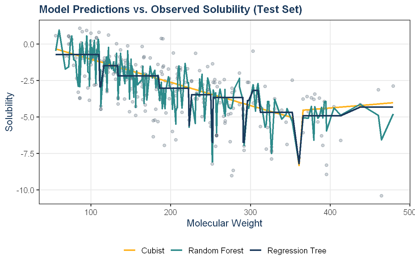
The three models tell visibly different stories about the MolWeight-solubility relationship. The regression tree produces clean horizontal steps at its split thresholds, approximating the downward trend through a coarse piecewise constant function. Cubist fits a single linear rule that decreases steadily across the range, the smoothest of the three models and arguably the most reasonable approximation of the broad trend given only one predictor. The random forest line is the most erratic, with sharp local fluctuations that reflect the fine-grained averaging of many trees over the training data’s MolWeight distribution. Despite producing the best cross-validated RMSE, the random forest prediction surface is notably noisy on the test set, with a single predictor and no smoothing mechanism, it captures local training structure rather than a generalizable trend. All three models struggle at the extremes where data is sparse, and none fully accounts for the considerable scatter around the trend, which is expected given that molecular weight alone explains only a share of solubility variation.
Approach: We evaluate each model on the test set using postResample() and summarize performance in a formatted table.
On the test set, the random forest achieved the best performance across all three metrics with RMSE of 1.34, R-squared of 0.59, and MAE of 0.93. The regression tree came in second with RMSE of 1.48 and R-squared of 0.50, while Cubist performed worst with RMSE of 1.54 and R-squared of 0.49. The test set rankings are consistent with the cross-validated results. However, the metric advantage of the random forest should be interpreted alongside the overlay plot; its prediction surface is visibly erratic, reflecting fine-grained local averaging rather than a smooth generalizable trend. Cubist’s single linear rule loses on RMSE but produces the most stable and interpretable prediction surface of the three, which may be preferable in practice when the goal is understanding the MolWeight-solubility relationship rather than minimizing error alone. Overall, these results should be interpreted cautiously. All three models are constrained to a single predictor, and the remaining variance in solubility almost certainly requires additional molecular descriptors to explain.
Exercise KJ 8.7
Refer to Exercises 6.3 and 7.5 which describe a chemical manufacturing process. Use the same data imputation, data splitting, and pre-processing steps as before and train several tree-based models:
Which tree-based regression model gives the optimal resampling and test set performance?
Which predictors are most important in the optimal tree-based regression model? Do either the biological or process variables dominate the list? How do the top 10 important predictors compare to the top 10 predictors from the optimal linear and nonlinear models?
Plot the optimal single tree with the distribution of yield in the terminal nodes. Does this view of the data provide additional knowledge about the biological or process predictors and their relationship with yield?
Code and Discussion
Approach: We recreate the data split and imputation from KJ 6.3 to keep this exercise self-contained.
Approach: We train four tree-based models: (1) a single regression tree, (2) random forest, (3) gradient boosted trees, and (4) Cubist, using 10-fold cross-validation, with the same preprocessing pipeline as KJ 6.3.
All three ensemble methods substantially outperformed the single regression tree, which had a CV RMSE of 1.43 and R-squared of 0.43, consistent with the well-known limitation of single trees on high-dimensional data. Cubist led with a CV RMSE of 1.00 and R-squared of 0.71, followed closely by gradient boosting (RMSE 1.09, R-squared 0.66) and random forest (RMSE 1.09, R-squared 0.69). The gap between Cubist and the two other ensemble methods is modest, while all three comfortably outperform the elastic net from KJ 6.3 (CV RMSE 1.18), suggesting the nonlinear flexibility of tree-based ensembles better captures the yield relationship than a regularized linear model.
Approach: We evaluate all four models on the held-out test set and compare against CV performance.
On the test set, Cubist achieved the best performance across all metrics with RMSE of 0.90, R-squared of 0.81, and MAE of 0.69, confirming its lead from cross-validation. Gradient boosting and random forest were closely matched at RMSE 1.18 and 1.19 respectively, while the single regression tree trailed significantly at RMSE 1.62. The CV and test rankings are fully consistent, suggesting no meaningful overfitting across the ensemble methods. Cubist’s test R-squared of 0.81 exceeds its CV estimate of 0.71, which mirrors a similar pattern seen in KJ 6.3 and is best attributed to sampling variability in a 32-observation test set rather than any structural advantage. All three ensemble methods also outperformed the elastic net from KJ 6.3 (test RMSE 1.29), reinforcing that the nonlinear flexibility of tree-based models better captures the yield relationship in this data.
Approach: We extract variable importance from the best model and compare its top 10 predictors against the top 10 from the elastic net in KJ 6.3.
Show code
# importance from best modelbest_fit_87 <- cubist_fit_87imp_87 <-varImp(best_fit_87, scale =FALSE)imp_df_87 <- imp_87$importance |> tibble::rownames_to_column("Predictor") |>arrange(desc(Overall)) |>slice_head(n =10) |>mutate(Type =case_when(grepl("^Biological", Predictor) ~"Biological",grepl("^ManufacturingProcess", Predictor) ~"Process",.default ="Other" ))# top 10 from elastic net in 6.3imp_63_top10 <- en_imp$importance |> tibble::rownames_to_column("Predictor") |>arrange(desc(Overall)) |>slice_head(n =10) |>select(Predictor)comparison_df_87 <-data.frame(Rank =1:10,Tree_Based = imp_df_87$Predictor,Elastic_Net = imp_63_top10$Predictor)comparison_df_87 |>flextable_defaults(digits =3)
Rank
Tree_Based
Elastic_Net
1
ManufacturingProcess32
ManufacturingProcess32
2
ManufacturingProcess17
ManufacturingProcess09
3
ManufacturingProcess09
ManufacturingProcess17
4
ManufacturingProcess33
ManufacturingProcess36
5
ManufacturingProcess04
ManufacturingProcess13
6
BiologicalMaterial03
ManufacturingProcess06
7
BiologicalMaterial12
BiologicalMaterial03
8
ManufacturingProcess13
ManufacturingProcess34
9
ManufacturingProcess29
ManufacturingProcess39
10
ManufacturingProcess25
ManufacturingProcess45
Show code
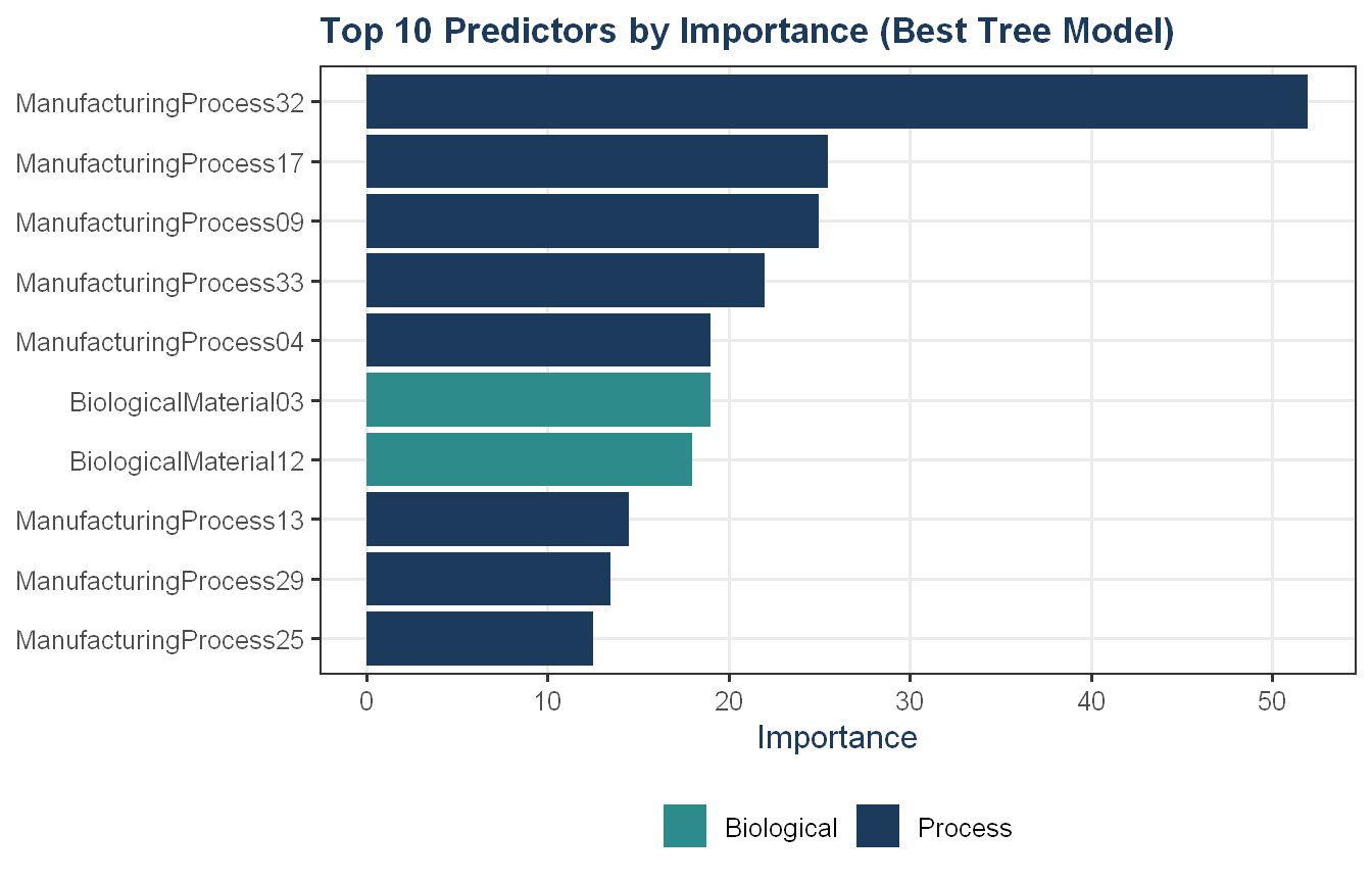
# importance plotggplot(imp_df_87, aes(x =reorder(Predictor, Overall),y = Overall, fill = Type)) +geom_col() +coord_flip() +scale_fill_manual(values =c("Biological"= proj_teal,"Process"= proj_navy,"Other"= proj_grey )) +labs(title ="Top 10 Predictors by Importance (Best Tree Model)",x =NULL, y ="Importance") +theme_proj()
ManufacturingProcess32 leads importance in both models by a clear margin, making it the most robust signal in the data regardless of modeling approach. ManufacturingProcess09, 13, and 17 appear in both top 10s as well, confirming these as consistently important process variables. The most notable difference between the two models is the role of biological predictors. The elastic net shrinks them to near-zero with one exception (BiologicalMaterial03 at rank 7), while Cubist places two biological predictors in its top 10 (BiologicalMaterial03 at rank 6 and BiologicalMaterial12 at rank 7). This suggests the elastic net’s sparsity penalty discounts biological predictors relative to their actual contribution, and that Cubist’s rule-based approach captures nonlinear structure that makes biological material quality more visible. Process predictors still dominate both lists, but the Cubist results reinforce that incoming raw material quality carries meaningful signal that a purely linear model may understate.
Approach: We plot the optimal single regression tree with yield distributions in the terminal nodes to assess whether the tree structure reveals additional insight about the predictors.
Show code
rpart_party_87 <-as.party(rpart_fit_87$finalModel)plot(rpart_party_87, gp =gpar(fontsize =7))
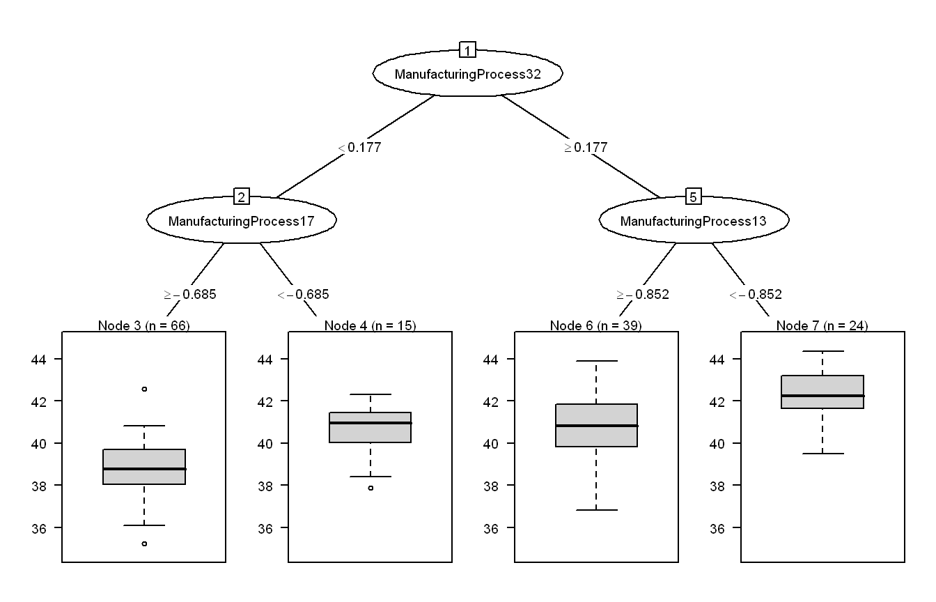
The optimal regression tree uses only three predictors across four terminal nodes, producing a remarkably interpretable structure given 56 available predictors. ManufacturingProcess32 forms the root split at 0.18, cleanly separating the training data into a lower-yield group (56%) and a higher-yield group (44%). Within the low-Process32 branch, ManufacturingProcess17 provides a secondary split, runs with very low Process17 (below -0.685) shift upward to a median yield around 41 despite belonging to the low-Process32 group, though this node contains only 15 observations and should be interpreted cautiously. Within the high-Process32 branch, ManufacturingProcess13 refines further, runs with very low Process13 (below -0.852) cluster into the highest-yield node with a median around 42 and the tightest distribution of the four nodes.
The tree structure reinforces the variable importance findings from both KJ 6.3 and the Cubist model: Process32 is the dominant lever, and the negative relationships for Process17 and Process13 observed in the scatter plots carry through into the tree’s splitting logic. For the manufacturing team, this suggests that maintaining Process32 above its scaled threshold while keeping Process13 at lower operating levels is associated with the highest yield outcomes.
Exercise: Recommendation System
You are a data scientist for FreshMart, a mid-size regional grocery chain with 12 stores across Central Texas. Leadership wants to improve:
Product placement
Cross-selling
Promotional bundling
In-aisle signage
FreshMart IT has provided you with a simple random sample of 6,000 transactions from one month of activity. Each row in the file represents a single customer transaction and contains:
Transaction ID: from T0001 to T6000
Items purchased: all products bought in that visit (between 1 and 12 items per basket)
For this assignment, FreshMart has limited the products to their top 40 grocery items of interest for merchandising analysis.
Your task: Perform a market basket analysis using association rule mining. Your goal is to:
Identify meaningful product affinities
Recommend three actionable merchandising strategies based on your findings
Deliverables
1. Exploratory Analysis
Include at least:
Number of transactions
Distribution of basket sizes (e.g., histogram or summary table)
Top 10 most frequent items (with counts and/or relative frequency)
2. Association Rule Mining
Note: You may select a minimum threshold, but if you do be explicit about what it is and why it was selected.
Using appropriate tools (e.g., arules in R), compute support, confidence, lift, and conviction for your rules. Identify top rules by lift and by confidence. Discuss whether the strongest rules appear meaningful (business-plausible, actionable) or spurious (artifacts of the data, too trivial, or not useful).
Be explicit about any thresholds you choose (e.g., minimum support, minimum confidence) and justify them briefly.
3. Business Recommendations
Propose three concrete merchandising actions for FreshMart, such as:
Product placement (e.g., adjacency in aisles, end-caps)
Bundles (e.g., “buy X, get Y at discount”)
Promotions or signage (e.g., co-featured items in weekly ads or in-store displays)
For each recommendation, reference specific rules (or item affinities) that support your idea and explain why this action could improve cross-selling, basket size, or customer experience.
4. Analysis Recommendations
(i) Data improvements: What additional data (e.g., time of day, store location, price, promotions, customer segments) would you recommend collecting or using to improve merchandising decisions?
(ii) Methodological improvements: What alternative or complementary techniques (e.g., clustering, sequence analysis, uplift modeling, price elasticity analysis) might help FreshMart make better merchandising decisions beyond basic association rules?
Code and Discussion
Approach: We load the FreshMart transaction data in Python, parse each basket into individual items, and compute basic EDA metrics including transaction count, basket size distribution, and top 10 item frequencies.
Show code
import numpy as npimport pandas as pdfrom collections import Counterdf = pd.read_csv("../resources/FreshMart_MarketBasket_6000.txt")# parse itemsdf["items_list"] = df["items"].str.split(",").apply(lambda x: [i.strip() for i in x])n_transactions =len(df)basket_sizes = df["items_list"].apply(len)all_items = [item for basket in df["items_list"] for item in basket]item_counts = Counter(all_items)top10 = pd.DataFrame( item_counts.most_common(10), columns=["Item", "Frequency"])top10["Support"] = top10["Frequency"] / n_transactionsbasket_size_df = basket_sizes.value_counts().reset_index()basket_size_df.columns = ["Basket_Size", "Count"]basket_size_df = basket_size_df.sort_values("Basket_Size")print(f"Transactions: {n_transactions}")
Transactions: 5999
Show code
print(f"Unique items: {len(item_counts)}")
Unique items: 39
Show code
print(f"Basket size range: {basket_sizes.min()} to {basket_sizes.max()}")
The dataset contains 5,999 transactions covering 39 unique products, with no missing values. The assignment description references 6,000 transactions. The one-record discrepancy traces to a transaction ID anomaly (T00114) that has no effect on the analysis, since transaction IDs play no role in the rule mining.
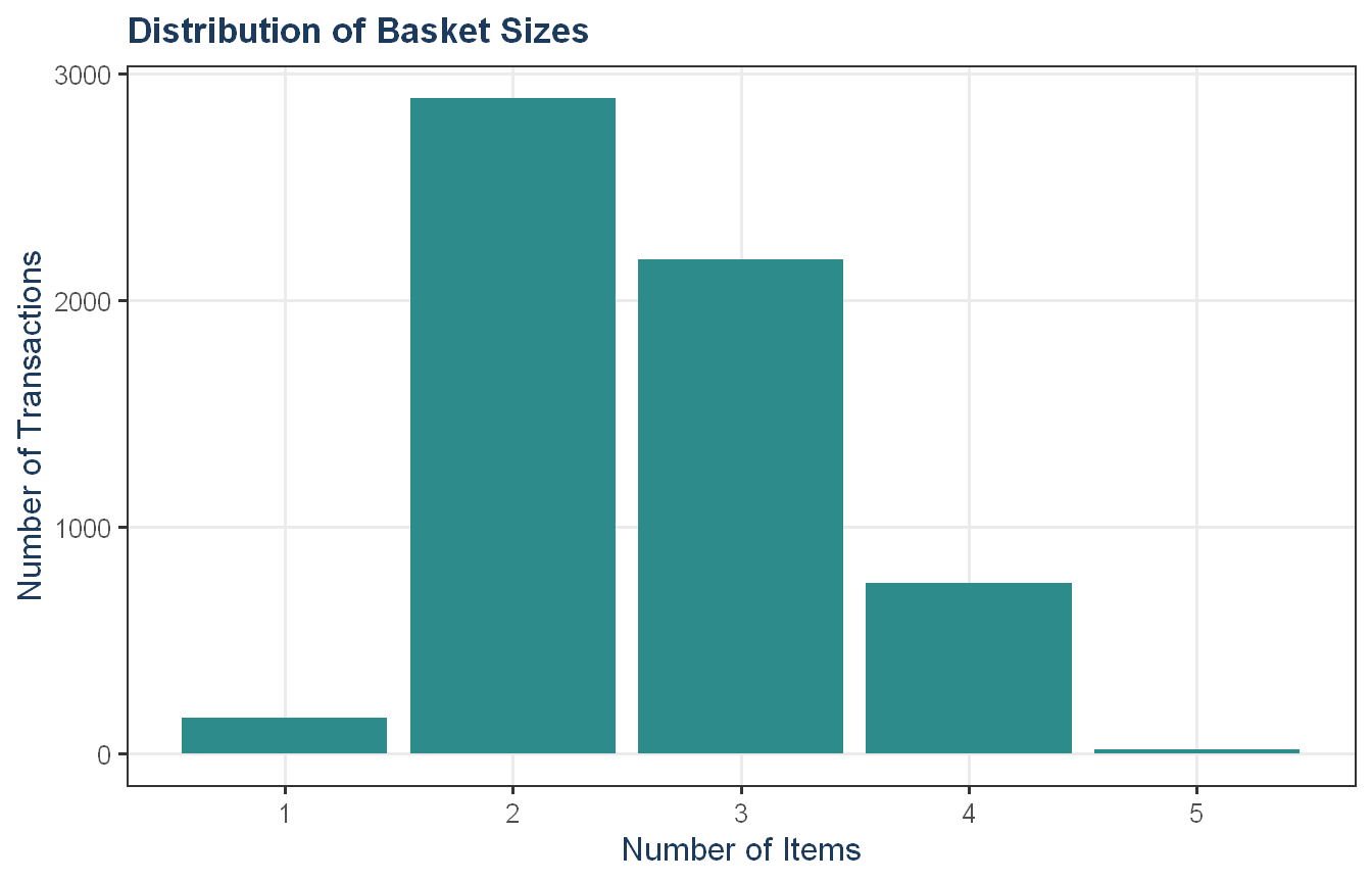
Basket sizes range from 1 to 5 items with a mean of 2.60, well below the 12-item maximum described in the assignment. Purchases of 2 and 3 items account for roughly 84% of all transactions, suggesting most FreshMart customers make targeted rather than comprehensive shopping trips. Single-item baskets (160 transactions) and 5-item baskets (20 transactions) are both uncommon. This compact basket structure means the Apriori algorithm will primarily surface pairwise and small-group item relationships rather than complex multi-item bundles.
Approach: We plot the basket size distribution and top 10 item frequencies.
Show code
basket_dist <-py_to_r_df(py$basket_size_df)ggplot(basket_dist, aes(x = Basket_Size, y = Count)) +geom_col(fill = proj_teal) +scale_x_continuous(breaks =seq(1, 12, 1)) +labs(title ="Distribution of Basket Sizes",x ="Number of Items", y ="Number of Transactions") +theme_proj()
Show code
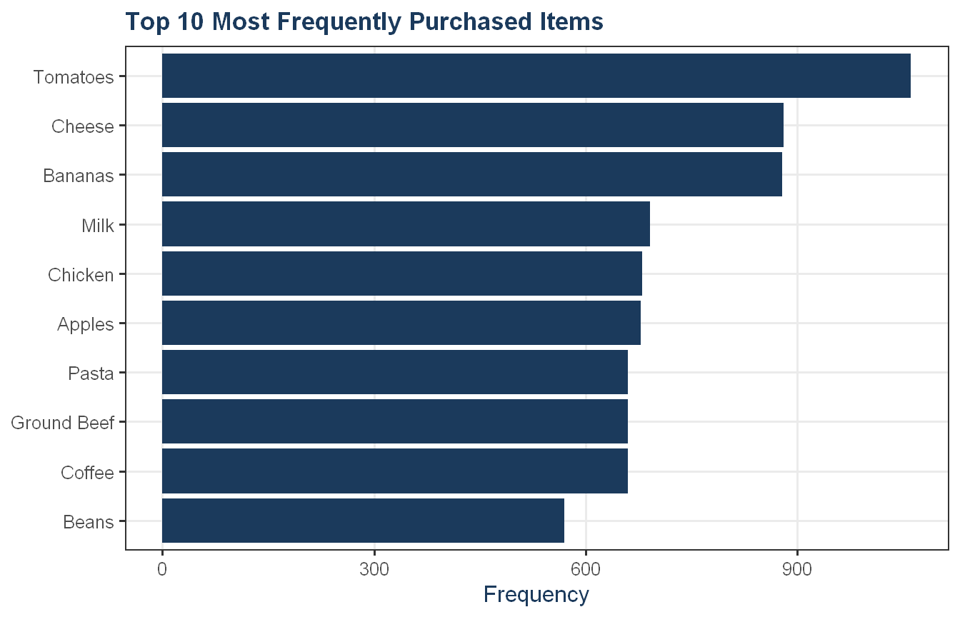
top10_r <-py_to_r_df(py$top10)ggplot(top10_r, aes(x =reorder(Item, Frequency), y = Frequency)) +geom_col(fill = proj_navy) +coord_flip() +labs(title ="Top 10 Most Frequently Purchased Items",x =NULL, y ="Frequency") +theme_proj()
Show code
top10_r |>flextable_defaults(digits =4)
Item
Frequency
Support
Tomatoes
1,061
0.1769
Cheese
881
0.1469
Bananas
879
0.1465
Milk
691
0.1152
Chicken
680
0.1134
Apples
678
0.1130
Pasta
660
0.1100
Ground Beef
660
0.1100
Coffee
660
0.1100
Beans
570
0.0950
Tomatoes are the most frequently purchased item at 17.7% support, ahead of Cheese and Bananas which are nearly tied at around 14.7%. Items ranked 4 through 10 form a tight cluster between 9.5% and 11.5%, with Pasta, Ground Beef, and Coffee sharing an identical frequency of 660 transactions. The basket size distribution confirms that most FreshMart customers make small, targeted trips as 2-item baskets are the most common at 2,888 transactions, followed closely by 3-item baskets at 2,177. Five-item baskets account for only 20 transactions. High individual item frequency does not necessarily correspond to strong purchasing relationships between items, for example, Tomatoes appear frequently but may not anchor the strongest association rules. That distinction becomes clear in the rule mining step.
Approach: We convert transactions to a binary matrix, run the Apriori algorithm with a minimum support of 0.05, and compute association rules with support, confidence, lift, and conviction.
We set a minimum support threshold of 0.05, meaning a product or product combination must appear in at least 5% of all transactions to be considered frequent. This threshold is a deliberate balance: too low and the algorithm surfaces thousands of spurious rules driven by noise; too high and meaningful but moderately common patterns get excluded. At 5% this translates to roughly 300 transactions, which is a reasonable floor for a dataset of this size.
The top rules by lift center on two distinct meal patterns. The taco cluster, i.e. Ground Beef, Cheese, Salsa, and Tortillas, produces the highest lift values around 16.6, meaning customers who buy any subset of these items are roughly 17 times more likely to buy the remaining items than random chance would predict. The salad cluster, i.e. Lettuce, Onions, Carrots, and Tomatoes produces lift values around 13.6. These are not coincidences in the data; they reflect real meal-based purchasing behavior.
The top rules by confidence are dominated by rules where confidence equals 1.0, meaning every transaction in the dataset that contained the antecedent also contained the consequent. This is a data statement, not an absolute law; a customer could walk in tomorrow and buy Oranges without buying Apples. It simply means the co-occurrence was perfect within these observed transactions.
Conviction adds a directional dimension that lift does not. Lift is symmetric as in the lift of Carrots + Tomatoes -> Lettuce + Onions is identical to its reverse, but conviction is not. A conviction of 32.5 for Carrots + Tomatoes -> Lettuce + Onions means this directional association is far stronger than random chance would produce. Rules with confidence of 1.0 produce undefined (infinite) conviction because the formula divides by zero when confidence reaches its maximum, which is mathematically correct rather than a data quality issue. The strongest finite conviction values in the lift table belong to the taco and salad clusters, reinforcing that these are the most robust purchasing relationships in the data.
Approach: We propose three concrete merchandising strategies grounded in the strongest association rules.
Show code
taco_lift <-round(lift_df[lift_df$antecedents =="Cheese, Ground Beef"& lift_df$consequents =="Salsa, Tortillas", "lift"], 1)salad_lift <-round(lift_df[lift_df$antecedents =="Lettuce, Onions"& lift_df$consequents =="Carrots, Tomatoes", "lift"], 1)cereal_conf <-format(round(conf_df[conf_df$antecedents =="Bananas, Cereal"& conf_df$consequents =="Milk", "confidence"], 2), nsmall =2)cereal_lift <-round(conf_df[conf_df$antecedents =="Bananas, Cereal"& conf_df$consequents =="Milk", "lift"], 1)recs <-data.frame(Recommendation =c("Taco meal end-cap","Salad ingredients co-location","Cereal and banana bundle" ),Rule =c(paste0("Cheese + Ground Beef -> Salsa + Tortillas (lift ", taco_lift, ")"),paste0("Lettuce + Onions -> Carrots + Tomatoes (lift ", salad_lift, ")"),paste0("Bananas + Cereal -> Milk (confidence ", cereal_conf,", lift ", cereal_lift, ")") ),Action =c("Feature Tortillas, Salsa, and Cheese on a dry goods end-cap with in-aisle signage directing customers to the meat counter for Ground Beef","Stock Lettuce, Onions, Tomatoes, and Carrots in adjacent produce bins with co-location signage","Cross-merchandise Cereal with Bananas and Milk via shelf signage or a buy-together discount" ),Benefit =c("Converts single-item trips into full meal purchases, increasing basket size","Reduces shopper search time and encourages customers to complete their salad ingredient purchase","Drives incremental produce and dairy sales from the cereal aisle with minimal placement cost" ))recs |>flextable_defaults() |>set_table_properties(layout ="autofit") |> flextable::width(width =c(1, 1.5, 2.5, 2))
Cross-merchandise Cereal with Bananas and Milk via shelf signage or a buy-together discount
Drives incremental produce and dairy sales from the cereal aisle with minimal placement cost
The three recommendations above are grounded directly in the strongest rules from the analysis.
The taco cluster produces the highest lift in the dataset at 16.6, meaning customers buying any subset of these items are roughly 17 times more likely to complete the meal purchase than random chance would predict. Since Ground Beef is a refrigerated product and cannot be physically co-located with dry goods, the practical implementation is a Tortillas, Salsa, and Cheese end-cap in the dry goods aisle paired with in-aisle signage directing customers to the meat counter for Ground Beef. This keeps the recommendation actionable within store layout constraints while still capitalizing on the strongest affinity in the data.
The salad cluster recommendation follows the same logic. Lettuce, Onions, Tomatoes, and Carrots co-occur with a lift of 13.6 and near-perfect confidence in both directions, suggesting these are consistently purchased as a set. Placing them in adjacent produce bins reduces friction for customers assembling a salad and increases the likelihood of a complete basket purchase.
The cereal and banana bundle targets a different type of affinity: a breakfast occasion rather than a meal kit. Bananas and Cereal co-occurring with Milk at confidence 1.00 and lift 8.7 indicates a strong and reliable breakfast basket pattern. Cross-merchandising Cereal with Bananas and Milk via shelf signage or a bundle discount targets this pattern at a low implementation cost, since the association is strong enough to justify the placement without needing a dedicated end-cap.
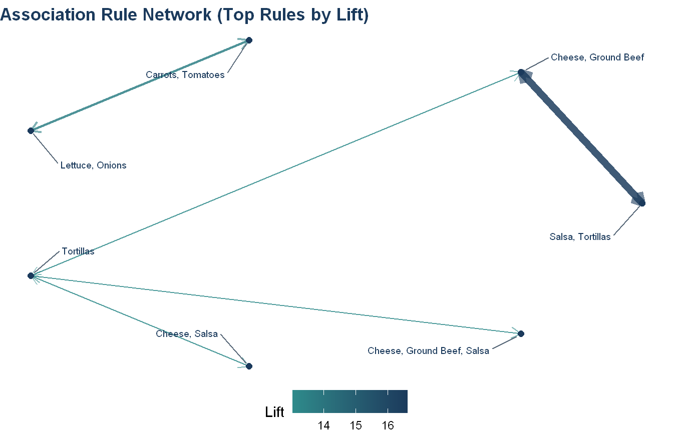
Approach: We visualize the top association rules as a directed network graph (using igraph), with edge thickness and color representing lift, to illustrate the strength and direction of the strongest product affinities in the data. We then discuss data and methodological improvements that could extend FreshMart’s merchandising analytics beyond basic association rules.
The network graph makes the two dominant purchasing clusters immediately visible. The taco cluster on the right is the more densely connected of the two. Tortillas acts as a hub with edges flowing to and from Cheese, Ground Beef, Salsa, and their combinations, all at lift values above 13. The thick dark edge between Cheese, Ground Beef and Salsa, Tortillas represents the strongest rule in the dataset at lift 16.6. The salad cluster on the left is simpler. A bidirectional relationship between Lettuce, Onions and Carrots, Tomatoes at lift 13.6 with high confidence in both directions.
On data improvements, the current dataset is limited to transaction IDs and item lists. Adding time of day and day of week would allow FreshMart to target promotions when specific purchasing patterns are most active. For example, taco ingredients may cluster on weekends while breakfast baskets like Cereal, Bananas, and Milk may peak on weekday mornings. Store location data across the 12 Central Texas locations would reveal whether affinities differ by neighborhood demographics, allowing location-specific planograms rather than a single chain-wide layout. Price and promotional flags would allow the team to distinguish organic affinities from promotion-driven co-purchases, which is critical for evaluating whether a bundling strategy reflects genuine preference or just a past discount.
On methodology, association rules describe co-occurrence but not causation or customer-level behavior. Sequence analysis would extend the current approach by identifying whether certain items tend to be purchased before others across multiple trips, which could inform loyalty program design. Uplift modeling would go further by estimating which customers are likely to add an item to their basket specifically because of a promotion, rather than those who would have bought it anyway. Customer segmentation via clustering would allow FreshMart to tailor recommendations by shopper type. For instance, a customer who regularly buys fresh produce has different cross-sell potential than one whose basket is primarily shelf-stable goods, though collecting the customer-level data needed for segmentation raises privacy considerations that would need to be addressed before implementation. Price elasticity analysis would complement the rule mining by identifying which bundled items are most sensitive to discounting, helping leadership prioritize which of the three recommendations above is likely to generate the highest incremental revenue per promotional dollar spent.